Pages

Showing posts with label occasional quotes. Show all posts

Wednesday, May 30, 2012

Rita's Baby Blog Hop! {FMS37}

Surprise!!  Hi everyone and welcome to a special Baby Blog Hop where the design teams of Freshly Made Sketches and The Paper Players teamed up to celebrate...and surprise...Rita Wright!  If you're following the hop, you've arrived here from the fabulous Linda Callahan's blog where I am sure she had an adorable project for Rita!  This week Rita is the hostess at Freshly Made Sketches and all of us secretly made a baby themed card with Rita's sketch!  What a great idea, Lesley! 
Didn't Rita design a great sketch?  Love it!  So, aside from the sketch, I knew two things I wanted to incorporate for my friend.  One of her favorite stamp sets, Fox & Friends and one of her favorite color palettes of Basic Gray, So Saffron and Crumb Cake. So here is what I made for you, Rita!
Oh, I had fun stamping these little guys!  I think my favorite is the So Saffron owl peeking out from the corners:
And that little jumping monkey is so cute isn't she?  I know it's a girl because for one, Rita's baby is a girl (!) and two, she has a little bow in her hair:
I fell in love with the flower Rita added to the girl fox in this post and just had to CASE the idea for her special card!
And it is my opinion that Rita and her husband are going to be the best parents little baby Laila could ever hope for!  My heartfelt wishes to you both for a healthy, beautiful baby girl and many joys in the years ahead.  Come on Baby Laila, we can't wait to meet you!!

To continue on the hop, you're headed "down under" for a visit with the terrifically talented Tui Nathan!  Thanks for hopping by and be sure to hop on over to Rita's Creations and leave her some baby love and to play along with her sketch at Freshly Made Sketches!

Rita's Baby Blog Hop

 Photobucket
Supplies 
Stamps: Fox & Friends; A Word for You; Occasional Quotes (retired)
Ink: So Saffron, Basic Gray, Crumb Cake, Basic Black
Paper: So Saffron, Basic Gray, Whisper White CS; Designer Series Paper--Patterns Stack (Subtles)
Xtras: Crumb Cake Taffeta Ribbon; Glimmer Brads (Neutrals); Scallop Ribbon Border Punch; Basic Rhinestones; Itty Bitty Punch Pack; 2 1/2" Circle Punch; Perfect Pennants Bigx L die  

Thursday, February 10, 2011

It's Curtain Call Baby! {68}

Hiya friends!  Just a quick post tonight to share a card I made with the scrump-dilly-icious colors from Stacey's Curtain Call Color Challenge {68}:
Aren't they gorgeous?  I think I say that about all the colors Stacey picks!   I'm not sure I'm in love with this card but it's growing on me...I think.
I was itching to use the Fun Flowers die that I've had since December but not yet used once!  Ack!  The flowers are cut from Pink Pirouette CS and then stamped in Melon Mambo with the En Francais background stamp.  I also sponged more Melon Mambo on the edges to define each layer.
The center is one of the Sweet Stitches fabric brads from the mini catalog.  Just love these!  I also embossed the card base with the Perfect Details texture plate.  I like how it gives a garden lattice look to the background.
And here's the inside...combined two sentiments here, Occasional Quotes & Short and Sweet, and I thought they worked well together.  I've only ever used the "Love begins in a moment..." sentiment for wedding or anniversary cards but when I gave it some thought, it really works for the birth of a baby too! Sorry for such a short post tonight...it's been a long work week but I'm off tomorrow and looking forward to a bit of quality time at my craft table.  Have a great Friday, friends!

supplies:
stamps: en francais, a word for you, charming, occasional quotes, short and sweet
ink: melon mambo, wild wasabi, pink pirouette
paper: whisper white, melon mambo, pink pirouette, wild wasabi CS
xtras: two tags die, fun flowers die, scallop border punch, polka dot impression folder, sweet stitches fabric brads, perfect details texture plate, wild wasabi striped grosgrain ribbon

Sunday, February 6, 2011

Love is in the Air {PP33} & candy winner!

Happy Sunday everyone and welcome to another week at The Paper Players.  What a time we had last week with our first-ever Blog Hop.  I am so grateful for all those who stopped by during the Hop and became one of my followers.  I just love to see all your little smiling faces on my blog each day--it warms my heart to know you're out there! 

So first order of business is to announce the winner of the Blog Hop candy!!  I used Random.org to generate the winning comment and it selected #65...Michelle!!! 
Congratulations Michelle!  Please email your snail mail address to nleedy@cox.net and I will put your Polka Dot impressions folder AND my blog hop card in the mail to you right away!

Alright, now onto this week's challenge..it's February and that means Valentine's Day and all things LOVE-ly!   Please join us for our "Love is in the Air" challenge to create a romantic card of any style.
I like to try and find other uses for holiday stamps and so it was with that approach that I used Valentine Defined to make an anniversary card.
I started with a card base of Basic Gray and a piece of Bashful Blue run through the Elegant Lines impressions folder and matted with Rich Razzleberry.   To make the focal medallion I stamped the heart grass from Valentine Defined in Bashful Blue and overstamped the lovin' flamingos in Rich Razzleberry.
I punched the flamingos with a 1 3/4" circle punch, backed it with a 2" Brushed Silver circle and a 2 1/2" scalloped circle in Rich Razzleberry.  I punched a bitty heart with the two-step owl punch (really, this time!) and added some Crystal Effects.  It makes a sweet little puffy heart!
I needed a place for the sentiment but didn't want to interfere with the embossed background.  So I stamped a piece of cardstock Vellum with a Basic Gray sentiment from A Word for You, punched a scallop border and added some pearls.  Some Basic Gray taffeta ribbon hid the adhesive perfectly!
On the inside I added a strip of more embossed Bashful Blue cardstock, a scalloped border of Rich Razzleberry and a sentiment from Occasional Quotes in Basic Gray.


Be sure to check out all the inspiration from the rest of The Paper Players design team and then link up your love-inspired creation on the Paper Players blog by midnight (MST) on Friday February 11th.  The design team will each choose A Cut Above and a Headliner.  Have fun all my lovely friends!


supplies:
stamps: valentine defined, a word for you, occasional quotes
ink: basic gray, rich razzleberry, bashful blue
paper: basic gray, rich razzleberry, bashful blue, brushed silver, whisper white, vellum CS
xtras: basic gray taffeta ribbon; basic pearls; 1 3/4" circle and 2" circle punches; 2 1/2" scalloped circle punch; scalloped border punch; crystal effects; elegant lines impressions folder

Sunday, December 12, 2010

Organic Winter PPA{28}

Happy Sunday everyone!  It's challenge day at The Paper Players and this week we are asking you to show us your favorite color combination for a specific card!  You might like Cherry Cobbler and Old Olive for Christmas cards or Chocolate Chip and Baja Breeze for sympathy cards--you choose!
 

One of my favorite color combinations for the holidays?  Silver & gold!  The shine, the shimmer, the cool elegance...I love it!  On my card, this translated to Very Vanilla, Brushed Silver and Crumb Cake.  I wanted to make a holiday card but wanted to use a non-traditional stamp so I reached for a favorite [retired] set Organic Outlines...I think it looks a bit like mistletoe, don't you think?  I stamped the solid image in  Crumb Cake onto my Very Vanilla panel then stamped the outline in Versamark, sprinkled with silver embossing powder and heat set.  I promise the outline is metallic silver, it doesn't look like it in the above pic but here you can see it better:
I don't think I will ever tire of watching the embossing powder turn to liquid silver under the heat gun--it's magic!  The circles were just calling out for some basic rhinestones so I just had to oblige!  Who am I to argue with more sparkle?!  I matted the whole piece with Brushed Silver cardstock and added some Crumb Cake seam binding ribbon to the side:
Crumb Cake seam binding ribbon is just one of the new and fabulous items in the upcoming spring Mini Catalog.  For the scrunchy ribbon technique, I just lay a piece of sticky strip where I want my ribbon and using the tip of a paper piercer pull up a little bit of ribbon and press down in between each ruffle.  Easy peasy!  You can see a close-up here, too, of the Woodgrain texture plate from PTI that I used in the background.  I brayered it with Crumb Cake ink first before running it through the Big Shot and the result is a wonderful tone-on-tone texture.
The inside got a little treatment too with the same organic stamp in Crumb Cake and stamped off once.  I overstamped a sentiment from Occasional Quotes in Encore metallic silver ink.  The effect is soft and subtle.

This card was a good opportunity to participate with the design team over at Pals Paper Arts.  I always enjoy their challenges and love to play along when I can.  They're having a "Winter White" challenge this week and I just love the inspiration storyboard.  My eye was drawn to the silver earrings and the Crumb Cake cookies which inspired me to use these colors on my card.
  

So what are your favorite colors for that special card?  The Paper Players would love to see!  Head on over to our blog for more inspiration from the design team and our returning guest designers.  Link up your project by midnight (PST) Friday, December 17th to be in the running for "A Cut Above" and "Headliner".  Have a great week, my friends!

Sunday, November 28, 2010

Embossed & Dashing for the Paper Players {26}

Happy Sunday everyone!  I hope all my US friends enjoyed the holiday weekend, I sure did!  It was nice to have a leisurely time making my card for this week's Paper Players {26} challenge.  Usually it's a mad rush to the deadline!  This week is Jaydee's Paper Players Plus challenge and she's calling for wet embossing.  Such fun--I love how embossing creates a sharp and glossy image.  For this one, I turned to a much-neglected holiday favorite from 2009.  Sweet Dasher has yet to see ink this holiday season so I thought he was due for a turn at my craft table.

Isn't he handsome?  He looks wonderful emobssed in Night of Navy.  First, I cut a 3" circle with my Nestabilities and stamped the long row of bare trees from Lovely as a Tree in Bashful Blue.  

 
Next, I overstamped Dasher by inking him first in Versamark, then Night of Navy and sprinkled with clear embossing powder and heat set.  I love this technique which allows me to emboss in any ink color.  Versamark + classic ink of choice + clear embossing powder and heat set = FAB results!  I also added a little Dazzling Diamonds to the snowy hills with a glue pen. 


Bashful Blue cardstock was embossed with the Northern Flurry impressions folder and sponged over with Frost White Shimmer Paint.  I applied the Shimmer Paint directly to the cardstock with a sponge and added a few basic rhinestones for even more sparkle!

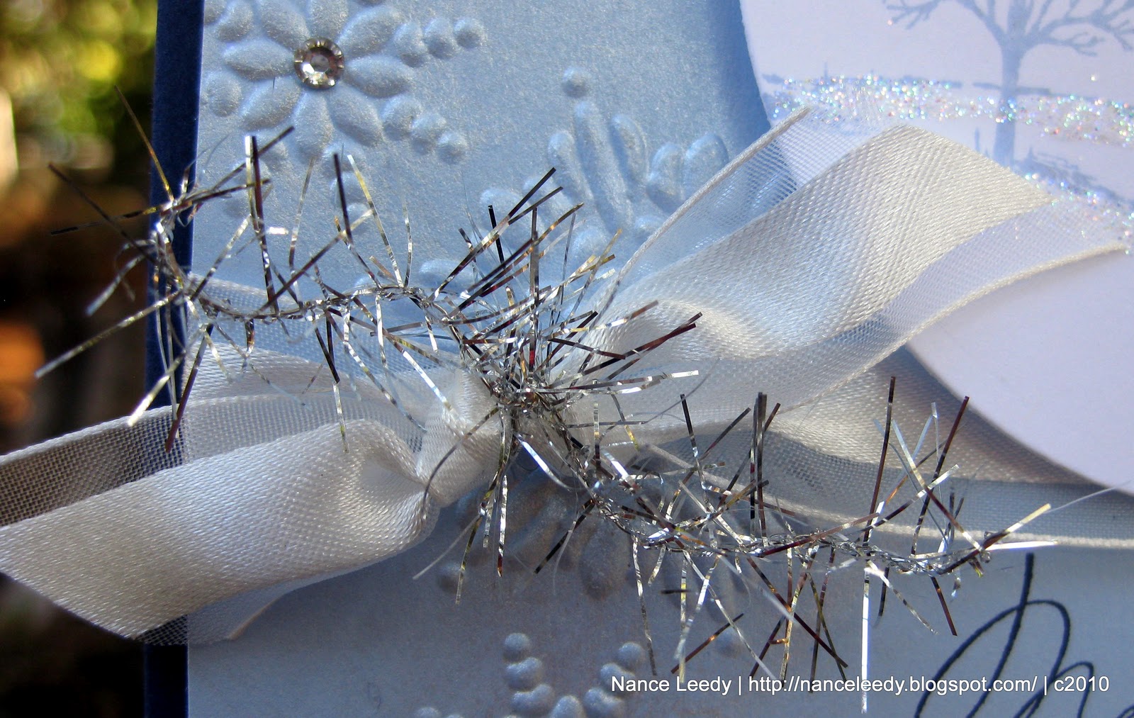
 Whisper White organza ribbon is my go-to ribbon for holiday cards--it's elegant and shimmery all at once.  Of course, my other go-to this season is the Silver Tinsel trim I tied onto the knot.  A little bit of tinsel goes a long way but adds such a fun element!


On the inside, I stamped Lovely as a Tree again in Bashful Blue and overstamped a sentiment from Occasional Quotes (hostess level 2) in Night of Navy.  I just love this sentiment, it's the perfect match for the serene, frosty mood I was going for.  Of course, the inside needed a bit of "frost" too so a few more strokes of the glue pen and a sprinkling of Dazzling Diamonds was in order.

Won't you join us for a embossing challenge?  Head on over to The Paper Players this week to check out the rest of the Design Team's creations--you're sure to find a lot of inspiration when you do!  To play along just link up your creation by midnight (PST) Friday, December 3rd to be in the running for "A Cut Above" and "Headliner".  The winners will be featured on The Paper Players blog Saturday, December 4th.  Come join us, we can't wait to see what you'll create!
 
supplies:
stamps: dasher; lovely as a tree; contempo christmas; occasional quotes
ink: bashful blue, night of navy, versamark
paper: night of navy, bashful blue, whisper white CS
xtras: northern flurry impressions folder; whisper white organza ribbon; silver tinsel trim; dazzling diamonds; frost white shimmer paint; basic rhinestones, clear embossing powder

Wednesday, October 20, 2010

Rich Sahara Parfait {CD81}

Hi friends!  Welcome to another week at The Color Dare.  Once again, Riley has chosen some fabulous colors for us--at first I said "what am I going to do with that?"--but she doesn't call it the color DARE for nothin' does she?!  Honestly, this is a beautiful combination that I would never have thought of and that's what a challenge is supposed to be, right?  So here you have it:
CD 81
Sahara Sand
Rich Razzleberry
Peach Parfait
 

French Foliage--oh how I love it.  I resisted for awhile because I thought I had enough leaf stamps but when I stamped with a borrowed set, I fell in love.  The images are crisp, deep impressions and stamp beautifully.  So I gave in to temptation, just call me weak!  Today's card is pretty simple but the background stamping was a little more involved.  I cut a piece of very vanilla to the size I wanted and placed post-it notes about and inch in around all the edges to create a frame.  Then I inked my Weathered background stamp (retired) in Sahara Sand and stamped right in the middle of the frame I made with the post-its.  When I removed the post-its I had a floating background image on which to stamp my leaves.  I really like the simplicity of this look.  Then it was a not-so-simple matter of leaf placement and color balance.  That design process always takes me longer than I think it should!  In the end, I am happy with it.


An Antique Brad was the perfect finishing touch to the Rich Razzleberry 1/4" grosgrain ribbon and some linen thread.  The sentiment is from Teeny Tiny Wishes and stamped with my stamp-a-ma-jig in Rich Razzleberry.

I repeated the same color scheme on the inside bringing together all the elements for a cohesive look. Now, head on over the The Color Dare and check out all the wonderful creations from the rest of the design team.  We hope you will join us!

Sunday, October 17, 2010

Season of Friendship for The Paper Players {PP20}

Happy Sunday, everyone!  Thanks for joining me here for another great week at The Paper Players.  This week Lesley has a clean and simple sketch for us to try:


Isn't that great?  You can do a lot of things with the center panel...and here is where I went with it:


I really like the colors of this card--traditional with a twist!  Here I used Crumb Cake, Real Red, and Baja Breeze--love BB and RR together.  I started with the center panel of Crumb Cake that I spritzed with Champagne Shimmer mist and stamped with the Season of Friendship tree in Whisper White craft ink.  Of course, it's always difficult to capture the sparkle in a photo (pic above looks so flat!) but maybe you can see it here:


Pretty, isn't it?  The trio of Real Red birdies are from another favorite tree stamp, Branch Out (retired) as are the sweet little Baja Breeze snowflakes.  With my glue pen, I added some Dazzling Diamonds to the Baja Breeze snowflakes as well as the ones on the background Candy Lane specialty designer paper because you can never have enough sparkle!


I thought this simple design needed a simple bow treatment so I ran a piece of the Whisper White organza ribbon around the strip of Real Red cardstock and then tucked a couple loops of ribbon under each side of the main panel.  I like the look of it and it's postal-friendly!

I had fun repeating the same elements on the inside stamping the tree in Crumb Cake on Whisper White with more Baja Breeze snowflakes and another Real Red bird:

And isn't this sentiment just perfect?!  It's another one from the level 2 hostess set Occasional Quotes--so versatile!  As I was taking these pictures, I realized I should have put some more Dazzling Diamonds on the inside so I may go back and add just a touch. :-)

I hope you've enjoyed my sample today...be sure to head over the The Paper Players and check out the rest of the design team.  I'm sure you'll find some wonderful eye candy and inspiration.  Then try your hand at Lesley's sketch and link it up.  We can't wait to come visit you!

supplies:
stamps: season of friendship; occasional quotes; contempo christmas (sentiment); branch out (retired)
ink: whisper white craft; baja breeze, real red, crumb cake, jet black stazon, basic black
paper: crumb cake, whisper white, real red CS; candy lane specialty DSP
xtras: MS glue pen; dazzling diamonds; whisper white organza ribbon

Friday, October 15, 2010

A Curtain Call Sketch 4 U

Hi everyone, happy Friday!  We all have the day off today, in fact almost the whole city does as it is a very big day here in North Florida.  Believe it or not, the schools all shut down for UF Homecoming!  I know, it's crazy but if you follow the Florida Gators at all, you will understand.  Parades, pep rallies, it's crazy!  We've lived here over 15 years and I still don't "get" it but I'll take the day off! :-)

Thank goodness, too, because it gave me time to stamp for Stacey's Curtain Call Color Challenge this week.  Aren't these colors fabulous together?!  So Saffron, Marina Mist, Crumb Cake, Basic Black & Whisper White...so fresh and modern!  I also used Kazan's great sketch over at 2 Sketches 4 You.  Here is what I created:

The single stamp, Ornate Blossom, was inked up with Stampin' Write markers in this weeks colors, stamped on Whisper White and cut out with circle nestabilities and the Big Shot.  I stamped the center of the blossom with Marina Mist ink on some scrap, cut it out and popped it up on dimensionals.  I really like how the Black Raven Lace looks laid flat on the So Saffron designer paper next to a piece of Marina Mist cardstock embossed with the Polka Dot impressions folder.  The sentiment from Curly Cute was stamped with jet black Stazon for a crisp clean look.  Not sure if I like the 3 pearls but I felt it needed something more in that corner to balance the blossom.

Here's a quick look at the inside with more of the same designer paper.  I'm sorry it looks crooked in the photo, I think it's the angle, I promise it's straight IRL!

This is a smaller version of the same ornate blossom and this one is from the Friends Never Fade set.  I inked it in Marina Mist and stamped off once before stamping on the paper.  Such a fitting sentiment for a thank you card, this one is from the level 2 hostess set Occasional Quotes.

So, that's it for today...I hope you like it.  As always, thank you for stopping by and thank you even more for leaving a comment with your feedback.  I love hearing from you!  Be sure to check back on Sunday for another fabulous week at The Paper Players!

supplies:
stamps: ornate blossom; friends never fade; curly cute; occasional quotes
ink: basic black, marina mist, stazon
paper: crumb cake, whisper white, sweet pea stack (retired)
xtras: crumb cake, marina mist, daffodil delight, basic black stampin' write markers; black raven lace; basic pearls; polka dot impression folder; circle nestabilities

Sunday, October 3, 2010

Monochromatic for The Paper Players {PP18}


Happy Sunday everyone!  It's another week for The Paper Players challenge and I am so excited to continue on board as Guest Designer this month!  October finally brings some cooler weather to Florida--and by cooler I mean pleasant [think 84 instead of 94](!)--so that had me thinking of fall colors.  This week's monochromatic challenge at The Paper Players is the perfect opportunity to highlight the SU Neutral color family with Crumb Cake, Early Espresso and Very Vanilla.  

For today's card I used a technique called "emboss resist" or "emerging color" to highlight the designer paper beneath the flowers.  This technique works best with a stamp that has a lot a surface area for the paper to peek through such as the Upsy Daisy set that I've used here.  First, stamp your image onto patterned paper with Versamark ink, sprinkle with clear embossing powder and heat set.  Next, fill a brayer with a coordinating color that is darker than your patterned paper and roll directly over the whole thing--paper & your embossed image.  Keep going!  You want to completely cover your paper and get a deep color.  When it's to your liking, wipe the ink off your embossed image and watch your pattern emerge within your stamped image...such a treat to watch...I know it's the little things that make me happy.  :-)


In keeping with the monochromatic theme, a slice of a Very Vanilla top note peeks out underneath the daises, anchors the image and holds a kind sentiment from the level 2 hostess set, Occasional Quotes.  


I wrapped the whole piece with some [retired] Crumb Cake taffeta ribbon and finished it off with another Vintage Brad--love those!  For more inspiration, check out the rest of the Players design team and their fabulous holiday cards.  We hope you'll join us with your monochromatic creations--I can't wait to see what colors you pick!

supplies:
stamps: upsy daisy, occassional quotes
ink: early espresso; versamark
paper: crumb cake, very vanilla CS; bella bleu DSP [retired]
xtras: scallop dotted ribbon border punch; vintage brads; crumb cake taffeta ribbon; top note die; brayer; clear stampin' emboss powder

Wednesday, September 15, 2010

Color Dare Design Team Debut {CD76}

Woo hoo!  I am delighted to share this card with you as my first contribution on the Color Dare design team! Riley Fitzgerald runs the Color Dare challenge with a new batch of fresh color combinations each Wednesday and I have joined their team for the next six months. We would love for you to play along...come check it out! This week's combination is Rose Red, Old Olive, Not Quite Navy & Elegant Eggplant and here is what I did with it:


I knew that I wanted to feature a fan fold flower--been seeing them all over blogland--and with a strong focal piece like that I needed to keep the rest of the card pretty simple.  This week's sketch over at Taylored Expressions was just perfect!  I love sketches and layouts that allow me to feature our beautiful designer paper.  Here I've used a combination of retired designer papers except for the Elegant Eggplant.  I didn't have any designer paper in EE so I stamped the cherry blossoms from Eastern Blooms in EE on my EE cardstock for instant patterned paper!

Here's a close-up of the fan fold flower with an Antique Brad center.  These brads sure are gorgeous!  I'm usually a clean and modern kind of girl but these brads have me humming a vintage tune!  I backed it with a circle of Not Quite Navy.  If you would like to see how I made the flower, check back tomorrow for a pictorial.  You'll want to try it right away, it's that easy!

Finally, a little peek at the inside for you.  I carried over a narrow strip of the same papers and repeated the Eastern Blooms cherry blossoms in Versamark behind the sentiment.  The sentiment is such a great one from the level 2 hostess set Occasional Quotes.

So that's it from me today...will you take the Color Dare?  Hop on over and take a look at the inspiration from the rest of the design team and then go get crafty...we would love to see what you come up with! 

supplies:
stamps: sincere salutations; occasional quotes; eastern blooms
ink: elegant eggplant; versamark
paper: crumb cake, very vanilla, old olive CS; urban garden, haiku, thoroughly modern DSPs (retired)
xtras: corner rounder, 2 3/8" scallop circle, 3/4" circle punches; old olive satin ribbon; antique brad


Sunday, August 22, 2010

Paper Players {12}

I can finally share some exciting news with you! I've been busting at the seams!! Lesley, of The Paper Players Challenge, asked me if I would like be one of their guest designers for the month of September! How exciting is that?! Of course, I said yes, yes, YES!! I am so honored to be part of this talented team. Even more exciting, I am starting a little early because DT LeAnne is taking a break to spend time with her new granddaughter (yeah, LeAnne!).

This week Jaydee is our hostess with the mostess and she has challenged us with an yummy inspiration photo. Hmmm, I have to say...I was stumped! But, I focused on the colors and the textures and an idea started to form. I knew that a Cumb Cake base was a must then I stamped a Sanded background with Whisper White craft ink to imitate the flour dusted bread.


The circular element of the blackberries stands out when I look at this photo and the Medallion stamp came to mind. I think it would also look good embossed with black embossing powder to really make it shine like the blackberries. This photo also makes me think of old world bakeries and the Medallion stamp has a similar vintage feel.

A strip of (retired) Riding Hood Red taffeta ribbon gives a little pop of strawberry red against the Crumb Cake background. And I am in LOVE with the Decorative Label punch from the upcoming Holiday Mini Catalog. Here, it's used with a Curly Cute sentiment on top of another medallion image, from Charming, in Crumb Cake ink. I love stamping the sentiment over a coordinating image--it really fills in the space!

Lastly, a peek at the inside. Just repeated elements from the front. A Crumb Cake Medallion, a sentiment from Occasional Quotes in Basic Black and a stamped scallop border in Riding Hood Red from the (retired) All Scallops set.

So what do you think? Are you inspired? What do you see when
you look at this photo? Hop on over to the Paper Players Challenge and link up your creation! We would love to see what inspires you! Thanks for stopping by.


supplies: stamps: medallion; curly cute; sanded ink: whisper white craft; jet black stazon; crumb cake, riding hood red paper: crumb cake, whisper white CS xtras: decorative label punch; basic rhinestone jewels; riding hood red taffeta ribbon; dotted scallop ribbon border punch