Pages

Sunday, December 10, 2017

Making Spirits Bright PP374

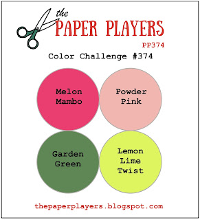
Hiya friends!  Here it is...the last Paper Players challenge of 2017.  The fabulous Claire is our hostess with a fun and festive color challenge:
These colors screamed vintage to me and the [retired] Festival of Trees stamp set was just the bold and graphic look I was going for:
It took me a few tries on scrap paper but I finally got the pattern I was after.  I stamped alternating trees in Powder Pink, Garden Green and Lemon Lime Twist with accents of Melon Mambo and [more] Garden Green.  These little triangle trees are easy to line up--no MISTI or Stamp-a-ma-Jig needed!  The layout at Freshly Made Sketches gave me the perfect way to highlight my stamped panel.  I just added a little bit of gold glitter washi tape to the border for some sparkle.

   
 A few more trees on the inside and a fun combination of sentiments from Petite Pairs made quick work of the inside and this card was done!  I hope I've inspired you to play along with us at The Paper Players.  Not only is this our last challenge of 2017, it's also the last challenge with our fabulous Guest Designer, Deanne.  I am going to miss her bright and happy creations but I hope to see her playing along with us in the gallery.  Thank you, Deanne, for giving us a whole year of your creativity and inspiration!  I hope you will find a little time to play along with us before our challenge ends on Friday, December 15th at Noon (PST).  Thanks for stopping by!

The Paper Players Design Team 


Sunday, December 3, 2017

Gingerbread Kisses PP373

Hi friends...can you believe it's December all ready?  Yikes!  Laurie's fun Theme Challenge at The Paper Players this week inspired me to make a card for our daughter. 
I don't have very many, well really, ANY stamps that feature baking items (gasp!) so I went searching for a digital stamp that I could color.  I didn't specifically have a card for our daughter in mind but when I saw the cute, kawaii images at The Happy Graphics shop on Etsy, I knew I had it made!
I downloaded the Gingerbread Stamp--only 98 cents!!--printed them on Whisper White cardstock with my home inkjet printer and got to work coloring these adorable gingerbread peeps.  I haven't yet invested in SU's new Stampin' Blends markers because I still have some of the retired Stampin' Blendabilities that work just fine!  I used a bunch of them here including Natural, Crumb Cake light, Pink Pirouette light, Wild Wasabi light, Wild Wasabi medium, Melon Mambo light, and Melon Mambo medium.  The glitter paper was cut with a Wonky Stitched Rectangle die from My Favorite Things and mounted on a Melon Mambo base.  The little strip of Wild Wasabi paper was stamped with a fun sentiment from a retired holiday set called Tin of Tags.  Lastly, I addded some [retired] enamel dots to the respective bows for an extra dimension.  No time to finish the inside today--lots to do! 

While I'm sure you have lots to do too, take a few minutes to pop over to my teammies on The Paper Players and check out their fun creations!  We hope you will take some time to play along with us before our challenge ends on Friday, December 8th at Noon (PST).  Thanks for stopping by! 

The Paper Players Design Team 
Sunday, November 26, 2017

Icy Wonderland Sketch PP372

Hi friends....happy Sunday!  I'm excited to be back with you and my gal pals over at The Paper Players where the fabulous Joanne has a sketch challenge for us:  
I have a really hard time parting with my favorite retired SU stamp sets especially holiday ones.  Today, I pulled out a retired favorite, Wonderland, to create another version of a frosty winter wonderland....
You know when you shop at a place like Target and they have the different styles of Christmas decorations?  Usually there's the traditional red/green look and there's always some frosty elements of silver/gold and pastel colors....yep, that's where you'll find me!  Love these icy colors together: Pool Party, Powder Pink and Sahara Sand.  I stamped the Wonderland Tree across the front of a piece of cardstock, cut out the center with an Oval framelit and popped it up with dimensionals.  You can see the right side sketch element in my [retired] piece of vellum DSP--it has a subtle silver polka dot that looks like falling snow.
To camouflage the edge of the trees around the oval die cut, I added another oval cut from plain vellum cardstock.  It coordinates with the vellum panel on the right and hides the rough edges.  Because I can't get enough of the trees in the Carols of Christmas card builder thinlits, I added a Dazzling Diamonds tree.  The iridescent colors of the Dazzling Diamonds, pick up those in my stamped trees nicely.  The silver foil deer is too cute to resist and the silver foil is repeated in my silver thread.
The vellum panel was adhered directly to the card base and I needed a way to wrap ribbon or thread around it.  I used a bitty hole punch to pop out a tiny hole in the top cold of the card--you can see the hole in the top right corner of in the picture above.  Then I just wound the thread through the hole and tied my bow.  A few more trees in my icy color trio and a few snowflakes from the Wonderland set, stamped in [retried] Silver Encore ink--love that stuff!

I hope you like today's card and feel inspired to play along with us at The Paper Players before our challenge ends on Friday, December 1st at Noon (PST). Do check out the rest of the fabulous inspiration from my teammates at The Paper Players!  Thanks for stopping by...

The Paper Players Design Team 


Sunday, November 12, 2017

Frosty Night Forest PP370

Hi friends and happy Sunday!  It's another week with The Paper Players where I have the pleasure of hosting a color challenge:
Oh how I love the simple elegance of white-on-white cards, especially for winter and holiday cards.  The most difficult part of using a monochromatic color scheme is to achieve dimension without an additional color.  The die cuts in the Carols of Christmas bundle make this a snap!
 I knew the tree die in this set would be perfect for this color challenge and you know how I love to play with negative space!  Here, I backed the tree and night sky cut outs with some Dazzling Diamonds glimmer paper.  While still white, the glimmer paper really stands out against the plain white.  Adding texture with the Softly Falling embossing folder adds another distinguishing element.  Lastly I cut some snowy hills from cardstock Vellum for one more interpretation of "white".   It didn't show up in my photo but the edges of the hills are brushed with a Wink of Stella.  You may wonder why the sentiment appears to have a drop shadow effect.  That's because I stamped it first in Archival Basic Gray and when I didn't like the look of it, I sprinkled on some white embossing powder and heat set.  The result is a bit of a shadow which helps make the white sentiment stand out--I like happy accidents!
I used the tree die to cut out a stencil from some plain copy paper.  I adhered the trees to the inside with removable adhesive and lightly sponged around the trees with Smoky Slate ink.  The sentiment and deer were stamped with Smoky Slate. 

I hope you like today's card and feel inspired to play along with us at The Paper Players.  Do check out the rest of the fabulous inspiration from my teammates at The Paper Players!  Thanks for stopping by...
The Paper Players Design Team 

Sunday, November 5, 2017

Pretty Pines in Plaid PP369

Hi friends and happy Sunday to you!  There's no denying we're headed into the holiday season now that Halloween is past.  With lovely LeAnne's theme challenge this week at The Paper Players, I couldn't resist the holiday card making any longer!
Pines and pine cones are among my favorite holiday decorations.  Before the tree lots figured out that they could use the scraps for wreaths, I used to pick up the trimmed pieces for free!  I used them everywhere possible in the house and it always smelled wonderful. This challenge kick started my holiday decorating with my favorite Pretty Pines thinlits and a little something different.....
I thought it would be fun to use the negative space of the pine dies and let the pretty plaid paper peek through.  I won't lie...I went through two pieces of cardstock to get the "random" arrangement of pine boughs just right.  "Random" and I don't get along well.... :-) Anyway....with three sizes of pine boughs in the die set, it didn't take as many passes through the big shot as you might imagine.  Once I liked the arrangement, I popped it up with ALOT of dimensionals on top of a Old Olive base that was covered with this pretty plaid from the Merry Little Christmas DSP. What didn't photograph well, is the liberal brushing of Wink of Stella all over the white panel.  It really makes the pine boughs sparkle!
The sun was really bright when I snapped these shots but I think you can see the sparkle from the black Glimmer paper I used to die cut the pine cone.  I tried a few black glimmer pine boughs but in the end, simple silver thread bow was just enough.
I mimicked the pattern of the front on the inside of the card with some pine bough stamped in Old Olive from the Christmas Pines set.  The lovely pine cone and sentiment are from the same set and stamped in black Memento ink.  

Thanks for stopping by today, friends!  Be sure to check out the rest of the awesome holiday pine creations my teammates created over at The Paper Players.  I hope you'll join us before our challenge closes on Friday November 10th at Noon (PST).
 
The Paper Players Design Team 

Sunday, October 29, 2017

Autumn Birthday Butterflies PP368

Hey there!  It's been a couple weeks but I'm back today with a Tic-Tac-Toe challenge from the awesome Jaydee over at The Paper Players:
Tic-Tac-Toe challenges are great because there are so many options!  Just choose three elements and get to work.  Since it's just recently cooled off here in north Florida, I want to enjoy fall a little while longer.  I needed a couple birthday cards for November friends and decided to try to incorporate a butterfly--usually reserved for spring--into an autumn card.  Here's the result:
I have to say, the butterfly works equally well with a fall color palette and I was happy to honor our fabulous hostess, Jaydee, in this way.  She always features amazing photos of her backyard flora and fauna on her blog.  I can picture this copper beauty swirling around her little corner of nature!
I cut a Copper Foil butterfly with the Butterfly Thinlits then cut the same shape out of a piece of retired DSP.  I popped up the DSP with dimensionals on a Cajun Craze base and set the copper butterfly inside the negative space.  I tucked in some wrapped Linen Thread and a [retired] Mossy Meadow banner stamped with some dots from the Watercolor Wings stamp set. 

I cut another butterfly to use as a stencil and sponged the inside with Crushed Curry ink.  This sentiment from the Colorful Seasons stamp set is perfect for so many occasions, including birthdays! It's stamped in Cajun Craze to match the base and a few [retired] Gorgeous Grunge speckles were added in Sahara Sand ink.
I liked the result well enough to make a second card using some other retired DSP as my inspiration.  The colors here are Island Indigo, Raspberry Ripple [retired], Crumb Cake, Soft Suede and Copper Foil.  I think I like butterflies as much in the deep, rich colors of fall as the light, breezy colors of spring.  I hope you do too!

Please pop over to my teammies at The Paper Players and check out all their Tic-Tac-Toe inspiration.  We hope you'll play along with us before our challenge ends on Friday, November 3rd at Noon (PST).
Thanks for stopping by!
The Paper Players Design Team 

Sunday, October 15, 2017

Boo! Spooky Cat PP366

Hiya friends!  Just a quick card today for our challenge this week at The Paper Players.  Lovely Laurie is our hostess for a fun Clean-and-Simple challenge....
 I am really glad this is a Clean-and-Simple week because time during this week sure got away from me!  Despite that, I love making Halloween cards and I love the "spooky" element even more.
Black cats, a spooky yellow moon, "crows", and a deep, dark forest all say "Spooky Halloween" to me!  I had this piece of Basic Gray cardstock in my stash--it was embossed with the Woodland folder and rubbed with white craft ink.  I thought it was just the right smoky, foggy look my spook forest needed.  Although I didn't really stick to it, this week's sketch at Freshly Made Sketches inspired my cut out window.  Through the window peeks a Crushed Curry moon made with a circle die and sponged ink.  The stark white sky needed some spooky clouds, so I used the classic scalloped circle technique to sponge on some Smoky Slate ink.  We can't have Halloween without a black cat and this one is embossed in Silver with the Spooky Cat stamp set and popped out with the Cat punch.  Easy peasey!  I needed a little something in the top right corner for balance and these birds from the HIgh Tide set, in context, look a lot like a flock of crows!

So there you have it...my Clean-and-Simple Spooky card.  Hope you like it!  Check out the rest of my teammates for some spooky inspiration over at The Paper Players!  Thanks for stopping by, friends!

The Paper Players Design Team 

Sunday, October 8, 2017

Colorful Seasons of Watercolor PP365

Hi everyone!  Our sweet and talented friend, Joanne, is our hostess this week at The Paper Players for a lovely color challenge:
I must admit I haven't used Peekaboo Peach much at all and now that I have, I'm not sure what took me so long.  It's a really lovely shade of orange and a refreshing take on the traditional orange of autumn.  I needed a masculine birthday day for a work colleague so I was inspired to make a relatively clean and simple card:
I am quite fond of this trend or watercolored backgrounds.  It's such a simple way to combine colors and it's really difficult to mess up watercolor! There's no mistakes in watercolor as it's all supposed to look rather artistic anyway!  I layered on washes of Crushed Curry and Peekaboo Peach to the hot press watercolor paper.  After each layer, I dried it with the low setting of my heat gun coz I'm impatient like that and can't wait for it to dry naturally, ha!
Once I was happy with the color intensity of the background, I stamped some random leaves from the Colorful Seasons stamp set in Early Espresso using my MISTI several times to achieve a [almost] solid stamped image.  The companion dies to this set are gorgeous and this maple leaf is amazing--especially in Copper Foil paper.  I backed it with a solid Early Espresso leaf to really make the copper pop.  Just a touch of linen thread was all this simple masculine card needed.
This pretty little leaf makes a great spray across the inside of the card.  Here we really get to appreciate the fresh look to the peach leaves.  I think I had a little leftover Early Espresso on my stamp when I inked up the leaves but, in truth, I like the little bit of speckle it adds to the leaves.  

I hope that you've enjoyed today's card and it inspires you to play along with us at The Paper Players.  For even more inspiration, pop over to my teammates' blogs and check out all their pretty creations.  Thanks for stopping by, friends!

The Paper Players Design Team 

Sunday, October 1, 2017

Autumn Blooms PP364

Happy Sunday, everyone!  Sunday is fun day because it's the start of another challenge at The Paper Players.  My dear friend Sandy has some gorgeous inspiration to get our mojo going for her theme challenge of Autumn Floral:
This card took waaaay longer than it should have.  Not because of the theme of the inspiration photo, because I could not translate the image in my head to paper!  I tried numerous stamp sets but couldn't capture the blended hues I wanted with just a single color of ink.  In the end I went with an old standby image and found my happy place in watercolor! 
I also used the fantastic sketch at the Global Design Project as my starting point--sure do love a sketch challenge and this one is great!  The first thing I stamped was the leaf from the Colorful Seasons stamp set.  I inked it in Crushed Curry and lightly kissed the inked stamp with Cajun Craze.  When stamped it gave a two-toned color to the leaves and no two are exactly alike, just like real leaves!
I am really liking the Fresh Fig in color for fall projects.  The gorgeous flower from Birthday Blooms was stamped in Basic Gray archival ink onto cold press watercolor paper.  I colored the image in layers starting with Sweet Sugarplum, adding a few layers of color to rich the intensity I liked.  Fresh Fig was washed on to shade the flower and add dimension.  I washed the center of the flower with Crushed Curry with some drops of Cajun Craze.  I wanted to mimic the color of the leaves in the inspiration photo as well as my stamped ones, so I colored these with a blend of Old Olive, Crushed Curry and just a hint of Cajun Craze.  The whole image was actually stamped twice--once to provide the base with leaves and the second to cut out and pop up just the flower.  I added some looped copper thread and a bitty die-cut stem in copper foil paper from the Flourish thinlits.
By this time, I was running out of light to snap a pic of my card so the inside was a quick 1, 2, 3 stamp job using a sentiment from Thoughtful Branches in Fresh Fig, the Birthday Blooms flower in Crushed Curry and some [retired] Gorgeous Grunge splatters in Sahara Sand ink.  There were a TON of stamp set and dies on my desk by the time I finished this card, lol!  It took me awhile to get there but, in the end, I am pleased with the colors and final result.  I hope you are too!

Here's the awesome Global Design Project sketch--thanks for the inspiration GDP!
Please go check out the rest of the lovely autumnal inspiration from my teammies at The Paper Players.  Maybe you'll be inspired to play along with us before the challenge closes on Friday, October 6th at Noon (PST).  Thanks for stopping by!

The Paper Players Design Team