Pages

Thursday, September 30, 2010

Southwestern Sunset

Hi everyone!  Just a quick post tonight to share a card I recently made for our Library Director.  I think I've mentioned before that I have the happy task of designing cards for all our special occasions at work.  I love picking out stamps and colors that combine to make a personalized card.  For this one, I even had to borrow the Nature Silhouettes set--thanks MaryE(!)--because I knew it was just perfect!  Our boss loves the southwestern US and Native American imagery so I wanted to create a landscape that evoked that feeling.

This one was way outside my comfort zone and my usual style but as it was for someone special, I persevered!   Everything on this card is SU except the textured background was made with the woodgrain impression plate from Papertrey Ink.  Some new SU items are featured here including the pretty strip of DSP from the Autumn Spice specialty paper in the Holiday mini.  This was also the first card to see one of my vintage brads--so pretty--and a bit of Seam Binding ribbon in Always Artichoke.  Looks a bit like the top of a bolo tie.

Too many products to list and I have to admit, Thursday night has me tired out!  So, I hope you like this for just a bit of eye candy tonight.  Here's wishing you a fabulous Friday!  Thanks for stopping by! :-)

Wednesday, September 29, 2010

Vanilla Chocolate Delight: {CD78} {JAI36}

Doesn't that sound like a wonderful dessert?  Hmmm.. some Very Vanilla, a lot of Chocolate Chip with a dash of Daffodil Delight.  What do you think?  I think Riley was eating dessert when she chose these colors for us this week at The Color Dare!

In addition to desserts, these colors make me think of elegant stationery and hand-written notes.  I tried to convey that mood with my choice of paper and stamps.  I started with this wonderful sketch from some talented stampers at Just Add Ink:


Love this layout--isn't it great?!  It's a good one for featuring our beautiful designer paper such as this damask beauty from Greenhouse Gala DSP.    There is perhaps no other stamp in the current SU catalog that embodies the elegant style than Elizabeth--even the name is perfect!  ;-)  I stamped it in Chocolate Chip onto the Very Vanilla panel and then again with Daffodil Delight ink onto a scrap of Very Vanilla.  I used a sentiment from the level one hostess set Because I Care in Chocolate Chip and then hand-cut the oval and popped it up on dimensionals.  Unfortunately, the oval does not fit with any of my oval punches but my paper snips made quick work of it!

Lastly, you just have to see a close-up not only of the detail in this stamp but the pretty little basic pearls I added.

I hope you will consider joining us this week at The Color Dare--we would love to see your creations.  Here's what the rest of the design team has created for you:


We hope you'll join us!

supplies:
stamps: elizabeth; because i care
ink: chocolate chip, daffodil delight
paper: very vanilla, chocolate chip CS; greenhouse gala DSP
xtras: chocolate chip 1/4" grosgrain ribbon (retired); basic pearls; ticket punch

Monday, September 27, 2010

Ruffled Flower Pictorial

Hi all!  Thank you for all your wonderful comments on my last pictorial.  You've bolstered my confidence enough to try it a second time.  One of these days, I will graduate to video tutorials...maybe ;-)  

Today's pictorial demonstrates how to make the Ruffled Flowers featured on this card and yesterday's post.  I hope you like it and find the information helpful.  

Ruffled Flower Pictorial

supplies:
  • cardstock of your choice
  • 2 3/8" scallop circle punch
  • 1 3/8" scallop circle punch
  • 1 3/8" circle punch
  • 1/16" circle punch
  • medium brad (any color/style; it won't show)
  • spray or mister bottle filled with water
  • multipurpose adhesive
  • sticky strip
  • paper towels for clean-up!
Begin with 5 scalloped circles punched from cardstock of your choice. I used one 2 3/8" scalloped circle and four 1 3/8" scalloped circles. Photobucket
With the 1/16" circle punch, punch a small hole roughly in the center of each scalloped circle. No need for precision; a bit off is more natural. Do this before the next step--it's hard to punch wet paper!Photobucket
With your spray bottle, mist each scalloped circle with water scruching it in your palm as you spray. Scrunching helps the water penetrate the paper fibers. Do not saturate it--one or two sprays should do.Photobucket
Now give each circle a good scrunching in your palm.Photobucket
You should have 5 wadded-up balls of cardstock. Don't worry, these will make a flower, I promise you!Photobucket
Layer each scalloped circle on the brad beginning with the 4 smaller circles and ending with the large circle. The largest scallop circle should be in back and it should look something like this:Photobucket
Pull up each layer of scalloped circle beginning with the top. The top scalloped circle will become the center of your flower and it should scrunch up enough to cover the brad.Photobucket
Continue scrunching up each layer. It's okay to mist your paper again to make it more pliable.Photobucket
After scrunching each layer, I find it helpful to squeeze in from both sides and then pull apart the layers.Photobucket
When you are finished scrunching, your flower should look something like this. Continue to play with it until you like the look of it.Photobucket
Punch a coordinating circle of cardstock to make a backing for your flower. (Here I used a 1 3/8" circle) Although I don't show it, put a few rows of sticky strip on one side of the circle for easy placement later. On the other side, run a circle of Tombow multipurpose glue.Photobucket
Place your ruffled flower on the glue side of the circle and press gently. Too much pressure will squish your flower!Photobucket
Let the flower dry for about 10 minutes and then it is ready to take the starring role in your next paper project!Photobucket
You can also dress up your flower with a marker + color spritzer and some shimmer spray. The shimmer spray looks beautiful in person!Photobucket

I know you will enjoy creating these flowers and hope that you find it easy to do. If you make a creation with a ruffled flower, post your link here in the comments. I would love to stop by and see your creations! Thanks for dropping in today!

Sunday, September 26, 2010

Love Letter Polka: PP{17} & PPA{61}

Welcome to another week at The Paper Players!  This week we have a sweet inspiration photo that is sure to garner more than a few "awwws", take a peek:
Isn't she the cutest?!  Inspired by the big pink box, I started with a distressed flower in Blushing Bride and built the card around it.  My next choice was this polka dot paper from the Love Letter DSP--just love those dots!  Now I had paper and a flower but wasn't sure what to do with it so I went looking for a sketch and found this versatile one over at Pals Paper Arts.
 Pretty easy to see where I went with this one but here's a close-up of that scrumptious 5/8" satin ribbon in Basic Black.  I ran a piece of sticky strip on my card front and lifted up the ribbon bit by bit to make the ruffled loops.  Then I stitched it in place and decorated it with a row of self-adhesive Black Flourish jewels!


I was finished with the whole card except the sentiment and was stumped on what to use.  I thought the sophisticated look of it lent itself to a wedding card.  So even though I don't currently know any newlyweds, I went for this pretty sentiment from Teeny Tiny Wishes.  Isn't that font just beautiful?!


I love making these flowers--they are so quick & easy and pack a big punch!  Awhile ago, I promised you a pictorial on making these beauties for yourself so check back tomorrow when I [finally] deliver on that promise!  In the meantime, hop over to The Paper Players and check out all the sweet creations made by the design team.  We hope you're inspired to join us this week!

supplies:
stamps: teeny tiny wishes
ink: jet black stazon
paper: crumb cake, very vanilla, basic black, blushing bride CS & love letter DSP
xtras: 2 1/2" scallop & 1 3/8" scallop circle punches; little leaves sizzlet; basic black satin ribbon, black flourish jewels; corner rounder punch

Wednesday, September 22, 2010

Wavy Trims

Thanks for stopping by tonight!  Before I get to the card, just want to give another shout-out for the great sketch challenge over at The Paper Players.  You still have time to participate and we would love to have you join us.  Here's the fun sketch:

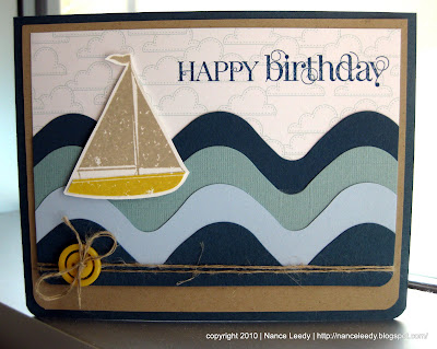
On to today's card...a masculine card for a co-worker who loves the ocean & the beach.  With my new XL die Tasteful Trims in hand, I was able to make rollicking waves of Not Quite Navy, Baja Breeze and Bashful Blue.

The boat is a PTI image (I don't have any SU boats!) that I stamped once in Crumb Cake and again in Daffodil Delight paper piecing the boat for a splash of color.  The cloud paper is from the retired Good Neighbors hostess pack--I'm hoarding it--and the Curly Cute sentiment fits on the sky quite well.  A little linen thread and a Daffodil Delight button finish it off in nautical style.  I have to give a shout-out to my dear blogging friend, Christina of Sea Glass & Sentiments.  She always makes fabulous beach/ocean/nautical cards so I was channeling her when I made this one!  Thanks for the inspiration, Christina!  And thanks to all of you for visiting and leaving me the most encouraging comments.  It warms my heart to know you are out there and I am grateful for your kind words.

supplies:
stamps: curly cute, masculine motifs (pti)
ink: not quite navy, crumb cake, daffodil delight
paper: crumb cake, not quite navy, baja breeze, bashful blue; good neighbors dsp
xtras: tasteful trims die; brights buttons; linen thread; corner rounder punch

Paper Dolls: CD {77}

Welcome to another week of The Color Dare challenge and wow do we ever have a dare for you!  This week Riley has chosen the color combination of Tempting Turquoise, Poppy Parade, Pumpkin Pie and Not Quite Navy...wow, right?!  I can honestly say that I never would have thought up this combo on my own but you know what?  I like it!  Here's where I went with it:
Now you can see why this post is titled Paper Dolls, right?  This is a single stamp that was stamped in NQN on Very Vanilla for the background.  Using the matching color ink, the ladies were stamped again on Poppy Parade and Tempting Turquoise designer patterned paper.  I cut out just their dresses and SNAIL'ed their fabulous frocks in place.  Of course, no lady of this era is complete without her pearls, dah-ling!

The large scallop trim was created by running NQN cardstock through my Big Shot with the new Tasteful Trims die.  I distressed it with a bone folder and some crumpling to separate the layers of paper.  Stitched in place onto some Poppy Parade DSP, the edges roll up like the ruffle of a dress!

With the dressmaker's pattern in the background, the sweet Puns from the Past sentiment was sew perfect (sorry, couldn't resist!) and I carried the theme over to the inside with the coordinating sewing machine image and a little more trimming and stitching.


So, come on over to The Color Dare and join us!  We would love to see what you make of these colors.  If you don't have these exact colors, something close will do--just get crafty!

supplies:
stamps: puns from the past; curly cute; make your own (hero arts)
ink: tempting turquoise, not quite navy, crumb cake, poppy parade
paper: crumb cake; tempting turquoise, very vanilla, not quite navy CS; poppy parade DSP; flock together DSP (retired)
xtras: tasteful trims die; basic pearls; pumpkin pie 1/4" grosgrain ribbon; brights buttons; DMC floss

Monday, September 20, 2010

Wicked Fun: PPA{60}

I had a lot of fun creating these wicked cards for this week's Halloween challenge at Pals Paper Arts.  It was so much fun that I actually made two cards.  The above card is a very literal interpretation of the challenge picture and I'm not sure anyone else would "get" it without seeing the inspiration image.  So the second card is a bit more traditional of a Halloween "look".

I just had to feature the contrast of the light and dark witches and since I've been on a bit of a Lattice die binge lately, see here and here, I had the idea to try it here.  I placed a piece of basic black cardstock next a piece of whisper white and with plain 'ole Scotch tape attached them together and placed it on my Lattice die making sure that the seam was aligned in the center of the die so that when I ran it through the Big Shot I got a black and white image!  

I stamped the hat from Wicked Cool in Versamark and then Basic Black ink, sprinkled it with black stampin' emboss powder and heat set.  This gave me a clean, crisp black witch hat.  We just know that these two witches are up to no good so this sentiment from Favorite Thoughts (retired) was just perfect.
 I had to dress up the inside too with a sentiment from All Holidays, some retired DSP and those fabulous boots from Wicked Cool.  I used my Basic Black and Pumpkin Pie stampin' write markers to color my stamp and highlight those striped stockings.  I just love these boots--in fact, I had some just like them in high school.  My dad hated them and I used to sneak out of the house wearing some perfectly acceptable alternative with these bad girls in my bag and then switch when I got into my friends car!!  Tee, hee!  Did you notice one of our kitties in the background?  How perfect is that?!  I swear I didn't position her there.  She just likes to follow me around the yard!

The second card has a more traditional Halloween look and features the Wicked Fun specialty designer paper, those Wicked Cool boots again and the addition of black raven lace and black jewels!


I was temped to use the Spider Web embossing folder AGAIN but decided to branch out for a more baroque and elegant look with the Vintage Waller paper embossing folder.  I think it works nicely with the lace, don't you?  To make my raven lace ruffle, I ran some SNAIL adhesive around the edge of the circle and just scrunched the lace up on the back side moving around the circle as I went. On the inside I repeated the same DSP with Old Olive cardstock and some Rich Razzleberry bats.

I hope you've enjoyed my Wicked fun Halloween cards.  There's still some time, until noon Tuesday 9/21, to enter your Halloween cards over at the PPA.  Thanks for stopping by today...cheers!


Card #1 supplies:
stamps: wicked cool; favorite thoughts
ink: versamark; basic black; jet black stazon
paper: basic black, old olive, pumpkin pie & whisper white CS
xtras: lattice die; 1 3/8" circle punch; glimmer brads; raven lace; basic black & pumpkin pie stampin' write markers

Card #2
stamps: wicked cool
ink: rich razzleberry; basic black
paper: cajun crze, rich razzleberry, old olive, whisper white & basic black CS; wicked fun
xtras: 1 3/4", 1 3/8" & 2 1/2" circle punches; black jewels; vintage wallpaper embossing folder

Sunday, September 19, 2010

Paper Players {16}: a sketch

Hi everyone and happy Sunday!  You're going to love the sketch Lesley has given The Paper Players to work with this week.  So versatile--for the right-hand boxes you can use any shape you want--leaves, butterflies, birds, circles, whatever strikes your fancy.  The important thing is to have fun!  


I choose to take an abstract route and use the sweet birdcages from the Aviary stamp set as my "shapes".

 
Cute?!  I was inspired by the colors in the Greenhouse Gala designer paper and chose to combine them for a fresh and slightly off-beat card: Pumpkin Pie, Pear Pizzazz, Baja Breeze, Crumb Cake and Whisper White.  The Stamp-a-ma-jig was a must for lining up the birdcages exactly...if a little wonky!  The birdcages are stamped in Crumb Cake and 3 little Basic Pearls decorate each one to mimic the dots of the Polka Dots impression folder.  I punched a spiral border on the Crumb Cake cardstock and used my aqua painter to wet the paper and distress it a little.  I wanted it to look like it had been torn out of a notebook.

The Pumpkin Pie base was run through the Big Shot with the Polka Dot impressions folder (aren't you glad I put down the Elegant Lines folder?).  The polka dots always look fresh and happy to me and fit the whimsical nature of Aviary to a tee.

Since it inspired my color palette, I used a bit of Greenhouse Gala paper for a Pear Pizzazz punch and wrapped the whole card front with some {retired} Baja Breeze grosgrain ribbon.  I adhered a piece of sticky strip to my ribbon, wrapped it around the card and just cut the end for a simple look.

The sentiment from Teeny Tiny Wishes was stamped in Early Espresso on Whisper White and popped out with the Modern Label punch.  I like the look of a watermarked image behind the sentiment so I inked a flower from Friends Never Fade in Pear Pizzazz, stamped off once and stamped onto the label.  I think it fills the area nicely and pulls in the 3rd color to this corner.

Be sure to head over to The Paper Players blog and check out all the lovely work of the other designers...and then link up your creation.  We would love for you to join us.

supplies:
stamps: aviary; teeny tiny wishes; friends never fade
ink: pear pizzazz, pumpkin pie, baja breeze, crumb cake & early espresso
paper: pumpkin pie, crumb cake & whisper white CS; greenhouse gala DSP
xtras: polka dot impressions folder; baja breeze grosgrain ribbon; modern label & spiral border punches; basic pearls; aqua painter; SAMJ


Friday, September 17, 2010

Sparkle Forest: CCCC {47}

Just under the wire...I couldn't let Stacey's Curtain Call Color Challenge go unanswered this week.  The colors are so pretty, soothing and natural--Crumb Cake, Always Artichoke, Whisper White & Early Espresso--love it!  With a simple but beautiful sketch from the clean & simple blog (107), I made this one in under 15 minutes but if I had more time I might do things a little differently...oh well!

I tried a new-to-me technique that was demonstrated at a stampin' event for Florida SU demonstrators last weekend.  I don't know the official name but I'm calling it "shimmer paper".  I started with a 3.5 x 2.5" piece of glossy white cardstock.  Using a stampin' sponge dipped in Champagne Mist Shimmer Paint I swirled it onto the glossy cardstock.  The result is a swirly pattern of sparkle in a color very similar to Crumb Cake.  Here are a couple of close-ups to show you the swirls and sparkle a bit better:

Isn't it pretty?  Looks like swirling snow doesn't it?  I think the Elegant Lines embossing folder and the coordinating DSP from Elegant Soiree mimic the swirling shimmer paint quite well.   With a challenge color of Always Artichoke, I had to use some fresh-out-of-the-brown-box Seam Binding ribbon in Always Artichoke.  This ribbon is just one of the wonderful new products from the Holiday Mini!   It's so easy to tie and has a beautiful luster to it that will add just the perfect touch of elegance to all your holiday creations.

I'll keep it short so I can get this one entered into the Curtain Call...thanks for looking and I hope you have a great weekend!  Be sure to check back on Sunday for the next challenge from The Paper Players...cheers! 

supplies:
stamps: plant hope; short & sweet
ink: early espresso, crumb cake, always artichoke
paper: early espresso, crumb cake & glossy white CS; elegant soriee DSP
xtras: scallop ribbon border punch; elegant lines embossing folder; always artichoke seam binding ribbon

Thursday, September 16, 2010

Fan Flower Pictorial

Hi everyone!  Here is the pictorial I promised you featuring the Fan Fold Flower from yesterday's post.  

There are a lot of pictures and steps here but please don't let that scare you...I might have been just a tad bit too thorough!  Who me?! :-) Here we go!


Begin with two scallop circles. Here I’ve used the 2 3/8” scalloped circle punch.
Using a scoring tool, such as Scor-Pal, line up the indents on your scallop circle so each indent lines up in the groove. It does not matter which number score line you use. We are not measuring, just using the grooves to align & score.Photobucket
Turn your circle and continue aligning and scoring between each “petal” as you go.Photobucket
Continue until you have scored all the “petals” of your scalloped circle.Photobucket
With your paper snips, choose any score line and cut on the scored line in toward the center.  STOP at the center!Photobucket
Fold your flower on each of the score lines making “mountains” and “valleys” as you go. Fold your first petal downward. Continue with the mountain & valley folds all the way around your circle.Photobucket
When you are finished folding, you will have something that looks like this:Photobucket
Now you have a half circle that looks like an open fan. Repeat steps #2-7 with the other scalloped circle.Photobucket
You will end up with two folded half circles.Photobucket
On one of the circles, apply SNAIL glue to both ends of the last scalloped “petal”. On the other half circle, apply SNAIL glue to the underneath of the last scalloped “petal”.Photobucket
Layer the half circle with the glue on the under-side on top of the other half circle.Photobucket
Punch a circle out of cardstock slightly smaller than the size scallop circle you used. In this example, I used a 1 ¾” circle punch. Apply Tombow mono glue to your circle and gently layer your fan flower onto of the circle. Apply gentle pressure. Heavy pressure will smash your flower!  Let dry ~5 mins.Photobucket
If you wish to apply a brad to the center of your flower, use a paper piercer to pierce a hole through the center and into the circle backing.Photobucket
Apply Sticky Strip (or similar strong adhesive) to the back of your circle. Photobucket
Apply your fan flower to your project and admire your creativity! Photobucket

Whew! I hope you were able to follow along.  This is my first attempt at a pictorial so please let me know what you think. If you have any questions, please don't hesitate to ask! Thanks for stopping by.