Pages

Showing posts with label friendly phrases. Show all posts

Sunday, January 27, 2013

Oh, Whale for the Paper Players

Happy Sunday, friends! I hope you're having a great weekend. Sundays are a great day around here because it means another week with The Paper Players!  Check out the great sketch our friend, LeAnne has for us this week:
It's a good one isn't it?  I must say, though, I took a few liberties with it--including flipping it--but I think you can see the bones, at least I hope that LeAnne can!
 
We made another version of this at my stamp clubs this month and it seemed to be a big hit!   Don't you just love that little whale?  For the main panel, I added some large scalloped "waves" cut with the Tasteful Trims die from the gorgeous Sale-a-Bration Sycamore Street DSP
I alternated the scallops and tucked the Island Indigo whale from Oh, Whale in amongst the waves.  Then, I curled up the edges of the scallops to add more dimension.  A pass through the new Cloudy Day embossing folder {heart!}, some [free] Tangerine Tango satin ribbon and a rhinestone eye completed the look.
To mimic the ribbon in LeAnne's sketch, I added a trio of waves with the stamp from Oh, Whale to the Sahara Sand card base.  Some Sahara Sand marker spritzed onto the card added interest and a "sandy beach" feel.
The inside got a similar treatment with some more wavy stamping and polka dotted waves.  With the ease of the coordinating Happy Whale Clearlit, I couldn't resist adding another die cut whale.

And, with LeAnne's great sketch I know you won't be able to resist our challenge this week!  Check out the rest of the Design Team for some fabulous inspiration and then go get busy in your craft room!  Just make sure to come back and share with us at The Paper Players by Friday, February 1st at Noon (PST).

The Paper Players Design Team
  Photobucket
Stamps: Oh, Whale; Friendly Phrases; Wishes Your Way
Ink: Tangerine Tango, Island Indigo, Sahara Sand, Summer Starfruit
Paper: Sahara Sand, Whisper White; Sycamore Street DSP
Extras: Tasteful Trims die; Tangerine Tango satin ribbon; Cloudy Day embossing folder; basic rhinestones; Happy Whale clearlit; 

Sunday, May 13, 2012

Happy Day to You {PP95}

Hiya, friends and welcome to another week with The Paper Players.  Happy Mother's Day to all the mamas, grandmas, sisters, aunts and friends out there!  I hope you all are enjoying a relaxing day full of family, friends and whatever makes you happy!  Color makes me happy and this week our ever-talented hostess, Ann, has challenged us with this Schach-a-licous beauty:
It's too bad that it's taken me two years to warm up to Poppy Parade since it retires at the end of the month!  Oh well, I'll still keep my ink pad for the occasional bird or flower that just needs a pop of color.   Today it is a flower that needed a little zing and I love how this color looks with the Fabulous Florets stamp set:
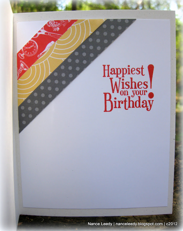
Can you tell I've been trying to use up my enormous stash of designer paper?  It's really amazing how it starts to accumulate!  I layered 3/4" strips of paper in the challenge colors on top of some whisper white cardstock embossed with the Polka Dot impressions folder.  The ends were flagged with a 1 1/4" square punch and attached with SNAIL adhesive.
Onto the Whisper White Framelit Label, I stamped the stem/leaf image from Fabulous Florets in Baja Breeze and popped up a fussy-cut Poppy Parade flower from the same set.  I had to show you the crisp, clean sentiment I achieved with a sneak peek of the new firm foam ink pads coming out from Stampin' Up.  OMG, these are fabulous!  Great ink coverage with just a single tap on the ink pad.  I always struggled with Basic Black ink--it looked deep purple, never true black--until now.  The firm foam is great for a crisp image--thank you SU!
I did a little masking on the inside with a companion flower from Fabulous Florets--stamping in again in all the challenge colors.  The sentiment is from the soon-to-be-retired set, On Your Birthday, which will remain a go-to set even after it retires!

On a side note, a big thank you to everyone who left a supportive comment on my final card for the Connie & Mary design team.  I appreciate your kindness and support as I let go of some commitments (as hard as it is to do).  I will still post to my blog--at least weekly--and will work to bring you all the latest from SU!

So, I would love to know what you think of today's card.  Be sure to pop along to the rest of the Design Team for even more eye-candy.  If you can join us this week, please link up to The Paper Players by Friday, May 18th at Noon (PST).  I hope to see you in the gallery!  Thanks for taking the time to stop by today!

The Paper Players Design Team
  Photobucket
Supplies
Stamps: Fabulous Florets; On Your Birthday; Friendly Phrases
Ink: Baja Breeze, Poppy Parade, Daffodil Delight; Basic Black (new firm foam!)
Paper: Whisper White, Baja Breeze CS; Flirtatious Specialty DSP; Greenhouse Gala DSP (retired); Hostess designer patterns stack (retired) 
Xtras: Whisper White organza ribbon; Labels Framelits; Basic Rhinestones; Polka Dot impressions folder; 1 1/4" square punch

Thursday, March 29, 2012

Two for One {CCMC195}

Hiya friends, and welcome to another week at Create with Connie & Mary!  The gals have a fun color challenge for us this week:
Basic Gray and So Saffron are two of my favorite colors and while they do look good with Poppy Parade....I'm still not in love with that color!  I think I will be glad to see it retire in June!  So what to do with these colors?  Well, inspiration truly is everywhere as evidenced by the design on this tee at I recently bought from Old Navy:
I loved the interlocking diagonal stripes and the pattern that runs underneath the stripes.  So...with that in mind, here's what I made for Connie & Mary:


Kinda cool, huh?  Different?  You know my philosophy when I am not keen on color, right?  Use it in small doses...as in half inch wide strips, lol!  I cut half inch strips from a collection of designer papers (supply list below) and started laying them out on a piece of textured Basic Gray cardstock.  The Basic Gray cardstock started out slight larger than I wanted the end product to be.  That way, I could lay the strips with edges hanging over and trim the whole edge at once.  Gives a nice even cut that way.  Once I had the strips laid out, I used the 2 1/2" circle punch to pop out a space for the sentiment from the Word Play set.  

Of course, there was some leftover strips which I just added to the inside along with a sentiment from Happiest Birthday Wishes.  I even stamped it in Poppy Parade!  Now, before I let you go I also wanted to show that these colors could be used for a more feminine card.  I saw this beauty over at Kristin's blog and just knew I had to case it.  Be sure to check out Kristin's blog--she is amazingly talented and one of the nicest people I've met in blog-land.  Anywho....here's my take on her blossom card with this week's colors:
 and a peek at the inside:


Sorry for the pic-heavy post, there's just so much to show you!  And there's also much to see from the Design Team over at Create with Connie & Mary...be sure to check it out and maybe you'll think about playing along with us this week!  The challenge ends on Wednesday, April 4th at Noon (EST).  Hope to see you there!

 Photobucket
Supplies 
Card #1: Stripes
Stamps: Word Play; Happiest Birthday Wishes
Ink: Poppy Parade
Paper: Naturals White, Whisper White CS; Basic Gray textured CS; Attic Boutique DSP (poppy); Pocketful of Posies DSP (so saffron); Designer Patterns Stack (Neutrals-basic gray)
Xtras: Basic Gray Satin Ribbon; Basic Rhinestones.

Card #2: Blossom
Stamps: Friendly Phrases; Pursuit of Happiness; Broadsheet Alphabet; Mixed Bunch
Ink: Poppy Parade, So Saffron
Paper: Naturals White, Whisper White CS; Basic Gray textured CS; Just Add Cake DSP
Xtras: Basic Gray Satin Ribbon; Basic Rhinestones
Punches: Blossom, 1" circle, 3/4" circle, 2 1/2" circle, Itty Bitty Punch Pack, Blossom Bouquet Triple Layer, Boho Blossoms

Sunday, March 4, 2012

Blue Skies & Happy Days {PP85}

Hey there friends! Coming to you today from sunny south Florida where our family is on Spring Break! Yes, still taking Spring Break after all these years, lol...that's just one benefit of living in a college town!  Today is Paper Players Sunday and Jaydee is our hostess-with-the-mostess for our monthly theme challenge:


My take on "spring" is blue skies, pastel colors and a happy sentiment.  I was totally inspired by this card from my CCMC team mate, Julie Edmonds and her super-clever use of the edgelit die.


Isn't that rolling hill of grass the cutest thing ever?!  I can say that since Julie thought of it so I'm not bragging, lol!  My base is Bashful Blue followed by a layer of a Certainly Celery mat and hill made with the Edgelit die and coordinating Adorning Accent embossing folder.   Thank you for the inspiration, Julie!


The balloons from Up, Up & Away were stamped in Bashful Blue, So Saffron and Pretty in Pink, hand-cut and accented with Dazzling Diamonds.  They are oh so sparkly in real life and oh-so-happy!  The clouds and balloon baskets were stamped in Crumb Cake...


...as was the inside sentiment from Sincere Salutations.  I stamped the Distressed Dots background on the inside as well as the outside along with a Pretty in Pink balloon and So Saffron balloon tail. 

I hope I've inspired you to play along with Jaydee's "Spring has Sprung" theme challenge this week at The Paper Players.  Be sure to check out the rest of the fabulous inspiration from our Design Team.  This week we are so excited to welcome two new team members, Heidi & Jenn, as well as one Guest Designer, Sherry!  Welcome ladies, delighted to be stamping alongside of you!
The Paper Players Design Team

If you decide to play along with us, please link up your craft goodness by Friday, March 9th at Noon (PST).  I can't wait to come visit you!

 Photobucket 
Supplies 
Stamps: Up, Up & Away; Friendly Phrases, Distressed Dots; Sincere Salutations
Ink: Bashful Blue, So Saffron, Pretty in Pink, Early Espresso, Crumb Cake classic ink
Paper: Bashful Blue, Certainly Celery, Whisper White CS
Xtras: Edgelit dies; Adorning Accents embossing folder; Bashful Blue gingham ribbon (retired); Dazzling Diamonds

Thursday, August 11, 2011

Dapper Ducky {CCMC162}

Happy Thursday friends!  Thursday means it's another fun challenge over at Create with Connie & Mary and this week it's a sketch challenge.  Everyone loves sketches right?  So take a look at CCMC162:
A good, clean, classic sketch that can be interpreted any number of ways.  I am in need of yet another baby card for friends of ours so here's what I made for them:
Aww, isn't that little ducky from  Easy Events the cutest?!  He looks so dapper in his hat and umbrella!  Here, let me show you a close-up:
He is stamped in Chocolate Chip ink and colored with a blender pen and ink pads in So Saffron, Marina Mist, Certainly Celery and Peach Parfait.  Did you notice how the umbrella extends beyond the circle?  Before I punched it, I snipped around the top part of the umbrella then slid the cardstock into my 1 3/4" circle punch but pulled the umbrella up so it didn't get punched out!  Just a fun little detail--you know the ones I kinda obsess over! ;-)
I colored the wave with a blender pen and Marina Mist ink and, of course, had to add some Dazzling Diamonds to make them sparkle. Can't seem to make a card without DD lately.
And the finished inside stamped with a Marina Mist sentiment from Friendly Phrases, some Certainly Celery DSP and another little So Saffron ducky!  Pretty quick and easy...the hardest part was deciding what colors to use!

I hope you've liked today's sketch card...check out all the fabulous inspiration from the rest of the Create with Connie & Mary Design Team and then think about what you might do with this sketch.  We would love for you to play along with us!  Thanks for stopping by...cheers!

supplies:
stamps: Easy Events, Friendly Phrases
ink: So Saffron, Marina Mist, Certainly Celery, Peach Parfait, Chocolate Chip
paper: So Saffron, Very Vanilla, Marina Mist, Peach Parfait CS; Pocketful of Posies DSP; Designer Patterns Stack (Subtles)
xtras: Dazzling Diamonds; Linen Thread; SU buttons [retired]; 1 3/4" Circle punch; 2 3/8" Scallop Circle punch; Circles die; Marina Mist 1 1/4" Striped Grosgrain Ribbon

Sunday, July 31, 2011

Vintage Flower Fields: {PP57}

Happy Paper Players Sunday, friends!  Glad to have you here with me for my week as hostess over at The Paper Players.  We're hosting a sketch challenge this week and I designed it especially for you:
Some more goodies from the new catalog arrived on my doorstep last week and I couldn't wait to ink up Field Flowers.
I turned to my Color Coach for inspiration and found this fresh color combo: Soft Suede, Island Indigo, More Mustard and Lucky Limeade isn't it pretty?  Field Flowers is a gorgeous two-step stamp set and the best part is that the stems are separate from the flowers so they can be two different colors without using markers!  The stems were stamped in Lucky Limeade directly onto some First Edition Specialty Paper--love this look!  
One flower was stamped directly onto the DSP while the other was stamped two-step style onto Very Vanilla cardstock and snipped out for some dimension.  Both flowers received a Soft Suede center with yet another stamp in the set. Because I was channeling my teammate, Ann Schach, (!) I sponged the edges of the flower with Soft Suede.  In fact, I think I sponged all the edges and oh, yes I even used one of Ann's favorite tools the 7-sided distressing tool!  Love how it roughs up the edges! 
I rolled one corner and separated the layers of Island Indigo cardstock--I told you I was channeling Ann, LOL!  The corner was just crying out for something so a sweet little Soft Suede bee floated out of the Nature Walk stamp set and landed on my paper!
The opposite corners of the Soft Suede base got a background stamping treatment with the water spots and script stamp from French Foliage. As well as the More Mustard Top Note peeking out from the bottom.  Isn't that new In Color ruffled ribbon lovely? 
Another new stamp set saw ink on this card...Friendly Phrases is a must-have--love the mixed fonts and the cursive handwriting. 
More fun with water spots on the inside too!  Can't get enough of them!  So, I hope you've enjoyed today's card and that you'll cruise on over to the rest of the Design Team for some lovely inspiration:
The Paper Players Design Team
If you decide to join us this week, please load your craftiness on The Paper Players blog by Friday, August 5th at midnight (PST) to be in the running for A Cut Above or even Headliner!  I can't wait to see what you do with our sketch!  Thanks for stopping by!

supplies:
stamps: field flowers, french foliage, nature walk, friendly phrases
ink: lucky limeade, more mustard, soft suede
paper: soft suede, island indigo, more mustard, very vanilla CS; first edition specialty DSP
xtras: lucky limeade ruffled ribbon; top note die; 7-sided distressing tool; sponges;