Pages

Showing posts with label sincere salutations. Show all posts

Sunday, March 4, 2012

Blue Skies & Happy Days {PP85}

Hey there friends! Coming to you today from sunny south Florida where our family is on Spring Break! Yes, still taking Spring Break after all these years, lol...that's just one benefit of living in a college town!  Today is Paper Players Sunday and Jaydee is our hostess-with-the-mostess for our monthly theme challenge:


My take on "spring" is blue skies, pastel colors and a happy sentiment.  I was totally inspired by this card from my CCMC team mate, Julie Edmonds and her super-clever use of the edgelit die.


Isn't that rolling hill of grass the cutest thing ever?!  I can say that since Julie thought of it so I'm not bragging, lol!  My base is Bashful Blue followed by a layer of a Certainly Celery mat and hill made with the Edgelit die and coordinating Adorning Accent embossing folder.   Thank you for the inspiration, Julie!


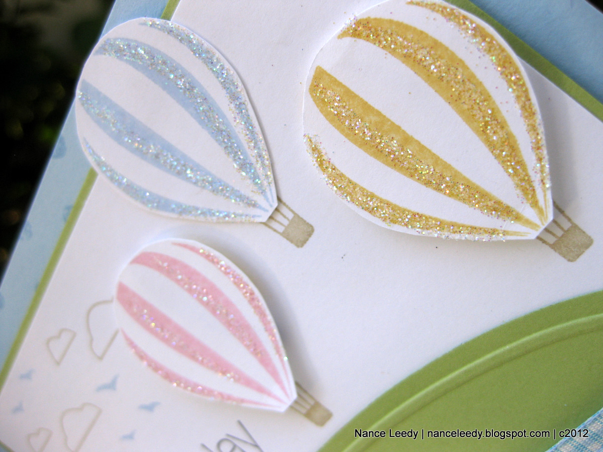
The balloons from Up, Up & Away were stamped in Bashful Blue, So Saffron and Pretty in Pink, hand-cut and accented with Dazzling Diamonds.  They are oh so sparkly in real life and oh-so-happy!  The clouds and balloon baskets were stamped in Crumb Cake...


...as was the inside sentiment from Sincere Salutations.  I stamped the Distressed Dots background on the inside as well as the outside along with a Pretty in Pink balloon and So Saffron balloon tail. 

I hope I've inspired you to play along with Jaydee's "Spring has Sprung" theme challenge this week at The Paper Players.  Be sure to check out the rest of the fabulous inspiration from our Design Team.  This week we are so excited to welcome two new team members, Heidi & Jenn, as well as one Guest Designer, Sherry!  Welcome ladies, delighted to be stamping alongside of you!
The Paper Players Design Team

If you decide to play along with us, please link up your craft goodness by Friday, March 9th at Noon (PST).  I can't wait to come visit you!

 Photobucket 
Supplies 
Stamps: Up, Up & Away; Friendly Phrases, Distressed Dots; Sincere Salutations
Ink: Bashful Blue, So Saffron, Pretty in Pink, Early Espresso, Crumb Cake classic ink
Paper: Bashful Blue, Certainly Celery, Whisper White CS
Xtras: Edgelit dies; Adorning Accents embossing folder; Bashful Blue gingham ribbon (retired); Dazzling Diamonds

Thursday, February 16, 2012

Embossed Color Blocking {CCMC189}

Happy Thursday, friends, and welcome to another week at Create with Connie & Mary!  This week it's a color challenge and everyone loves a color challenge, right?!
Gosh, it's been a long time since I've used Chocolate Chip!  Ever since Early Espresso came along, I have barely touched my stash of cardstock.  Luckily I still had a bit laying around and that was all I needed for what I had in mind.  I was inspired by a card I saw on Maille Belles blog using a color blocking technique. Here is my card:


I'm not sure I like it all that much but I was experiementing, lol!  I cut several strips of cardstock at funny angles and attached them to a piece of cardstock.  


and here's what it looks like on the back, showing the piece of cardstock holding it all together:

I trimmed it to the desired size so all the edges were even:


and used one of the Framelit Labels dies to cut my window.  Next, I ran the whole piece through the Square Lattice embossing folder on my Big Shot.  Then I stamped a piece of scrap vanilla with a sentiment from Sincere Salutations and layered it under the window.  Here's a close-up:

You can see that the sentiment is below the main panel.  I love how the Framelits let you cut anywhere on your cardstock! I finished it off with some Lucky Limeade organza ribbon and a Lucky Limeade designer brad!

I would be interested to hear what you think of this technique and my card!  Be sure to check out the rest of the Design Team creations over at Create with Connie & Mary.  I hope you will play along with these gorgeous colors...I can't wait to see what you make!  The challenge will close on Wednesday, February 22nd at Noon (EST).
Photobucket
Supplies 
Stamps: Sincere Salutations, Kindness Matters 
Ink: Chocolate Chip, Melon Mambo classic ink 
Paper: Chocolate Chip, Melon Mambo, Lucky Limeade, Very Vanilla cardstock 
Extras:Framelits Labels Collection; Square Lattice embossing folder; Lucky Limeade organza ribbon; Designer Brads In Color; Adorning Accents embossing folder

Sunday, November 13, 2011

Little Red Riding Hood {PP72}

Hiya friends...happy Sunday! Welcome to another week with The Paper Players.  This week LeAnne has a fabulous holiday color challenge for us:
These colors gave me a holiday vibe but you could go in many directions with them depending on which color is most prominent in your design.  I paired them with Rita's fantastic sketch from Freshly Made Sketches:
 I had not used the Greeting Card Kids set in awhile and I just love the little girl image:
A blender pen with Riding Hood Red, River Rock and Always Artichoke classic inks made quick work of coloring the image.  I also added a little Dazzling Diamonds to her coat, hat and the snowy ground.
You know I have just about every color of the wide striped grosgrain ribbon...even some retired colors like the Riding Hood Red piece I used here.
I tied it off with some linen thread and two mini jingle bells--they make the sweetest little sound when the card is opened!
One other little detail is the stamped border from Creative Elements that I used to frame the center panel. 
And there you have it!  I hope I've inspired you to play along with us at The Paper Players.  Be sure to check out the rest of the design team for some fabulous inspiration:

The Paper Players Design Team
Tara Bilbao
  Susan Joyce (November GD)
 
If you do play along, please link up your creation to The Paper Players by Friday, November 18th at midnight (PST).  Thanks for stopping by today!
Photobucket 
 supplies:
stamps: greeting card kids, sincere salutations, creative elements; seasonal sentiments [retired but available in MDS]
ink: river rock, riding hood red, always artichoke; jet black stazon
paper: very vanilla, always artichoke CS; timeless portrait DSP
xtras: riding hood red wide striped grosgrain ribbon [retired]; linen thread; mini jingle bells; dazzling diamonds; blender pen

Thursday, November 10, 2011

Ode to Cherry Cobbler {CCMC175}

Hiya friends! It's Thursday and you know what that means....welcome to another week at the Create with Connie & Mary challenge!  This week those crafty gals have a lovely color combination for you; check it out:
Pretty, yes?  These colors seem very sophisticated and elegant to me--I pictured an elegant LBD (that's little black dress, dont'cha know) with a camel hair coat and a deep red flower brooch.  Can you see it?  I did!  So with that in mind, I created this:

Pretty clean and simple really but the wow comes from the flower and the lattice background.  I used the Lattice die to cut some More Mustard cardstock and laid it at the top of a 3.5" x 5" piece of Very Vanilla.  I ran little bits of snail tape at all of the intersecting loops.  I got a little bit outside the lattice edges but when you emboss it, you can't see it at all.
Then I ran just the top two thirds of the whole thing through the Big Shot with the Square Lattice embossing folder.  The result is a really cool inlaid embossing technique  with enough space at the bottom for a sentiment. The whole panel was matted in Cherry Cobbler to pull in the color of the flower.  And speaking of the flower:
It's made with two Cherry Cobbler flowers cut from the Fun Flowers die.  I ran both of them through the paper crimper many, many times to break down the fibers and peeled the larger one apart.  I flipped one side over for a sueded look.  Each petal was turned upward by a few passes with the bone folder.  For the center I used a black flower punched with the Blossom Bouquet Triple Layer Punch and a More Mustard designer button.  A little flourish of Basic Black wide striped grosgrain ribbon was tucked behind the flower to mimic leaves and add a little flair.

Pretty simple but the color combination packs a punch doesn't it?  Be sure to check out the rest of the design team where they are sure to have some gorgeous creations!  I hope you'll think about joining us this week at Create with Connie & Mary...I can't wait to see what you make of these colors.  If you do join us, please link up your crafty goodness by Wednesday, November 16th at Noon (EST) to be considered for the Top 3 picks!  Thanks for stopping by today!

Photobucket

supplies:
stamps: sincere salutations
paper: basic black, very vanilla, cherry cobbler, more mustard CS; patterns designer series paper stack (regals)
ink: jet black stazon
xtras: lattice die; fun flowers die; designer buttons (regals); blossom bouquet triple layer punch; basic black wide striped grosgrain ribbon; square lattice embossing folder

Sunday, September 18, 2011

Thoughts of Thistles {PP64}

Happy Sunday, friends, and welcome to another fun-filled week with us at The Paper Players!  Ann is our hostess this week and she has a fun challenge for you.  It's our Clean and Simple week and Ann is challenging you to use either an animal or a plant on your card.  Any flora or fauna that you choose--have fun with it!


Trees, leaves, flowers and plants certainly fill up the bulk of my stamping arsenal so I reached for some brand-new rubber, Nature's Pace, and with this sketch from the gals over at Sketch Frenzy Friday in hand,


I made this for your inspiration:


My maternal grandmother, my Nana, was born in Scotland and emigrated to Canada as a young girl.  Thistles always make me think of her.  I loved listening to stories of her country and the longer she talked the thicker her brogue became--what a magical sound!  Knowing I wanted to use Rich Razzleberry for the thistle image, my card developed around those two elements.


For the main image I cut a circle with my Nestabilities and while the circle was still in the Nestie, I sponged a light application of Baja Breeze ink through the nestie.  When the Nestie circle is removed you get a nice matted edge.  The Rich Razzleberry thistle really pops against the Baja Breeze and coordinates well with this pattern from the Pocketful of Posies paper pack.

On each side I layered a piece of yummy Quilted Satin ribbon in Early Espresso and a Crumb Cake "button" made with the Sweet Buttons embosslit.

The sentiment that comes in this set is such a wonderful reminder in these hectic times.  Here's hoping that this inspires you to adopt the pace of nature this coming week--even if in only one area of your life.  Thanks for spending a little of your time with me today.  Please check out what the rest of The Paper Players design team has to inspire you:

The Paper Players Design Team
Tara Bilbao
Sandra Conner (September GD)

I hope you will play along with us this week.  If you do, please link up your creation to The Paper Players blog by Friday, September 23rd at midnight (PST) to be in the running for Headliner or A Cut Above.  Have a great day!

Photobucket

supplies:
stamps: nature's pace, woodgrain, sincere salutations
ink: early espresso, baja breeze, rich razzleberry, crumb cake
paper: early espresso, crumb cake, baja breeze, rich razzleberry, very vanilla CS; pocketful of posies DSP
xtras: scalloped envelope die; 2.5" circle punch; sweet buttons embosslit; early espresso quilted satin ribbon; scallop ribbon border punch; nestabilities

Sunday, June 5, 2011

Kind Thanks: {PP50} {CTD144}

Happy Paper Players Sunday, friends! Our first challenge of the month is always a theme challenge and this week it is Kind Thanks appropriately hosted by one of the kindest crafting bloggers I know, LeAnne Pugliese.
Growing up, my mother never let me get away without sending a thank you so, very early on, I learned the importance of a hand-written note!  Kind of ironic that years later, my Mom is the one that got me started with Stampin' Up and card-making!  :-)   Thanks, Mom!  Anyhoo, my card today uses these amazing colors at The Color Throwdown #144Melon Mambo, Certainly Celery and Pumpkin Pie.
I've been on an pink and orange kick lately so I was delighted to use these colors today for my Simple & Kind Thanks card:
I told 'ya it was simple--somehow it just felt like a clean-and-simple kind of day!  My Certainly Celery card base was stamped with an all-time favorite background stamp, Sanded.
I was very saddened to learn that this stamp is on the Last Chance Stamps list as it is truly fantastic background stamp. So great that I will keep on using it even after it retires! I layered the floral stamps from Just Believe in Certainly Celery, Melon Mambo and Pumpkin Pie to create my garden.
When I was finished with the garden I stamped a sentiment from Sincere Salutations in Early Espresso just over the garden edge.  I almost left the background a plain and simple card base but decided the Pumpkin Pie strip from the brights Patterns Designer Series Paper Stack would draw your eye to the sentiment in the middle.  Does it work?
The inside is just a simple piece of whisper white cardstock but I wanted to pull in all three colors in one stamped image.  I inked the leaves of the stamp with Certainly Celery marker and combined Melon Mambo & Pumpkin Pie markers on the flowers to get a multi-colored flower.  I also stamped a little celery behind the white cardstock so it didn't look like it was floating!

So there you have it...Kind Thanks, clean and simple style.  Be sure to check out the rest of the team's inspiration over at The Paper Players and then go get your craft on!  We're welcoming three new Guest Designers so that means there will be 3 more winners selected on Saturday!  If you can join us, please load your creation over at The Paper Players by midnight (PST) Friday, June 10th to be in the running for A Cut Above and Headliner.  We hope you'll play along!

supplies
stamps: just believe, sincere salutations, sanded
ink: melon mambo, certainly celery, pumpkin pie, early espresso
paper: certainly celery, whisper white; brights patterns designer series paper stack

Thursday, November 11, 2010

Button, button, whose got a button?

Hi everyone!  I hope you had a great day.  Today's card is one that I made for a friend and colleague with the maiden name of Button--she adores them and rightfully so!  I was so excited to feature some of our fabulous buttons on her birthday card.  The layout was inspired by a card on the cover of the Idea Book & Catalog and I couldn't wait to make it for her!  Just look at these beauties:

 
OK, technically one is a brad but it could be a button, right?  My favorites are the biggest ones in Old Olive, Rich Razzleberry, Crumb Cake and Tempting Turquoise.  Look at all those pretty swirls!  They almost look glass don't they?  This is a pretty simple layout and design--the better to let the buttons speak for themselves!  So, I will make this a quick post tonight.  Supplies are listed below--sorry I've neglected that lately, too pooped!  LOL.  Please let me know if you have any questions and thanks for stopping by...cheers!

supplies:
stamps: medallion; sincere salutations
ink: crumb cake, early espresso
paper: crumb cake CS; bella bleu DSP (retired); taste of textiles specialty paper (retired)
xtras: old olive striped grosgrain ribbon; scallop oval & large oval punches; antique brads; designer button collection (brights & neutrals); retired whisper white flower button (don't remember the name!) 

Wednesday, November 10, 2010

Dream Garden for The Color Dare {84}

Hello Color Dare fans!  It's time for another color challenge and here's what Riley has for us:
Color Dare 83
Soft Suede
Pear Pizzazz
Night of Navy
And here is what I've created for you:


The stamp-a-ma-jig made easy work of the center panel.  I started with a piece of Naturals Ivory cardstock (it's okay to add a neutral) and stamped the beautiful panel from Dream Garden in all 3 challenge colors.  I left a little bit of ivory cardstock at the bottom so I could wrap it with the scrunchy ribbon technique in Night of Navy taffeta ribbon.  


I made a flower embellishment from Night of Navy cardstock and layered two flowers from the Flower Fusion sizzlit.  The card base looked too plain to me so I chose another Asian-themed stamp set, Eastern Blossoms,  and stamped the cherry blossoms in Soft Suede as a frame.    
When I was finished, I realized that I wasn't finished--there was no sentiment!  I stamped it on the side to see what it would look like and I really like the effect.  What do you think?


And I couldn't ignore the inside....so the crane was inked up again in Pear Pizzazz and a sentiment from Sincere Salutations stamped in Night of Navy.

Sorry to make this a quick post tonight...please let me know if you have any questions or comments--love to hear from you.  Please be sure to check out the rest of the Design Team.  I'm sure you will find some fabulous inspiration on their blogs:

Wednesday, September 15, 2010

Color Dare Design Team Debut {CD76}

Woo hoo!  I am delighted to share this card with you as my first contribution on the Color Dare design team! Riley Fitzgerald runs the Color Dare challenge with a new batch of fresh color combinations each Wednesday and I have joined their team for the next six months. We would love for you to play along...come check it out! This week's combination is Rose Red, Old Olive, Not Quite Navy & Elegant Eggplant and here is what I did with it:


I knew that I wanted to feature a fan fold flower--been seeing them all over blogland--and with a strong focal piece like that I needed to keep the rest of the card pretty simple.  This week's sketch over at Taylored Expressions was just perfect!  I love sketches and layouts that allow me to feature our beautiful designer paper.  Here I've used a combination of retired designer papers except for the Elegant Eggplant.  I didn't have any designer paper in EE so I stamped the cherry blossoms from Eastern Blooms in EE on my EE cardstock for instant patterned paper!

Here's a close-up of the fan fold flower with an Antique Brad center.  These brads sure are gorgeous!  I'm usually a clean and modern kind of girl but these brads have me humming a vintage tune!  I backed it with a circle of Not Quite Navy.  If you would like to see how I made the flower, check back tomorrow for a pictorial.  You'll want to try it right away, it's that easy!

Finally, a little peek at the inside for you.  I carried over a narrow strip of the same papers and repeated the Eastern Blooms cherry blossoms in Versamark behind the sentiment.  The sentiment is such a great one from the level 2 hostess set Occasional Quotes.

So that's it from me today...will you take the Color Dare?  Hop on over and take a look at the inspiration from the rest of the design team and then go get crafty...we would love to see what you come up with! 

supplies:
stamps: sincere salutations; occasional quotes; eastern blooms
ink: elegant eggplant; versamark
paper: crumb cake, very vanilla, old olive CS; urban garden, haiku, thoroughly modern DSPs (retired)
xtras: corner rounder, 2 3/8" scallop circle, 3/4" circle punches; old olive satin ribbon; antique brad


Friday, April 23, 2010

The curtain is almost down: CCCC26 & PPA39

It's the final hours of Stacey's Curtain Call Challenge and I couldn't resist this fabulously modern color combination. I love Crushed Curry & Basic Gray together and will be sad to say goodbye to Crushed Curry when it retires this June. Back to the card...this one might be as simple as it gets. This is a combination card that meets Stacey's color challenge as well as the current KISS challenge at Pals Paper Arts (PPA39). I punched the corner of the whisper white card with the boho blossoms punch and then placed a piece of basic gray dsp (from a retired hostess pack) behind the punched shape. This adds a surprise element to the inside of the card and is a fun way to show off the designer paper. I finished off the front with the polka-dot grosgrain ribbon in crushed curry and a sentiment from Sincere Salutations in basic gray. I did not have any going gray to use on this card but I'd like to think that the flowers on the basic gray dsp are close enough! Some adhesive rhinestones from my stash accent each of the flowers. Did you notice that the rhinestones are scaled in size with each flower?


supplies:
stamps: sincere salutations
paper: whisper white cardstock; basic gray dsp
xtras: boho blossoms punch; crushed curry polka dot grosgrain ribbon; adhesive rhinestones.