Pages

Showing posts with label Mixed Bunch. Show all posts

Sunday, March 23, 2014

Barn Door Sunflowers {PP188}

Hiya friends!  What a fun sketch the sensational Sandy has this week for us at The Paper Players
Isn't that great?!  I had a lot of ideas swirling in my head but in the end I just couldn't resist the pull of more happy flowers. I had the benefit of seeing the sketch early and was able to design a card for my stamp club gals and, with a few modifications, this challenge too.  My inspiration came from bright, happy colors and fields full of sunflowers--like the ones I received as part of the CSA farm share that comes to our campus every week.
If you don't yet have the Hardwood stamp from the spring catalog, what are you waiting for??!!  This stamp is fantastic and looks great in any color combination.  Here, Soft Suede on Crumb Cake creates a dramatic background that really makes the flowers pop.  I like the opportunity for a punch of color provided by the little strip in Sandy's sketch.  Here, a Tangerine Tango pattern from the Retro Fresh DSP ties to the sentiment and really livens up the design and color palette.
A close-up here shows you the different flower stamps, punches and dies I used.  Mixed Bunch for the largest flower and Simple Stems with coordinating Secret Garden Framelits on the two smaller ones.  All three were stamped in Soft Suede on Daffodil Delight cardstock.  Stamping on colored cardstock really gives a punch of color without any extra effort like watercoloring or sponging.
This is one of those cards where I didn't think too long about my choice of stamp sets or colors, just let inspiration take flight and see what develops.  As it turned out, this was the favorite card of the night at stamp club--even more than the ones I really fussed over!  LOL, there's a lesson in there somewhere I am certain....

I hope you will check out the rest of the inspiration from my pals on the Paper Players Design Team.  The range of styles and interpretations of the sketch will amaze you!  I also hope that you can join us before the challenge closes on Friday, March 28th at Noon (PST).  Until then...thanks for stopping by!


Photobucket

Supplies used on today's card...click any image for more 
details and ordering info:
Table built using Product Table Builder by The Crafty Owl - Independent Stampin' Up! Demonstrator.

Sunday, February 9, 2014

A Mixed Bunch of Happy {PP182}

Happy Sunday everyone!  I am thrilled to be the hostess this week at The Paper Players for a color challenge!
Color challenges are my favorite.  I am so inspired by color everywhere I go and this week's challenge is no exception.  I snapped the photo during a recent day of shopping with my Mom and daughter.  We had so much fun looking at all the jewelry, scarves and clothes that we were there for TWO hours!  OMG, like kids in a candy store we were!  Anywhooo....I love the colors and patterns in these necklaces and couldn't wait to turn them into a card:
These colors really made me happy!  Of course gold is the in "color" this season so I was happy to incorporate that too.  Do you notice the striped effect given by the hanging necklaces in the photo?  That inspired my background panel which consists of layered strips of Crisp Cantaloupe and Midnight Muse cardstock attached to a piece of Whisper White cardstock.  I wanted to add a little more dimension so I clear embossed the Positively Chevron background over the whole piece.
Layering the cardstock first makes it as easy as a single piece to stamp the background.  It was a last minute decision to clear emboss the stamping when the Versamark alone wasn't deep enough.  I really like the shine it provides.
This is my favorite stamp from Mixed Bunch and I think the clean lines are a good companion to the stripes and chevrons.  I started to embellish the flower centers and once I started with the Very Vintage Designer Button, I couldn't stop!  LOL.  I punched two of the largest Boho Blossoms flower from Midnight Muse and Champagne Glimmer paper--layering them for just a peek of color.  With an accent of Gold Baker's Twine at the bottom of the card, it seemed fitting to add some more to the flowers!  ;-)  I just made a small loop and attached it to the back with glue dots. 
Leaves don't have to be green!  Champagne Glimmer makes a lovely accent to the tones of Crisp Cantaloupe and Midnight Muse.  The Secret Garden Framelits cut through the glimmer paper like a hot knife in butter!  So easy that a little bit was needed to back the Perfect Pennants banner.  I trimmed the sentiment banner down to the stamped image so the glimmer paper would peek around it.

There you have it!  I hope I've inspired you to play along with these beautiful colors before the challenge closes on Friday, February 14th at Noon (PST).  If you need even more encouragement, take a peek at the rest of the Design Team for some lovely inspiration!  Thanks for stopping by, friends!


The Paper Players Design Team

Photobucket
Supplies
Stamps: Mixed Bunch, Perfect Pennants, Positively Chevron
Ink: Crisp Cantaloupe, Midnight Muse, Versamark
Paper:  Crisp Cantaloupe, Midnight Muse, Very Vanilla, Naturals Ivory, Whisper White CS; Champagne Glimmer Paper
Xtras: Secret Garden & Banner Framelits; Gold Baker's Twine; Very Vintage Designer Buttons; Clear embossing powder; Boho Blossoms punch; Blossom punch

Sunday, April 22, 2012

A Sketch for the Paper Players

Happy Paper Players Sunday, friends!  This week at The Paper Players, I am delighted to be the hostess with a sketch that I designed:
The sketch is based on this card I designed a few weeks ago and I liked it so much that I CASED myself, LOL!
This card is going to a very special blogging friend of mine who is celebrating a birthday this week.  She's probably going to see it here but she doesn't yet know it's for her.  Shhh, don't tell!  {wink!}  I hope she will be surprised when she finds it in her mailbox!  I took my color cues from the Timeless Portrait designer paper: Basic Black, Very Vanilla, River Rock, Cherry Cobbler & Island Indigo.  Designer paper is a great source for color combinations and takes the guess work out of the process!

Along each side of the center panel, I embossed the scalloped border with the Adorning Accents embossing folder.  Embossing Vanilla cardstock really lends an elegant feel to the whole project and coordinates nicely with the floral spray on the DSP.
The Mixed Bunch blossom was heat embossed with Cherry Cobbler embossing powder and the scalloped borders were sponged with Island Indigo ink to make them pop!  Because my friend adores pearls, I filled the center of the flower with as many as I could fit!
I hope you'll consider playing along with my sketch over at The Paper Players--just link up before Friday, April 27th at Noon (PST).  Be sure to check out the rest of the Design Team for even more amazing inspiration.   Thanks for stopping by today!
The Paper Players Design Team
Shirley Pumpkin (April GD)

  Photobucket
Supplies 
Stamps: Mixed Bunch; Sweet Cake; Bring on the Cake 
Ink: Cherry Cobbler, Island Indigo, Jet Black Stazon, Versamark
Paper: Very Vanilla, Basic Black, River Rock, Island Indigo CS; Timeless Portrait DSP
Xtras: Cherry Cobbler embossing powder; Basic Pearls; Blossom punch; Scallop border punch; Adorning Accents embossing folder; Island Indigo ruffled ribbon

Sunday, April 1, 2012

Lunchbox Punny Love {PP89}

Woohoo, it's Sunday! I love Sundays because I get to play with my gal pals at The Paper Players! Our friend Anne Marie has a challenge as big as the state of Texas for us this week:


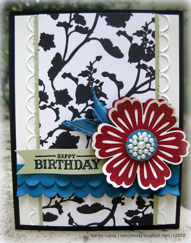
Yes, you read that right..."Tickle your Funnybone!"  If you're a follower of my blog, you know that I don't do humorous cards very often...so this one was definitely a challenge for me.  I decided to go the "punny" route and make a set of "Lunchbox Love" cards to brighten my daughter's day at school:


Aren't they cute?!  I printed a sheet of images in MDS from the Under the Big Top set and colored each one with ink pads and blender pens to coordinate with the new Summer Smooches DSP which is available beginning today!  The coordinating sentiments are so "punny", I just know that they will come in handy when my daughter needs a school-day smile!  I thought you might want to see each one up close...

Isn't this muscle man the cutest?!  His Tempting Turquoise unitard just makes me giggle and that big 'stache makes him look a little bit like the guy from the Village People don't you think?  LOL!


Who can resist a Tangerine Tango lion?  Not me!  And finally...


The smarty pants of them all...isn't he too cool for school with his Converse sneakers?  You may have noticed the size is a little bit different...these are all 4 1/4" square...a nice size for a lunchbox note but a little more "canvas" to work with than bitty notecards.  I won't bore you with the details...supply list is below.  Be sure to check out the inspiration from my fabulous teammates:

The Paper Players Design Team
Shirley Pumpkin (April GD)

I would also like to extend a big Paper Players welcome to our April Guest Designer Shirley Pumpkin!  Welcome aboard, Shirley, we're delighted to work along side of you this month.  And, we would be delighted to see your card or project in the gallery this week...so get bizzy in your craft space!  You've got until Friday, April 6th at Noon (PST).  Thanks for stopping by!
 
Photobucket 
Supplies 
Card #1: Strongman
Stamps: Under the Big Top (MDS); Mixed Bunch
Ink: Tempting Turquoise, Daffodil Delight, Real Red classic inks
Paper: Lucky Limeade,Tempting Turquoise, Daffodil Delight, Whisper White CS; Summer Smooches DSP; Real Red glimmer paper.
Xtras: 2 1/2" circle punch; Scallop Ribbon Border punch;  Adoring Accents embossing folder & Edgelits; Decorative label punch; Itty Bitty punch pack (circle); Blender Pen; Real Red polka dot grosgrain ribbon (retired); Blush Blossom Stampin' Write marker

Card #2: No Lion
Stamps: Under the Big Top (MDS); Mixed Bunch
Ink: Tangerine Tango,Tempting Turquoise, Daffodil Delight, classic inks
Paper: Tempting Turquoise, Daffodil Delight, Lucky Limeade, Whisper White CS; Summer Smooches DSP
Xtras: 2 1/2" circle punch; Scallop Ribbon Border punch;  Adoring Accents embossing folder & Edgelits; Decorative label punch; Blender Pen; Tangerine Tango striped grosgrain ribbon (retired)

Card #3:  Smarty Pants
Stamps: Under the Big Top (MDS); Mixed Bunch
Ink: Real Red, Tempting Turquoise, Daffodil Delight, classic inks
Paper: Tempting Turquoise, Daffodil Delight, Real Red, Whisper White CS; Summer Smooches DSP
Xtras: 2 1/2" circle punch; Scallop Ribbon Border punch;  Adoring Accents embossing folder & Edgelits; Decorative label punch; Blender Pen; Tempting Turquoise 1/4" grosgrain ribbon; Lucky Limeade ruffled ribbon; Blush Blossom Stampin' Write marker

Thursday, March 29, 2012

Two for One {CCMC195}

Hiya friends, and welcome to another week at Create with Connie & Mary!  The gals have a fun color challenge for us this week:
Basic Gray and So Saffron are two of my favorite colors and while they do look good with Poppy Parade....I'm still not in love with that color!  I think I will be glad to see it retire in June!  So what to do with these colors?  Well, inspiration truly is everywhere as evidenced by the design on this tee at I recently bought from Old Navy:
I loved the interlocking diagonal stripes and the pattern that runs underneath the stripes.  So...with that in mind, here's what I made for Connie & Mary:


Kinda cool, huh?  Different?  You know my philosophy when I am not keen on color, right?  Use it in small doses...as in half inch wide strips, lol!  I cut half inch strips from a collection of designer papers (supply list below) and started laying them out on a piece of textured Basic Gray cardstock.  The Basic Gray cardstock started out slight larger than I wanted the end product to be.  That way, I could lay the strips with edges hanging over and trim the whole edge at once.  Gives a nice even cut that way.  Once I had the strips laid out, I used the 2 1/2" circle punch to pop out a space for the sentiment from the Word Play set.  

Of course, there was some leftover strips which I just added to the inside along with a sentiment from Happiest Birthday Wishes.  I even stamped it in Poppy Parade!  Now, before I let you go I also wanted to show that these colors could be used for a more feminine card.  I saw this beauty over at Kristin's blog and just knew I had to case it.  Be sure to check out Kristin's blog--she is amazingly talented and one of the nicest people I've met in blog-land.  Anywho....here's my take on her blossom card with this week's colors:
 and a peek at the inside:


Sorry for the pic-heavy post, there's just so much to show you!  And there's also much to see from the Design Team over at Create with Connie & Mary...be sure to check it out and maybe you'll think about playing along with us this week!  The challenge ends on Wednesday, April 4th at Noon (EST).  Hope to see you there!

 Photobucket
Supplies 
Card #1: Stripes
Stamps: Word Play; Happiest Birthday Wishes
Ink: Poppy Parade
Paper: Naturals White, Whisper White CS; Basic Gray textured CS; Attic Boutique DSP (poppy); Pocketful of Posies DSP (so saffron); Designer Patterns Stack (Neutrals-basic gray)
Xtras: Basic Gray Satin Ribbon; Basic Rhinestones.

Card #2: Blossom
Stamps: Friendly Phrases; Pursuit of Happiness; Broadsheet Alphabet; Mixed Bunch
Ink: Poppy Parade, So Saffron
Paper: Naturals White, Whisper White CS; Basic Gray textured CS; Just Add Cake DSP
Xtras: Basic Gray Satin Ribbon; Basic Rhinestones
Punches: Blossom, 1" circle, 3/4" circle, 2 1/2" circle, Itty Bitty Punch Pack, Blossom Bouquet Triple Layer, Boho Blossoms