Pages

Tuesday, December 22, 2009

PPA21 - Winter Wonderland


Just under the wire but I made it!  Like everyone else, this time of year tends to take over and I haven't had a chance to post a card for my favorite challenge!  The design team at Pals Paper Arts asked for cards & projects with a winter wonderland theme for PPA21 and with the help of the always handsome Dasher stamp, I think we deliver!  My base is basic grey and the main panel is night of navy run through a holiday '09 cuttlebug folder.  I received the CB folder as a gift and I don't know the name--sorry!  It looks like swirling snow, yes?  Dasher is embossed in white and a bit of dazzling diamonds applied with a glue pen add the perfect amount shimmer to his splendid antlers!  The sentiment from Teeny Tiny Wishes is stamped in Encore metallic silver and mounted on a modern lable punch from the brushed silver cardstock.  SU's brushed silver CS is so lucious--just like brushed metal and a perfect match to the metallic silver ink.  It's finished off with some elegant white organza ribbon.  I hope you and your family have a wonderful holiday and wish you the best in the new year.  Cheers!

Supplies:
stamps: dasher, teeny tiny wishes
ink: craft whisper white, encore metallic silver
paper: basic grey, whisper white, night of navy CS
xtras: CB EB folder holiday '09, white EB powder, MS glue pen, dazzling diamonds, modern label and word window punch, organza ribbon white

Thursday, December 3, 2009

My adventure in web design!

In addition to working at Santa Fe College, I am also a student...well, at least for this semester.  I don't know if I can keep up with those 20-somethings!  Anyway, this semester I took a web authoring class.  For our final project we had to create a 3-page web site entirely from scratch using CSS and XHTML.  No Dreamweaver, Front Page or any other fancy web design software that does it all for you.  Nope, entirely hand-coded--yikes!  Sure, plenty of people do it all the time but this was my first attempt.  Of course, I wanted to have a go at making a Stampin' Up! website for myself.  What fun I had!  I used My Digital Studio to create my banner, navigation buttons and color scheme.  It was just like creating a papercraft with all the colors, punches, shapes and embellishments we use everyday but digitally.  How cool is that?  The digital option gives you so much flexibility to experiment with different colors, layouts and patterns until you get the exact look that matches your vision.  I still have a long way to go to fill it out with details like tutorials, samples, etc and I may not even use it but it was fun to design all the bells and whistles for it!  So...do you want to see??  Check it out... (they may be cut off on the screen, just click the image for a full view)

here is the header:


...the navigation buttons:

...and the link to SHOP:

all made with My Digital Studio!  For the full view, head on over to Canopy Crafts, the Annex (!) and let me know what you think!

Sunday, November 29, 2009

Peaceful Forest & PPA 18


I hope everyone had a fantastic fun-filled holiday weekend.  We're about to gear up into high anxiety mode with December 1st on Tuesday.  So, this card for Pals Paper Arts latest challenge helps calm and soothe my December-induced stress.  Even though we live in Florida now and I don't miss 4+ months of snow, I do miss a quiet walk in the woods when the snow blankets everything and brings a calm, soothing hush to the forest.  This card reminds me of snowy walks and is a perfect fit for PPA's KISS challenge.  The construction of the card is pretty simple to figure out just Kraft, Whisper White and Always Artichoke cardstock but the Lovely as a Tree stamp set is the star.  I inked the background trees with Always Artichoke and stamped off once before stamping on my cardstock.  The single tree is also inked in Always Artichoke and stamped directly on the cardstock. The little bird from Branch Out (dormant list) adds just a touch of Real Red which coordinates nicely with the Real Red sentiment from the classic All Holidays set.  Lastly, it wouldn't be a holiday card without sparkles so a few strokes of the glue pen on the focal tree and a sprinkling of dazzling diamonds bring the forest to life.   I hope this has brought a little calm to your busy day!

Supplies:
stamps: lovely as a tree, branch out, all holidays
ink: always artichoke, real red
paper: kraft, always artichoke, whisper white cardstock
extras: scallop edge punch, glue pen (martha stewart), dazzling diamonds

Wednesday, November 18, 2009

Minty Fresh Turkey!


I saw these peppermint patties all over Splitcoast Stampers--particularly this one--and I just had to make them!  Aren't they the cutuest?  My kindergarten-age daughter and I had a blast punching, snail-ing (is that a verb?) and drawing together.  She passed them out to her classmates at her school's Thanksgiving feast today.  All the parts were made completely with punches, except for the eyes which were hand drawn with a stampin' write marker--how cool is that?  The "feathers" are half of a scallop circle punch attached to a 1 3/4" circle.  The face is a 1 1/4" circle of soft suede topped with two whisper white 1/2" circles, one petal cut from the 5-petal flower punch (crushed curry) and the horizontal slot punch makes the wattle (riding hood red).  Sticky strip holds it firmly onto the peppermint patty and another 1 3/4" circle (chocolate chip) is attached to the bottom.  As an afterthought, I stamped the Happy Thanksgiving sentiment from Falling Leaves on the back in chocolate chip (sorry the pic is poor quality).  It fit perfectly in the center and was the finishing touch!  Happy turkey day!

supplies:
stamps: falling leaves
ink: chocolate chip
paper: chocolate chip, crushed curry, dusty durango, soft suede, whisper white, riding hood red (retired)
punches: scallop circle, 1 3/4" circle, 1 1/4" circle, 1/2" circle, 5-petal flower, horizontal slot

Saturday, November 14, 2009

Loungin' Rudy: PPA16

Oh my gosh, it's been a long time since I last posted.  Whew, what a month it's been.  Life just takes over sometimes, right?  So anyway, I'm back with a post this week for the PPA16, Christmas Cheer, challenge over at Pals Paper Arts.   My card is one we made last month in my stamp club featuring two favorites this holiday season--Dasher & the Holiday Lounge designer paper.  The star here is the every-handsome Dasher himself and the non-traditional color combination.  I am really loving the teal & red combo lately.  The retro feel of these colors coordinates well with the Holiday Lounge paper, dontcha think?  Dasher is embossed in silver on a 3" circle of Whisper White.  The mat was made from Sahara Sand cardstock by dialing up on the Circle Scissor Plus to create the perfect 3.25" circle mat.  Love it!  The rest of the card is pretty simple but I want to give a shout out to this video for the stay-put-bow.  I love this technique--especially for tricky-to-tie material such as the silver elastic cord used here. Thanks for looking!

supplies:
stamps: dasher, christmas greetings
ink: real red, versamark
paper: sahara sand, real red & whisper white cardstock, holiday lounge designer series paper
xtras: silver stampin' emboss powder, circle scissors plus, SAMJ, silver elastic cord, scallop edge punch, rhinestone (my stash)

Saturday, October 17, 2009

easy, breezy butterflies @ PPA

It's a great day when I have time to play at the PPA! Here's my entry for the PPA12 sketch challenge. It's a great sketch by the talented Margaret Moody. I love her clean and COLORFUL designs. With the SU exclusive Beautiful Butterflies die (#114507) and this great sketch my card came together easy-peasy. There's an A2 card base in soft suede with two panels from the Thoroughly Modern dsp spaced evenly in the middle. It looks like I cut out the middle with a circle punch but it's actually a 3" circle cut with my Nestabilities and placed in the center--much easier! The big beautiful butterfly comes from more coordinating Thoroughly Modern dsp and she is held firmly in place on the circle with two mini glue dots. The rhinestones, from my stash, are a perfect match for the bermuda bay color, don'tcha think? The sentiment, Garden Greetings (retired), is inked in coordinating soft suede on whisper white cardstock and popped out with the Large Oval (#107305) punch. The bottom strip where the sentiment lands is actually two bermuda bay labels punched with the Modern Label (#116630) punch attached together with some SNAIL. The oval lays on top and the whole thing is popped up on dimensionals. Easy, breezy, beautiful butterflies!


Supplies:
stamps: garden greetings (retired)
ink: soft suede
paper: whisper white, soft suede, bermuda bay CS; thoroughly modern DSP
extras: beautiful butterflies bigz die; large oval punch; modern label punch, circle nestabilities, mini glue dots, stampin dimensionals, rhinestones (personal stash)

Monday, October 12, 2009

PPA11

I couldn't resist making another version of my curried moon card to answer the challenge posed by the design team at PPA. This week it's a color challenge: old olive, pumpkin pie and perfect plum. Great fall or halloween colors and I thought these colors worked pretty well with my card from yesterday's post. (Please take a look for directions on how I made this card.) The challenge did allow us to add neutral colors so I also have basic black, basic grey and just a tad of whisper white. It was a challenge to fit the perfect plum in there but I relied on the Cast-a-Spell designer paper to pull all the challenge colors together for me! Since I used just a bit of it on the actual card, I carried more designer paper into the lining of the envelope. Cute!

I also can't resist showing you my new personalized stamp! Another thing I've held off purchasing... don't know why... I'm glad I did because I love it! What a great way to advertise our craft and the best part is, the butterfly stamp meets SU!'s Angel Policy which allows individuals to sell any cards you make as long as they bear this stamp--done! This is actually the Hand Stamped by stamp (#115602) AND a one-line Text-Only Stamp (#115576). They are ordered separately but the wood block was big enough for both so I mounted them together--otherwise, I would never get the blog address lined up exactly where I wanted it, LOL!

Supplies:
stamps: woodgrain, season of friendship, forest friends, all holidays
ink: basic black, stazon jet black, perfect plum
paper: basic black, basic grey, pumpkin pie, whisper white cardstock, cast-a-spell DSP
extras: 1 3/4" circle punch, SAMJ, modern label punch, word window punch, crop-o-dile, 1/4" old olive grosgrain ribbon, whisper white medium envelope

Sunday, October 11, 2009

curried moon

I just got the Woodgrain (#117100) background stamp and I love it! It's been on my wish list for awhile but I hadn't gotten around to buying it until now. As always with SU! stamps, the quality and definition of the woodgrain lines is perfect--not too fat, not too thin and very well defined. I think it will be very versatile. So, this one is pretty simple and, once I figured out how to translate what I saw in my mind to paper, it went together quickly. Here's what I did:
  1. started with an A2 base in basic black cardstock
  2. cut a 3 3/4 x 5 piece of basic grey cardstock and stamped it with the Woodgrain background stamp in basic black.
  3. using my StazOn jet black pad (for an even black finish) I stamped the tree from Season of Friendship (#111776) horizontally about a third of the way down.
  4. my 1 3/4" circle punch made a nice portal for my crushed curry mat which doubles as the full moon.
  5. to line up the owl from Forest Friends (#113748) just right, I stamped him first onto my stamp-a-ma-jig. Using dotto adhesive to secure the crushed curry mat to my work surface, I lined up the basic grey panel where I wanted it and then laid the plastic piece of the stamp-a-ma-jig where I wanted my owl to be. Leave the SAMJ in place, remove the grey panel, ink the owl in basic black and stamp him in place!
  6. The sentiment from All Holidays (#114916) was inked with versamark on basic black cardstock, sprinkled with silver stampin' emboss and heated until fluid and shiny--don't you love watching that happen?!
  7. The Modern Label punch (#116630) popped the sentiment out perfectly and balanced out the lower right corner.
  8. 1/4" Old Olive grosgrain ribbon was tied around the basic grey panel using Michelle Single's excellent technique for a stay-put bow. Check it out and you'll say, "of course--how easy!"
  9. The basic grey panel is matted on crushed curry with stampin dimensionals to give extra emphasis to the yellow moon.
Supplies: stamps: woodgrain, all holidays, forest friends, season of friendship
ink: basic black, versamark, stazon jet black
paper: basic grey, basic black, crushed curry cardstock
extras: old olive 1/4" grosgrain ribbon; 1 3/4" circle punch; modern label punch; stampin' emboss power (silver); stamp-a-ma-jig; crop-o-dile

Wednesday, October 7, 2009

my first mojo! (mojo107)

I've been so hesitant to post an entry to the Mojo Monday challenges--somehow it seems like the "big leagues"! I guess because so many stampin' bloggers I admire post there, I wasn't sure I had it in me! This week I decided to give it a try--who could resist the great prizes--because I really liked the sketch and immediately thought of all the great leaf wreaths I have seen around stampin' land such as this one, that one and one more! Genius, ladies!

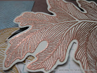
This is a sympathy card for a friend and co-worker. She's part of my stampin' circle and this is one of her favorite stamp sets and colors. I knew she would appreciate all the hand-cut leaves as well. I used the layout for Mojo107 with a Chocolate Chip card base and papers from the Autumn Meadows designer series paper (#116769). The large oak leaf is stamped in VersaMark onto Very Vanilla cardstock and embossed with copper embossing powder from Ranger. The smaller leaves are stamped directly onto more designer paper in Taken with Teal and More Mustard and hand-cut as well. I cut a 3" circle of designer paper with my circle nestabilities and, using my stamp-a-ma-jig, stamped the sentiment from Sincere Saluations (#115068) in the center with chocolate chip ink. The leaves were arranged around the circle to form the wreath and do you think I could do that haphazardly? Oh no, it took me forever to get it even close to how it looked in my mind's eye! A few copper brads from my stash added the finishing touch to my mojo leaves. So, what do you think...did I bring it this week?! I'd love to hear from you!

Supplies:
stamps: autumn splendor, sincere salutations
ink: versamark, taken with teal, more mustard, chocolate chip
paper: very vanilla, chocolate chip cardstock, autumn meadows designer series paper
extras: stamp-a-ma-jig, circle nestabilities, copper embossing powder, stampin dimensionals, copper brads

Wednesday, September 30, 2009

it's finally here!

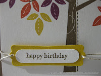
As I write this tonight, it's actually cool enough to have the windows open and today it was beautifully cool for our area. Yahoo! I guess all my fall cards have made an impact--tee, hee! Today's post is a large 5x7 card for a male co-worker's birthday. I really like how the colors turned out--it took me awhile because they were out of my usual zone but I like the combination. I was inspired by this card over on the fabulous Nancy Riley's blog. I loved her use of the {in colors} and the Season of Friendship stamp has long been a favorite. The main panel is stamped with the Season of Friendship (#111776) tree in soft suede ink. I stamped the little tri-bunch of leaves all over the tree to fill it out with autumn color. I intended to stamp just a few leaves but I was not happy with it and as I added more and more, I came to a point where I realized that I liked the full look of it and just kept going! There might be one too many but you know how hard it is to know when to say "when"! LOL! The leaves are inked up in crushed curry, dusty durango, rich razzleberry & just for good measure...kiwi kiss (retired) makes a return appearance. Has it been hard for you not to use kiwi kiss too?! The tree is partially matted with some dusy durango cardstock attached on dimensionals to a larger mat of rich razzleberry that was stamped with the Sanded background stamp (#109294) in soft suede. I stumbled for awhile longer (sometimes it just takes me FOREVER!) over where to put the sentiment and I ended up using the Teeny Tiny Wishes set (#115370) popped out with the Word Window punch (#105090) and attached to a Modern Label (#116630) of crushed curry. I just love how the Word Window fits perfectly on top of the Modern Label punch! I punched a small hole in each end of the modern label and using some hemp twine "tied" the sentiment onto the card. Oh, I almost forgot the inside! A couple pieces of light cardstock are a must to line the inside of a dark card base and it provides the perfect blank canvas to carry over a little bit of the front image on the inside. I think stamping a matching or coordinating image on the inside just adds a little professional touch, don't you? I'm pleased with the results and hope you are too...thanks for looking.

Supplies:
stamps: season of friendship, sanded background, teeny tiny wishes
ink: soft suede, crushed curry, rich razzleberry, dusty durango, kiwi kiss
paper: very vanilla, soft suede, dusty durango, rich razzleberry cardstock
extras: word window, modern label, and 1 1/16 circle punches, hemp twine

Sunday, September 27, 2009

inspired by fall: PPA9


Lately, I keep turning to my autumn stamps and inks in the hopes that fall will soon arrive here in North Florida. No such luck so far with temps at 91 yesterday, ugh! Since I am so eager for fall to arrive, I couldn't help but play along with the Pals Paper Arts design team and their Picture Perfect Inspiration challenge #9. They inspired us with this beautiful photo from Pottery Barn. I am really loving the Autumn Splendor stamp set and used it to it's maximum advantage for my card. Here's the task:
  1. Started with a A2 side-fold chocolate chip card base
  2. Randomly stamped a 2 3/4 x 3 3/4" piece of very vanilla CS with all the leaf images from Autumn Splendor (#116503) using more mustard, always artichoke, really rust and chocolate chip.
  3. This main panel is set off by a 3 x 4"mat of always artichoke.
  4. Next, with a piece of hemp twine, I tied the end of the GORGEOUS 1 1/4" striped chocolate chip grosgrain ribbon (#115617) and notched the top. The ribbon gets adhered to the back of the always artichoke mat with enough hanging down to wrap around the back--but don't do that yet!
  5. Next, I cut a 3 1/2 x 4 1/2" piece of more mustard from the autumn vine (retired) DSP.
  6. The always artichoke mat is up on dimensionals and can now be attached to the more mustard DSP. The striped ribbon gets a little bit of SNAIL on the bottom edge and wraps around the back of the more mustard DSP.
  7. The acorns from Autumn Splendor were inked in chocolate chip and then colored with the more mustard stamp pad and an aqua painter. I popped them out with a 1 1/4" circle punch and sponged the edges with close to cocoa. The acorns landed on a 1 3/8" circle of always artichoke and a scallop circle of really rust. The edges of the scallop circle also got a sponging of close to cocoa.
  8. Finally, my stamp-a-ma-jig was just the thing to ensure that the chocolate chip Happy Thanksgiving greeting from Teeny Tiny Wishes (#115370) was spot-on perfect.
It sounds more difficult than it was--truly. I hope you like it. Thanks for looking and be sure to check out all the great cards over at PPA9!

Monday, September 21, 2009

paradise island

Good friends of ours, both opticians, own a fabulous optical boutique, Alligator Island Optical, and I make handmade cards for them to send as a thank you to their customers. I also get great deals on glasses--a girl can't have too many! Anyway, I made 10 of these cards this morning to replenish their stash. I CASEd it from this card by Kimberly Van Diepen. I just loved her use of colors with the Paradise stamp set (#113778) and the layout of the stamped images. It adds a little extra fun element when the images run off the edge, I think. I changed a few things since I was making these in quantity and they also needed to be easy for mailing. I also changed up the mat a bit and used my tiny mosiac CB folder on the old olive cardstock. Because this CB folder looks slightly like alligator skin, it has become a staple on all the cards I make for the boutique. In case you're interested, here are the measurements of each element:
  1. A2 card with side fold
  2. old olive mat: 3 1/2 x 4 1/2"
  3. bermuda bay mat: 3 1/4 x 4"
  4. whisper white main panel: 3 x 3 3/4
Thanks for looking and be sure to check out Alligator Island Optical!

supplies:
stamps: paradise
(#113778), short & sweet (#115060)
ink: bermuda bay, old olive, crushed curry, basic black
paper: whisper white, bermuda bay, old olive CS
extras: tiny mosaic CB folder, stampin dimensionals

Sunday, September 20, 2009

PPA8: Keep It Simple Sweetie!

No, you're not going crazy and neither am I...you did see this card a few days ago. This is a card I designed for my stampin' group last week and it was a perfect fit for this week's design challenge at the PPA! The Pals Paper Arts design team asked us to K.I.S.S a card...that is "Keep It Simple Sweetie!" Since clean and simple is my favorite design style and I had this one already made it was a natural fit. The design team challenged us to:

1) keep it c
lean with lots of 'white' space
2) keep to a
simple design
3) takes a minimum time to create
4) with limited layers and embellishmen
ts...
Check! I think it's a fit. For directions and supplies, please see my original post, or scroll down a bit on this page, LOL! Don't forget to go "Play @ the PPA!

Thursday, September 17, 2009

need a nail file?

Here's a little hostess gift I made for a friend. Yes, those really are Stampin' Up! emery boards and they match the Thoroughly Modern designer paper--is there no end to the creative ideas at company headquarters?! These are a supply item available only to demonstrators--just one of the many perks to the SU team. Anyway, here's how I made it:

1. Cut a 3 x 12" piece of Thoroughly Modern DSP
2. Place two emery boards on the paper and fold the two ends in toward the center--they won't exactly meet but that's okay because the belly band will cover it. Place a piece of sticky strip on the each inside edge of the bottom half to seal up the bottom.
3. With the 3/16" corner rounder round the top two corners--this gives it a more professional look.
4. Create your sentiment for the inside. Here, I used the scallop oval and large oval punch out of bermuda bay & whisper white and stamped it with the "thank you" from the Short & Sweet set--inked in soft suede to match the paper, of course!
5. Next, to create the belly band cut a 2 x 9" coordinating piece of DSP and wrap it around the package overlapping the ends in the back and closing with snail adhesive.
6. Slide the belly band down, fold the top half down and then slide the belly band back up and over the top half. The belly band should cover both top and bottom edges.
7. Decorate and embellish as desired on the front. Here, I used the Daisies #2 Sizzix die with more coordinating DSP.
Super quick and super cute, eh?!

Supplies:
stamps: Short & Sweet
paper: Bermuda Bay & Whisper White CS, Thoroughly Modern DSP
ink: Soft Suede
extras: Corner Rounder punch, Scallop Oval punch, Large Oval punch, Daisies #2 die

Wednesday, September 16, 2009

delightful merriment


I love this stamp set and punch! This is what I love about SU--coordinating stamps and punches. Coordinating helpers like these are perfect for mass producing holiday cards especially with this simple layout. I can see a group of us making a bunch of these in an hour or two--throw in some christmas cocktails, some Frank on the CD player and it's a party! Oh, but I'm getting ahead of myself...it's still only September. Pretty easy to see the details on this one. I used Very Vanilla cardstock, a strip of Merry Moments designer paper and a little peek from a Chocolate Chip scallop edge. I stamped two of the ornaments from the Delightful Decorations set (#116517)--one in real red and the other in old olive. The ornaments are punched out with the coordinating Ornament punch (#116794) and layered on top of each other with the red ornament up on dimensionals. The chocolate chip "string" is part of another delightful set from the holiday mini catalog called Berry Christmas (#116509). So many to choose from! Warm Words (#115108), one of my all-time favorites, provides the perfect holiday sentiment inked up in cheery real red. Be Merry!

supplies:
stamps: delightful decorations, berry christmas, warm words
paper: very vanilla & chocolate chip cardstock, merry moments DSP
ink: real red, old olive, chocolate chip
extras: ornament punch, stampin dimensionals, stamp-a-ma-jig, scallop edge punch

Wednesday, September 2, 2009

you liked it, you really did!


OMG...I am so excited! The design team at Pals Paper Arts chose my pumpkin patch card as one of this week's artist picks! It is a complete and total honor to be recognized by such an amazingly talented group of artists. The ladies at PPA provide us with a fantastic challenge each week and it's been a real treat (pun intended!) to "play @ PPA". Check 'em out--maybe you'll be inspired to play along too. Thank you so much!

Monday, August 31, 2009

graveyard skull & PPA5 (#2!)


Are you a fan of Edgar Allan Poe? Do you love baroque gothic motifs this time of year? Then you probably love this stamp set like I do! From the Crypt has the most amazing artwork. Pumpkins and skulls, ravens and spiders and bats, oh my! I paired this gothic beauty with the cast-a-spell designer paper for an erie delight. I started with this layout from the amazing Mary Fish. Using a base of old olive cardstock (4 1/4 x 11") folded at the top, I layered a 4 x 5 1/4" piece of basic black cardstock and dressed it up with 1 1/8 x 5" strips of the DSP. I cut a 3" circle of pumpkin pie & vellum cardstock with my circle nestibilities. Then, using my stamp-a-ma-jig (love it!) I stamped the fantastic skull on the vellum with basic black ink. Layering the vellum over the pumpkin pie dilutes the orange a bit but still gives a much needed punch of color. And the vellum just makes the skull look even more erie... Can we just talk about the artwork on this stamp for a minute? Look close and you will see ghosts rising from the ground, ravens circling, crooked old tree branches--this set is not for the faint of heart. It's perfect for the halloween season! A strip of basic black gets a simple sentiment from Teeny Tiny Wishes inked up in whisper white craft ink. Finally, three "chrome" studs (jo-ann's) break up the 3 panels and give just the right amount of shine. Oh, and I almost forgot the spiders crawling up the inside...right onto your arm...eeek!


supplies:
stamps: From the Crypt, Teeny Tiny Wishes
paper: old olive, basic black, pumpkin pie, vellum cardstock & cast-a-spell DSP

ink: basic black, whisper white craft
extras: circle nestabilities, "chrome" spot stickers (jo-anns)

Sunday, August 30, 2009

sassy sprite


I'm not sure which dollar bin she came from (really!) but dressed up in rich razzleberry and matted in crushed curry she looks downright elegant, dontcha think?! This is a large (5x7) card for a co-worker. Not my favorite size but necessary for all the staff well wishes. The large size of this one actually gave me the right sized canvas to create this super-sized flower. It's made from the new ornament punch in the Holiday mini and we're just one day away from being able to order it (September 1st)! The ornament punch is so cool--you're going to love it. It coordinates with the fabulous Delightful Decorations ornament stamp set that will make christmas card-making a piece of cake! Anyway, I punched out 6 "ornament" shapes from the Razzleberry Lemonade DSP and arranged them to resemble a flower. The credit for this great idea goes to Jeni Allen--check out her Stampin' Spot blog. I used my oval nestabilities to create the sassy sprite in the center of the flower. The flower landed on a rich razzleberry background that was run through my cuttlebug with the birds & swirls embossing folder, matted on crushed curry and clipped with the ticket corner punch. The banner for my sentiment is more Razzleberry Lemonade DSP and the stamp from Sincere Salutations looks great inked up in rich razzleberry and stamped directly on the designer paper. Three gold rhinestone brads (circles, fire) provide just the right amount of sparkle for this sassy sprite. Hope you like it!

Supplies:
pre-made card (michael's)
paper: rich razzleberry, crushed curry & whisper white CS, razzleberry lemonade dsp
ink: rich razzleberry
stamps: sincere salutations, sprite (Kolette Hall for Studio G)
extras: birds & swirls embossing folder, scallop edge punch, ticket corner punch, oval nestabilities, rhinestone circle brads (fire)

Tuesday, August 25, 2009

sneaky pumpkins & PPA5

Oooh, the new holiday mini catalog is fab-u-lous! I can't wait to share it with you on September 1st. Until then, here is a sneak peek at two of the oh-so-fun new stamp sets called Sweet Centers and Pumpkin Patch. For the sweet center, I punched out a 1 3/4" hole, dropped in the plastic sweet treat cup, filled it up with a sweet treat (here I used just the orange reese's pieces) and covered up the back by attaching it to another piece of cardstock. For this treat, I first stamped one of the pumpkin faces from the Pumpkin Patch stamp set on the outside of the treat cup with jet black stazon ink. The Pumpkin Patch stamp set is very versatile because it comes with 3 different pumpkin faces that you can stamp on just about anything. Notice that all 3 of the pumpkin faces here are different? To create my focal pumpkin, I covered up the edge of the sweet treat cup with a 3" circle that I ran through the cuttlebug with the distressted stripes folder and punched another 1 3/4" hole from the center. The pumpkin buddies, also from the Pumpkin Patch stamp set, are stamped in pumpkin pie (of course) on whisper white and hand-cut. The stem, curly vines, and patch of grass are all from the same set, inked up in old olive and stamped right on my whisper white panel. I finished off the bottom of the main panel with a piece of the Cast-a-Spell designer paper (gorgeous) and covered up the edges where the two papers meet with 1/4" old olive grosgrain ribbon. Happy sneak peek!
edited 8/27/09: The Pals Paper Arts team just announced this week's theme challenge with the theme of Halloween so I have entered this card in their challenge. Be sure to check them out--what a talented group of ladies!


glass decor

Whew! It's been a long time since my last post. We've had some illness in our house but all are well again. I've been itching to use the Decor Elements that came with my SU starter kit and found a great use for them at my office! There is a glass panel next to my office door with a metal frame that made the perfect "shelf" for a stack of books (I am a librarian, afterall) and this beautiful potted orchid from the "Shelf Life" decor element. They went on easy-peasy and adhered to the glass smooth as silk. Check out the Decor Elements catalog and see what strikes your fancy!

Wednesday, August 5, 2009

our feline friends


Here's a card I made a little while ago for a dear friend of mine who lost her dear friend. Very simple, not too much to explain...kraft card base (5 1/5 x 8 1/2" folded at the top) run through the cuttlebug with a swiss dot embossing folder (one of my absolute favorites!) on the bottom third. I stamped the kitty in basic black ink on the main panel and then, using a post-it note, created a mask so I could stamp the grass around him. I wanted it to look like he was sleeping in the grass--just as my kitties do in our yard. The basic black kitty is from hanko designs. I just fell in love with this cat when I saw him; it's hard to find animal stamps that are not too whimsical or too literal. I like the stylized depiction of this design. The tall grass stamp (impress rubber stamps) is stamped on and off in kiwi kiss (miss it terribly). The sentiment inked up in basic black is a very versatile one from the Love You Much set and the 3 little rhinestones (michael's) give a respectable amount of polish to this sympathy card. Thanks for looking and send a little thought out to all the kitties in your life--past and present.

Sunday, August 2, 2009

I love to play @ PPA!

I'm so exited to participate in the first Pals Paper Arts challenge! I've been a long-time reader of Mary Fish's blog (who hasn't?!) and am looking forward to great things from the design team of her downlines. This card meets the PPA Challenge #1, PPA1, using a slight variation on layout #52 (FTL52) from the Clean and Simple blog (another favorite). Here I started with a sahara sand base cut to 5 1/2 x 8 1/2" folded at the top. The thoroughly modern dsp provides a beautiful panel of bermuda bay pattern set off by soft suede scalloped edges. Since I didn't have any of the rose red ink that coordinates with the thoroughly modern dsp, I substituted the "in color" melon mambo on the biggest flower from the "petal pizzazz" set. I cut it out and added a little oomph with a flower burst embosslit, an SU exclusive, that had been brayered with melon mambo before running through my cuttlebug. To tie the flower in with the other two colors, I punched out a 3/4" circle of bermuda bay and topped it off with a 1/2" circle of the soft suede pattern from thoroughly modern dsp then popped it up on stampin' dimensionals. The sentiment from "upsy daisy" was inked up with my melon mambo and bermuda bay stampin' write markers and stamped on whisper white cs. Don't you just love having the in color markers?! Lastly, it's punched out with the new modern label punch and tucked it under the flower. What do you think?
edited to add: Oops! I just realized that I used soft suede instead of the challenge color--chocolate chip! I think I intended to use one of the thoroughly modern patterns that included soft suede so there was, apparently, no getting me off the soft suede train. Sorry about that!

Supplies:

stamps: petal pizzazz, upsy daisy
ink: melon mambo
paper: sahara sand cs, soft suede cs, whisper white cs, thoroughly modern dsp
extras: stampin write markers (melon mambo and bermuda bay), scalloped edge punch, modern label punch, 3/4 " and 1/2" circle punches, flower burst embosslit, brayer, stampin' dimensionals.

Saturday, August 1, 2009

sunset wheat


A "guy" card I actually am proud to post! That doesn't usually happen...but this one came together nicely. I needed a birthday card for my brother-in-law and I got the idea to cut shapes from a six-pack beer case. Specifically here, I used Leinengkugel's Sunset Wheat because the images were so, dare I say it, "pretty" and since my BIL lives in Wisconsin Leine's was a perfect choice! I started with a 5 1/2 x 8 1/2" card cut from pacific point (retired) textured cs and folded at the top. I tried to punch out parts of the carton but it was too much for the punch so I ended up using my tabletop paper cutter to cut out the sections that I wanted. I think next time, I will scan the carton and print it out onto cardstock so that I can punch the desired sections. Anyway...after I cut out my sections I played around with the layout until I liked the distribution of color and pattern. I mounted them onto a piece of river rock (retired) cardstock using an alternating pattern of up and down with stampin dimensionals. This helped it look not so flat since 3 of the 6 squares were on dimensionals. Three brown eyelets (jo-ann's) gave a final touch of masculine metal to the front. For a little more interest, I rounded the bottom right corner of both panels with my corner rounder. The sentiment is stamped in basic black from the "on your birthday" set (*love* that set!). But wait, look at the inside! A beer mug stamp from the dollar bin at Michaels was stamped in basic black on another river rock panel and then colored in with my crushed curry marker. And see the envelope behind there? I love stamping the front of the envelope with a related image--sort of a sneak peek to what's inside. Do you recognize the image? It's the wheat from the "autumn days" inked up in crushed curry. It is similar to the hops/wheat image from the beer carton, dontcha think?