Pages

Sunday, October 31, 2010

Anything Goes: Paper Players {22}

Happy Halloween friends! No tricks here just today's project for the Anything Goes challenge over at The Paper Players.  I am the challenge hostess this week--my first ever hostess gig--and I would love to have you play along.  I've had this 1" square Simply Adorned charm for way too long and it was just crying out for some stampin' love!


The Charming set is the perfect size for these little "inchies" and provided the Baja Breeze medallion and the Early Espresso text.  "Inspire" is snipped out from the Define Your Life stamp set and the Butterfly embosslit made the pretty little butterfly in Poppy Parade.  Some 1/8" taffeta ribbon in Early Espresso and a Basic Jewel were the finishing touches.  I hope you can join us at The Paper Players this week--anything goes so go get your craft on and make something.  We can't wait to see your creations!  Short post today as I'm in Orlando to present at a conference...so it's back to work.  Thanks so much for stopping by...have a good one!

Wednesday, October 27, 2010

Ornate Blossom for Color Dare: CD82

It's another week at The Color Dare and Riley has challenged us with some rich, yummy, saturated colors this week: 
CD82
Night of Navy
Daffodil Delight
Old Olive
Now, I have to admit that I was short on time with family visiting so my creative energy was low and time was short.  My card this week was heavily inspired by this fantastic card from Australian demonstrator, Danielle Daws.  I loved her use of the Ornate Blossom stamp and combined with this week's sketch at the Sweet Sunday Sketch Challenge, I created this:

I stamped the Ornate Blossom in the middle of my Old Olive panel and used my stamp-a-ma-jig to stamp the 4 other blossoms in each corner.  Looks a bit like a piece of damask wallpaper doesn't it?  I loved how Danielle incorporated a color underneath the scallop border punch.  At first, I thought it was just a strip of paper but I quickly realized that it would show beyond the scallops and I didn't want that so.....I punched a 1/2" circle of Daffodil Delight and attached it behind each scallop.  From the back, my Night of Navy border strip looked like this:

When I turned it over, wrapped it with some fabulous vintage seam binding and added a Daffodil Delight button, it looks like this:


Pretty isn't it?  I love this idea--wish I could say I thought of it!  Thanks Danielle!  It's a great way to incorporate a subtle addition of color.  And can you believe that seam binding?  I found a whole box of the real deal at an estate sale--various colors, mint condition, some still sealed...for $1!!!!  I know, amazing right?  And it's a perfect match for SU's Night of Navy!

Lastly, the sentiment from the level 2 hostess set, Apple Blossoms, was stamped in Night of Navy ink directly on some Greenhouse Gala DSP which just happens to be Daffodil Delight and repeats the Ornate Blossom shape.


Hope you'll pop on over to The Color Dare blog to see what fabulous creations the rest of the design team has for you.  You're sure to find something that will inspire you to take the Dare.  Here's the rest of the design team:
supplies:
stamps: ornate blossom; apple blossoms
ink: old olive, night of navy
paper: old olive, night of navy, daffodil delight CS; greenhouse gala dsp
xtras: wide oval punch; scallop trim border punch; vintage seam binding; brights designer buttons

Sunday, October 24, 2010

Jolly Old Saint Nick: Paper Players {21}

Happy Sunday everyone!  It's another week at The Paper Players and we have a fun challenge for you this week.  Everyone likes to share recipes, right?  So this week, Ann has shared a favorite card recipe with us!  Your challenge is to use at least one of the following ingredients in your project:

one designer/patterned paper
one punch
one sentiment

Of course, you can use more but it must have at least those three items.  The Paper Players have cooked up some incredible inspiration to get your creative juices flowing!  Here's what I designed for you this week:


I really love this Santa--I love his retro look.  He reminds me of the Santa Claus of my childhood.  I stamped him onto Whisper White with jet black Stazon for a crisp image.  I used a blender pen and my ink pads to shade his beard (Sahara Sand) and his skin & cheeks (Pink Pirouette).  But the real fun was decorating his hat.

A little Silver Tinsel trim wrapped around a silver Glimmer Brad, gave instant pop to the pom-pom of Santa's hat.  Almost makes it looks like it is a shining ray of light, doesn't it?  I also colored his hat with a Real Red stampin' write marker.


And this picture shows just how sparkly the trim on Santa's hat is!  I filled it in with my 2-way glue pen and sprinkled Dazzling Diamonds over it.  Just love how dazzling it looks.  The sparkle behind Santa comes from a generous spritz of Shimmer Mist onto the Blushing Bride circle.

Once my card was laid out, the plain cardstock background seemed a little naked to me so I dug out a retired snowflake set, Snow Burst, and stamped one of the small snowflakes in Baja Breeze as a background to the sentiment.  I like repeating elements in my cards and I thought this little snowflake mimicked the silver tinsel to a tee!  I love the combination of this sentiment from the Just Believe set with Santa--it's absolutely perfect!  It's difficult to tell in the photo but the sentiment was stamped first in Versamark ink, then Garden Green, sprinkled with clear embossing powder and heat set.  It really makes the sentiment stand out.

I was having so much fun with this stamp set and the paper, that I had to play some more on the inside!  I love how Santa is winking at us over the DSP.  He was stamped in Garden Green with a Real Red sentiment and a sprinkling of Baja Breeze snowflakes all from the Jolly Old Saint Nick stamp set.

So, that's my interpretation of Ann's recipe challenge...are you up for it?!  We would love to see what you cook up for us!  Head over to The Paper Players blog to see what the rest of the team has made for you and to link up your creation.  We can't wait for you to join us!  Thanks so much for stopping by...have a great week!

supplies:
stamps: jolly old saint nick, just believe, snow burst
ink: baja breeze, real red, garden green, pink pirouette, versamark, jet black stazon, sahara sand
paper: baja breeze, whisper white, blushing bride, garden green, real red CS & candy lane specialty DSP
xtras: scallop ribbon border punch; dazzling diamonds; shimmer paint; clear embossing powder; silver tinsel trim; glimmer brads; real red stampin write marker

Wednesday, October 20, 2010

Rich Sahara Parfait {CD81}

Hi friends!  Welcome to another week at The Color Dare.  Once again, Riley has chosen some fabulous colors for us--at first I said "what am I going to do with that?"--but she doesn't call it the color DARE for nothin' does she?!  Honestly, this is a beautiful combination that I would never have thought of and that's what a challenge is supposed to be, right?  So here you have it:
CD 81
Sahara Sand
Rich Razzleberry
Peach Parfait
 

French Foliage--oh how I love it.  I resisted for awhile because I thought I had enough leaf stamps but when I stamped with a borrowed set, I fell in love.  The images are crisp, deep impressions and stamp beautifully.  So I gave in to temptation, just call me weak!  Today's card is pretty simple but the background stamping was a little more involved.  I cut a piece of very vanilla to the size I wanted and placed post-it notes about and inch in around all the edges to create a frame.  Then I inked my Weathered background stamp (retired) in Sahara Sand and stamped right in the middle of the frame I made with the post-its.  When I removed the post-its I had a floating background image on which to stamp my leaves.  I really like the simplicity of this look.  Then it was a not-so-simple matter of leaf placement and color balance.  That design process always takes me longer than I think it should!  In the end, I am happy with it.


An Antique Brad was the perfect finishing touch to the Rich Razzleberry 1/4" grosgrain ribbon and some linen thread.  The sentiment is from Teeny Tiny Wishes and stamped with my stamp-a-ma-jig in Rich Razzleberry.

I repeated the same color scheme on the inside bringing together all the elements for a cohesive look. Now, head on over the The Color Dare and check out all the wonderful creations from the rest of the design team.  We hope you will join us!

Monday, October 18, 2010

Sweater Weather for the PPA {64}


Doesn't this picture just say it all?  The exhilaration, crispness and sweaters of Autumn--oh, how I love it!  I couldn't resist the inspiration photo at Pals Paper Arts this week.  This fabulous sweater was the perfect opportunity to showcase these sweet little crocheted flowers made by blogging friend, Christina.  She sells them in her etsy shop, Seaglass Papercrafts, and will even custom match them to SU colors! They are just darling and the starting point I needed for today's card:


The large Old Olive medallion from Day of Gratitude forms the base of the flower on which I layered two blooms from the SU exclusive Blossom Party die.  I sponged the edges of the More Mustard flower with the same color ink and layered on a Cajun Craze flower that was also run through the Big Shot with the Square Lattice impressions folder.  Christina's sweet flower was layered on top and finished off with an Old Olive button and some linen thread.

I finished off the inside with some more of the coordinating papers from the Autumn Spice specialty DP--it has a wonderful texture that is just perfect for this card.


Seasonal Sentiments has been my go-to set for all holiday cards and I just love the feeling behind this one for Thanksgiving.  I stamped it in Early Espresso ink and added a couple leaves in Cajun Craze and Old Olive from the Falling Leaves set.  I think they are a good match for the leaves on the paper. 

I'm going to make this one short as I'm having laptop troubles so I want to get this posted before Blogger gives out on me again!  Thanks for looking and have a great day!

Sunday, October 17, 2010

Season of Friendship for The Paper Players {PP20}

Happy Sunday, everyone!  Thanks for joining me here for another great week at The Paper Players.  This week Lesley has a clean and simple sketch for us to try:


Isn't that great?  You can do a lot of things with the center panel...and here is where I went with it:


I really like the colors of this card--traditional with a twist!  Here I used Crumb Cake, Real Red, and Baja Breeze--love BB and RR together.  I started with the center panel of Crumb Cake that I spritzed with Champagne Shimmer mist and stamped with the Season of Friendship tree in Whisper White craft ink.  Of course, it's always difficult to capture the sparkle in a photo (pic above looks so flat!) but maybe you can see it here:


Pretty, isn't it?  The trio of Real Red birdies are from another favorite tree stamp, Branch Out (retired) as are the sweet little Baja Breeze snowflakes.  With my glue pen, I added some Dazzling Diamonds to the Baja Breeze snowflakes as well as the ones on the background Candy Lane specialty designer paper because you can never have enough sparkle!


I thought this simple design needed a simple bow treatment so I ran a piece of the Whisper White organza ribbon around the strip of Real Red cardstock and then tucked a couple loops of ribbon under each side of the main panel.  I like the look of it and it's postal-friendly!

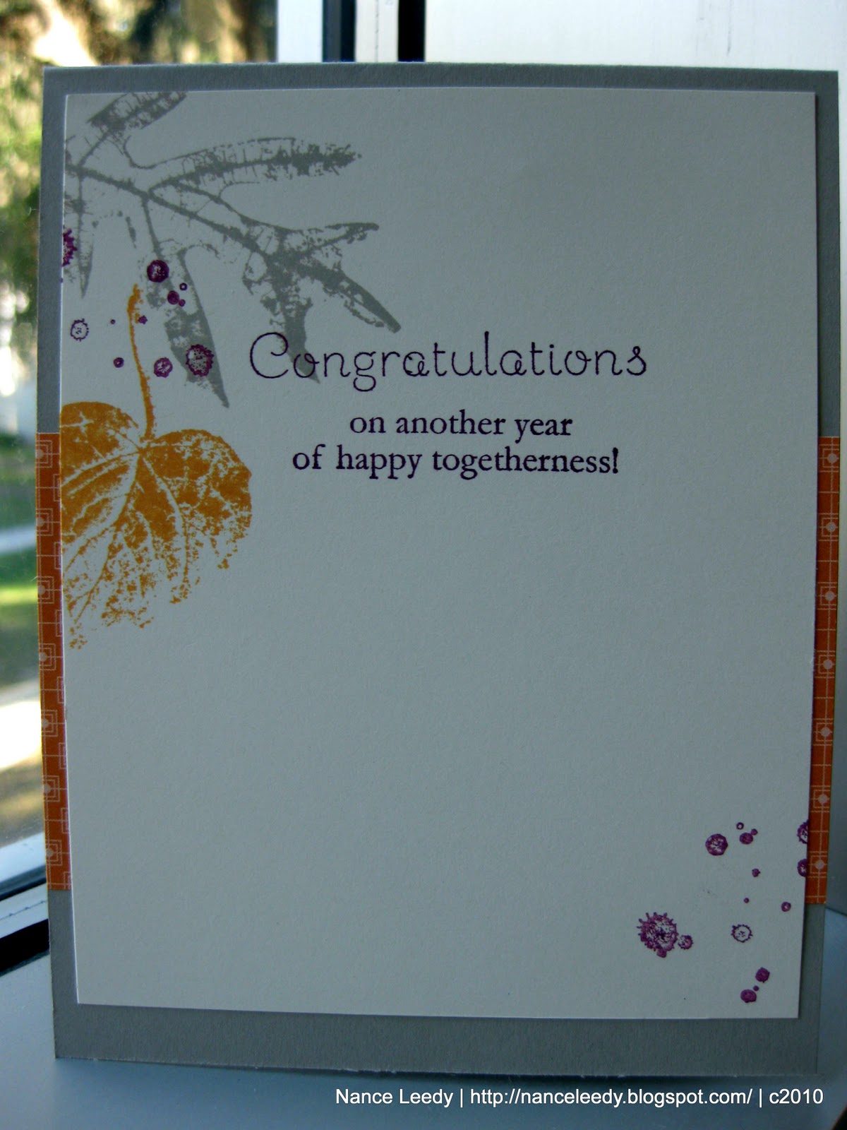
I had fun repeating the same elements on the inside stamping the tree in Crumb Cake on Whisper White with more Baja Breeze snowflakes and another Real Red bird:

And isn't this sentiment just perfect?!  It's another one from the level 2 hostess set Occasional Quotes--so versatile!  As I was taking these pictures, I realized I should have put some more Dazzling Diamonds on the inside so I may go back and add just a touch. :-)

I hope you've enjoyed my sample today...be sure to head over the The Paper Players and check out the rest of the design team.  I'm sure you'll find some wonderful eye candy and inspiration.  Then try your hand at Lesley's sketch and link it up.  We can't wait to come visit you!

supplies:
stamps: season of friendship; occasional quotes; contempo christmas (sentiment); branch out (retired)
ink: whisper white craft; baja breeze, real red, crumb cake, jet black stazon, basic black
paper: crumb cake, whisper white, real red CS; candy lane specialty DSP
xtras: MS glue pen; dazzling diamonds; whisper white organza ribbon

Friday, October 15, 2010

A Curtain Call Sketch 4 U

Hi everyone, happy Friday!  We all have the day off today, in fact almost the whole city does as it is a very big day here in North Florida.  Believe it or not, the schools all shut down for UF Homecoming!  I know, it's crazy but if you follow the Florida Gators at all, you will understand.  Parades, pep rallies, it's crazy!  We've lived here over 15 years and I still don't "get" it but I'll take the day off! :-)

Thank goodness, too, because it gave me time to stamp for Stacey's Curtain Call Color Challenge this week.  Aren't these colors fabulous together?!  So Saffron, Marina Mist, Crumb Cake, Basic Black & Whisper White...so fresh and modern!  I also used Kazan's great sketch over at 2 Sketches 4 YouHere is what I created:

The single stamp, Ornate Blossom, was inked up with Stampin' Write markers in this weeks colors, stamped on Whisper White and cut out with circle nestabilities and the Big Shot.  I stamped the center of the blossom with Marina Mist ink on some scrap, cut it out and popped it up on dimensionals.  I really like how the Black Raven Lace looks laid flat on the So Saffron designer paper next to a piece of Marina Mist cardstock embossed with the Polka Dot impressions folder.  The sentiment from Curly Cute was stamped with jet black Stazon for a crisp clean look.  Not sure if I like the 3 pearls but I felt it needed something more in that corner to balance the blossom.

Here's a quick look at the inside with more of the same designer paper.  I'm sorry it looks crooked in the photo, I think it's the angle, I promise it's straight IRL!

This is a smaller version of the same ornate blossom and this one is from the Friends Never Fade set.  I inked it in Marina Mist and stamped off once before stamping on the paper.  Such a fitting sentiment for a thank you card, this one is from the level 2 hostess set Occasional Quotes.

So, that's it for today...I hope you like it.  As always, thank you for stopping by and thank you even more for leaving a comment with your feedback.  I love hearing from you!  Be sure to check back on Sunday for another fabulous week at The Paper Players!

supplies:
stamps: ornate blossom; friends never fade; curly cute; occasional quotes
ink: basic black, marina mist, stazon
paper: crumb cake, whisper white, sweet pea stack (retired)
xtras: crumb cake, marina mist, daffodil delight, basic black stampin' write markers; black raven lace; basic pearls; polka dot impression folder; circle nestabilities

Wednesday, October 13, 2010

Chocolate Pear Parade: Color Dare {80}


It's Color Dare time again and the Design Team has a gorgeous color combination to inspire you: 
CD 80
Chocolate Chip
Pear Pizzazz
Poppy Parade
Very Vanilla
Pretty simple card to share with you today using one of my all-time favorite stamp sets that returned for another year in the catalog...Inspired by Nature.  The beautiful flowers were inked with my Stampin Write markers in all 3 of this week's colors and stamped onto a Naturals Ivory cardstock Top Note.  I just trimmed off part of the Top Note to allow more room on the right side of the card.  I really like this layout.  Next, I stamped the grass from the Inspired by Nature in Chocolate Chip on a Chocolate Chip base.  The grass was stamped again in Pear Pizzazz on a strip of the same cardstock and then lined up with the grass image on the base card:

I inked the large flower again with my Stampin' Write markers and then fussy-cut the flower to pop it up for some added dimension.
I hope you've enjoyed my card today--be sure to check out the inspiring projects from the rest of the Color Dare Design Team.  Then try your hand at this week's colors.  If you don't have these exact colors, a similar match will do.  We can't wait to see what you create!

supplies:
stamps: inspired by nature; because i care
ink: chocolate chip, pear pizzazz
paper: chocolate chip, pear pizzazz, poppy parade, naturals ivory CS
xtras: antique brads; hemp twine; top note die

Sunday, October 10, 2010

Paper Players Colour Challenge: {PP19}

Happy Sunday everyone!  Sunday just might be the best day of the week--sleeping in, leisurely breakfasts and...The Paper Players challenge!  Jaydee is our hostess this week and she has chosen this gorgeous photo as our color inspiration featuring the colors of Real Red, Basic Black and Whisper White.  So beautiful and elegant!

I may live in Florida now but winter scenes like this were a magical part of my childhood...until I actually had a job and responsibilities that meant digging out the car and scraping the ice from the windshield in the mornings, LOL!  Now, I just remember the good parts of it--the beauty and serenity of a winter forest like this one.  Today's card demonstrates an idea I've had floating in my head since I saw Jaydee's inspiration picture and this card on Carrie Gaskin's blog gave me just the inspiration I needed to bring it to life.


I love hanging a wreath on our door especially during the holidays and I can just imagine that this beautiful red house has a pretty decoration to welcome all visitors.  I punched ten branches from Whisper White cardstock with the Two-step Bird punch and trimmed down the branch to just a nub.  To create a base for the branches, I first punched a 1" circle out of WW cardstock and then punched around the circle I just cut with a 1 1/4" circle punch.  I ended up with a 1 1/4" circle with a hole in the middle...otherwise known as a wreath!  Next, I ran the wreath base through my Xyron sticker machine to get it all sticky.  Then it was a simple task of layering the branches around the wreath base being careful not to lay them down completely on the base so they stick up a little.   Some 1/8" Basic Black Taffeta ribbon was the perfect wreath topper.
It's difficult to see in the photo but I spritzed the wreath with some Shimmer Spray (Champagne Mist Shimmer paint + rubbing alcohol) and it is very sparkly in real life!  My red door is a piece of Real Red cardstock that I stamped with the Woodgrain backgound.  I inked Woodgrain first in Versamark and then Real Red ink before stamping on my cardstock.  I sprinkled on some clear Stampin' Emboss powder and heat set for a dramatic woodgrain effect.  The doorknob was a simple addition with a silver Glimmer brad.

The card background was embossed with the Northern Flurry impressions folder, spritzed with Shimmer Spray and matted with Brushed Silver cardstock to pick up the silver doorknob and the little bit of white on the ribbon that actually looks silver.  The Heard From the Heart stamp set provided the perfect welcoming sentiment.

I repeated another piece of WW cardstock embossed with Northern Flurry and Shimmer spray on the inside.  This extra piece also provides a bit of stability to the Whisper White which can be a little thin for a card base.  Before I embossed the inside, I stamped a two-tone Christmas greeting from the Seasonal Sentiments set.  I inked the stamp first with my Real Red stamp pad and then went over just the "Merry...and a Happy New Year" with a Basic Black Stampin Write marker.   

Thanks for welcoming me into your day for a minute--your visit means so much!  Head on over to The Paper Players to see all the fabulous Design Team inspiration waiting for you.  We hope you will be inspired to join us this week--we can't wait to come visit YOU!

supplies:
stamps: seasonal sentiments; heard from the heart; woodgrain
ink: real red, basic black
paper: whisper white, real red, brushed silver CS
xtras: northern flurry impressions folder; glimmer brads; basic black 1/8" taffeta ribbon; two-step bird punch; 1" & 1 1/4" circle punches; xyron machine; shimmer paint

Wednesday, October 6, 2010

Clearance Rack blowout!

Oh my gosh....amazing deals on the SU Clearance Rack. Stampin Up added 200 items to the sale with some up to 80% off...OMG...you have to go see.  Buttons, paper, ink pads, ribbon, punches, brads--great stuff!
  1. Go to my online store
  2. On my SU site, click the link to Shop Now
  3. click the link on the right-hand side for the Clearance Rack
Clearance rack items are only while supplies last and only available through an online order...check it out!  Happy shopping!

Perk Up for The Color Dare {CD79}

Hello everyone!  Today's card is for this week's  Color Dare combination:
CD 79
Wild Wasabi
Early Espresso
Marina Mist

So pretty together...do I say that every week?!  This little get well card is addressed to my stampin' mojo.  I don't know where it went but I hope it perks up soon.  I guess we all have creative slumps now and then, right?  Anyway, pretty simple layout today with stack of wonky teacups courtesy of the Stamp-a-ma-Jig and the Tiny Teacup stamp.  

I'll bet you're wondering how I made the scalloped Whisper White rectangle, right?  With the scallop square clear die!  First, I cut some WW cardstock with the scallop square die.  Next, I picked up the square I just cut and slid it over on the die so that some of the square was hanging off the edge and the scallops line up with the scallops on the die.  Run it through the Big Shot a second time to cut off the edge and you end up with a scalloped rectangle!  You can adjust the size of the rectangle by lining up as many scallops as you wish.

The little tag was stamped first with another Tiny Teacup inked in Wild Wasabi and stamped off once.  The sentiment from Puns from the Past was perfect for my get well/tea theme and was stamped in Early Espresso.  My 1 1/4" and 1 3/8" circle punches made the perfect sized tag to dangle from the retired Wild Wasabi striped grosgrain ribbon.

This is a really great color combination that could be used so many ways.  Check out the rest of the inspiration from the Color Dare design team and then head on over to the Color Dare blog to link up your creation.  We can't wait to come visit you!
supplies:
stamps: tiny teacup; puns from the past
ink: wild wasabi, early espresso, marina mist
paper: whisper white, early espresso, marina mist CS
xtras: 1 1/4" & 1 3/8" circle punches; scallop square clear die; wild wasabi ribbon [retired]; polka dots impressions folderbaker's twine

Monday, October 4, 2010

Holly Jolly PPA {62}

Hello everyone!  Have you played at the Pals Paper Arts yet?  This week they have a fun challenge to use buttons!  I've recently discovered buttons in my own crafting and love the new color family packs of SU buttons that coordinate with all our paper and ink.  So once I figured out what colors & papers I was using for today's card, I knew I had a matching button in my Brights collection.  Here it is:


This is a pretty simple layout but features the bold colors of the Jolly Holiday designer paper: Cherry Cobbler, Old Olive and Very Vanilla.  What a deep, rich color combination!  The bottom half of the card base was embossed with the Polka Dot impressions folder and I used two strips of coordinating Jolly Holiday paper at the top.  Polka dots and stripes usually don't work for clothes but are always a winning combination on cards!  The highlight though was making the little ornament tag.


I inked one of the sentiments from Tags til Christmas first in Versamark, then Cherry Cobbler ink and stamped it onto Whisper White cardstock.  I sprinkled it with clear stampin' emboss powder and heat set for a shiny finish.  I punched it out with my 1 3/4" circle punch, added some gold elastic cord and finished it with an Old Olive button.  Makes a cute ornament, yes?  I had the luxury of a little time when working on this one so I was able to finish the inside as well:


I love this retro tree from Contempo Christmas--the little curly que branches and the stylized graphic makes me smile.  I stamped it in Old Olive and paired it with the sentiment from A Christmas Greeting, stamped in Cherry Cobbler.  Isn't that a nice thought?  Holiday neutral too which makes it good for all!

Thanks for letting me know what you think of this one--I so enjoy reading your comments and appreciate the time you took to visit me today...have a great one!

supplies:
stamps: tags til christmas; contempo christmas; a christmas greeting
ink: old olive, cherry cobbler, versamark
paper: cherry cobbler, very vanilla CS; jolly holiday DSP
xtras: clear stampin' emboss powder; designer buttons (brights collection); gold elastic cord; scallop dotted ribbon border punch

Sunday, October 3, 2010

Monochromatic for The Paper Players {PP18}


Happy Sunday everyone!  It's another week for The Paper Players challenge and I am so excited to continue on board as Guest Designer this month!  October finally brings some cooler weather to Florida--and by cooler I mean pleasant [think 84 instead of 94](!)--so that had me thinking of fall colors.  This week's monochromatic challenge at The Paper Players is the perfect opportunity to highlight the SU Neutral color family with Crumb Cake, Early Espresso and Very Vanilla.  

For today's card I used a technique called "emboss resist" or "emerging color" to highlight the designer paper beneath the flowers.  This technique works best with a stamp that has a lot a surface area for the paper to peek through such as the Upsy Daisy set that I've used here.  First, stamp your image onto patterned paper with Versamark ink, sprinkle with clear embossing powder and heat set.  Next, fill a brayer with a coordinating color that is darker than your patterned paper and roll directly over the whole thing--paper & your embossed image.  Keep going!  You want to completely cover your paper and get a deep color.  When it's to your liking, wipe the ink off your embossed image and watch your pattern emerge within your stamped image...such a treat to watch...I know it's the little things that make me happy.  :-)


In keeping with the monochromatic theme, a slice of a Very Vanilla top note peeks out underneath the daises, anchors the image and holds a kind sentiment from the level 2 hostess set, Occasional Quotes.  


I wrapped the whole piece with some [retired] Crumb Cake taffeta ribbon and finished it off with another Vintage Brad--love those!  For more inspiration, check out the rest of the Players design team and their fabulous holiday cards.  We hope you'll join us with your monochromatic creations--I can't wait to see what colors you pick!

supplies:
stamps: upsy daisy, occassional quotes
ink: early espresso; versamark
paper: crumb cake, very vanilla CS; bella bleu DSP [retired]
xtras: scallop dotted ribbon border punch; vintage brads; crumb cake taffeta ribbon; top note die; brayer; clear stampin' emboss powder

Saturday, October 2, 2010

All a Flutter for the ColorQ {52}

I was delighted to see this week's challenge over at the colourQ and since it's been ages since I've played at the Q, I was determined to participate!  To celebrate colourQ's birthday, Arielle gave us this great sketch to work with:

 
and let us choose any past colourQ combination as inspiration.  What a great idea!  I knew right away which one I would choose because I missed it the first time around...#42:

I love these colors and that skirt is fantastic!  I was inspired by the pattern of the fabric and knew immediately that I would use the lattice die as a focal point.  So, here is my card:

I had a bit of indecision over which color to use for the lattice die and which for the background but I finally settled on this beautiful piece of So Saffron designer paper from the [retired] Sweet Pea stack and a Tangerine Tango lattice.  The Tangerine Tango lattice was also run through the Big Shot with the Square Lattice embossing folder to mimic the texture of fabric.  For the three elements in the top corner, I substituted some paper piercing because I just couldn't make brads or anything bulky work there!


The butterfly is a [retired] a la carte stamp called All a Flutter that was stamped on Whisper White with Timber Brown Stazon.  I stamped it in Stazon (which doesn't run) because I colored the butterfly with a blender pen and classic inks in So Saffron, Tangerine Tango and Real Red.  My friend Jaydee, of Jaydee's Stamping, created a wonderfully helpful video tutorial on this technique which gave me the courage to try my hand at coloring.  I still need much practice but it was my first attempt!  I hand cut the butterfly and popped her up on a 1 3/4" circle punched from a beautiful bronzey-brown glitter paper.  The body needed a little something so I added some brown adhesive jewels, from my stash, to pull the eye in.  I purchased the Hope Happens stamp set just so I could use this sentiment on butterfly cards.  I think it's just perfect!

Without a sentiment on the inside, it is suitable for any occasion.  But I couldn't just leave it bare so I added more of the same DSP used on the front and a Chocolate Chip butterfly to finish it off.

So, there you have it--Happy Birthday colourQ and congratulations Arielle on a full year of fabulous fun and inspiration.  I can't wait to see what the next year brings.

Thanks all, for stopping by tonight.  I hope you have a great evening.  Be sure to check back tomorrow for the next challenge at The Paper Players!