Pages

Showing posts with label seasonal sentiments. Show all posts

Sunday, October 6, 2013

Haunted Trick or Treat {PP166}

Hi everyone! This week I am the hostess over at The Paper Players where we have a fun Halloween challenge going on.  Like a lot of people, I love Halloween but I have to say that there wasn't a ton of Halloween SU stuff this season that I fell in love with.  Gasp, I know!  So I dug into my stash and pulled out a couple favorites and created without worry over whether it is retired or not.
I adore this [retired] Haunted Forest stamp.  I stamped it in Versamark ink onto a Summer Starfruit pattern of (digital) Witches' Brew DSP.  I sprinkled on some Heat and Stick Powder, blasted it with my heat gun and when it was wet, quickly sprinkled some Black Stampin' Glitter.  Oh, how it sparkles!  Once I had my focal piece, I cut some strips from more Witches' Brew DSP to layer them on my card base.  This is my favorite way to pull in different colors and patterns while using very little designer paper!  Because, of course, I love to hoard collect it! ;-)
I still can't believe SU retired the Spider Web embossing folder!  It's fantastic and I never make it through a Halloween season without using it.  Such great texture!  I embossed the front panel as well as just a bit of the inside.  The sentiment is from [retired] Seasonal Sentiments and seemed appropriate for this week's Trick or Treat" theme.  It's difficult to see in the photo but I colored in the letters with a Summer Starfruit and Pumpkin Pie Stampin' Write marker for a little extra color.

The rest of the Design Team knocked this challenge out of the park so be sure to stop by and check 'em out!  I hope you'll join in the haunting fun over at The Paper Players before our challenge closes on Friday, October 11th at Noon (PDT).  Thanks for stopping by today, friends!

The Paper Players Design Team
Photobucket

Supplies
Stamps: Haunted Forest [retired]; Seasonal Sentiments [retired]
Ink: Versamark, Basic Gray
Paper: Basic Black, Basic Gray, Whisper White CS; Witches Brew DSP [digital]
Extras: Raven Lace Ribbon [retired]; Hexagon Punch; Spider Web embossing folder [retired]; Heat and Stick powder; Circle Collection Framelits; Black Stampin' Glitter; Stampin' Write Markers (Summer Starfruit, Pumpkin Pie, Basic Black)

Sunday, September 1, 2013

Falling for Thanksgiving {PP161}

Hiya friends!  So glad you've checked in with me for another week with The Paper Players.  This week, Sandy is filling in for Jaydee with our Theme Challenge:
For today's card, I was inspired by the colors in this month's FREE digital download from My Digital studio...here's a peek:
Old School September Wallpaper is available for FREE as a digital download...check out my website for more details!  Inspired by these colors and our Fall theme, here's what I made:
I started with a Baked Brown Sugar base to which I added the Dictionary background stamp in matching ink.  The main panel is a 3.75" x 5" base of Whisper White cardstock adhered with 1.25" strips of Cajun Craze, Sahara Sand, Island Indigo and Summer Starfruit cardstock.
I stamped leaves from an old favorite, Gently Falling, in Versamark ink and heat set with gold embossing powder.  The sentiment is stamped in Early Espresso ink on Sahara Sand CS with the Tags 4 You stamp and matching Label Bracket Punch--available as a bundle.  The sentiment is backed with some gorgeous Gold Foil Sheets.
I've been liking something other than white or vanilla for the inside of my cards and thought Sahara Sand was a good substitute.  Repeating elements on the inside of the card continues the design and creates an extra bonus "card" for the recipient! 

I hope you've enjoyed my Falling for Thanksgiving card today.  Please be sure to stop by the rest of the Design Team for more fabulous inspiration.  We hope you'll join us at The Paper Players before our challenge ends on Friday, September 6th at Noon (PDT).

Before I let you go, some of you asked to see more pictures from our trip to Tanzania...so...here you go...enjoy!   


Thanks for stopping by today...to my friends in the US, enjoy the rest of Labor Day weekend!

The Paper Players Design Team

Photobucket
Supplies
Stamps: Gently Falling, Dictionary, Tags 4 You, Seasonal Sentiments [retired]
Ink: Cajun Craze, Summer Starfruit, Island Indigo, Baked Brown Sugar, Early Espresso, Sahara Sand, Versamark
Paper: Cajun Craze, Summer Starfruit, Island Indigo, Baked Brown Sugar, Sahara Sand & Whisper White CS; Gold Foil Sheets
Xtras: Gold embossing powder; Linen thread; Bracket Label punch; 2" circle punch (non SU); Neutral Candy Dots

Sunday, November 27, 2011

A Dashing Sketch {PP74}

Hiya friends! I hope my US friends had a wonderful Thanksgiving and that everyone is enjoying the weekend. It's another week at The Paper Players and the lovely and talented Lesley is bringing us a sketch:

Lesley always comes up with the best sketches--ya know she's the creator of Freshly Made Sketches--and this week is no exception!  One look at that tilted panel and I knew what I wanted to do:


Since titled panels are a challenge for me, I like to tilt the paper but stamp the image straight.  It's a sneaky way to embrace the tilt!  For this card, I paired some Mocha Morning DSP with some Brushed Gold cardstock cut with the Two Tags die.  I did cut it down a little to better fit my image.  Dasher was inked in Versamark, then Early Espresso, stamped onto the Brushed Gold and heat set with clear stampin' emboss powder.


The background was stamped in Early Espresso with the En Francias stamp and I added a little fussy ribbon treatment with vanilla seam binding, linen thread and a glimmer brad.  You might notice that the tiny tag was sponged with Champagne Shimmer paint to dull the brightness of the vanilla a bit.

I did the same with the Northern Frost snowflakes--the vanilla just seemed too bright next to the gold.  A little bit of shimmer paint sponged right on gives it instant sparkle with an aged look.

I went to town with the shimmer paint using it to ink up Dasher again on the inside.  Applied directly to the stamp gives it a shimmery watermark appearance.

And there you have it!  I hope you like today's card...please let me know if you have any questions.  Be sure to check out the rest of the Design Team at The Paper Players:

The Paper Players Design Team
Tara Bilbao
  Susan Joyce (November GD)

If you decide to play along with Lesley's fabulous sketch, please link up your creation to The Paper Players by Friday, December 2nd at midnight (PST).  I can't wait to come visit you!

Photobucket

supplies:
stamps: dasher, seasonal sentiments [retired], en francais, tiny tags
paper: early espresso, very vanilla, brushed gold CS; mocha morning DSP
ink: early espresso, versamark, soft suede
xtras: northern frost die; two tags die; very vanilla seam binding ribbon; linen thread; glimmer brad; basic pearls; champagne shimmer paint

Thursday, November 24, 2011

Happy Thanksgiving! {CCMC177}

Greetings everyone and to my friends in the United States, Happy Thanksgiving!  I have much to be thankful for today--family, friends and the ability to share with you all, a craft that I love!  I am so thankful for your continued visits to the Canopy, your supportive comments and the friends that I have made through blog-land!  So for today's Create with Connie & Mary challenge, I had to make a Thanksgiving card even though today's colors are a bit non-traditional for this holiday:
Lovely aren't they?  Greens and blues are some of my favorite colors and paired with River Rock they just sing!  Take a look:
I've been wanting to try sponge daubers with the medallion from Day of Gratitude so I did just that starting with the lightest color, River Rock in the center and proceeding with Lucky Limeade and finally Night of Navy on the edges.  I stamped onto Very Vanilla cardstock and then did some fussy cutting.
I inked and stamped another one, punching out the center with a 1 3/8" circle punch and decorating the center with pearls!  I carried the medallion into the inside:
stamping in River Rock and although the Night of Navy sentiment stamp I used is retired, it is available as a digital file in My Digital Studio.  Remember you don't need MDS to use a digital file--just download and use in any word processing or graphics program!

I chose this sentiment because it perfectly sums up my thoughts for you today...thank you!  Please be sure to stop by Create with Connie & Mary to see all the wonderful creations from the rest of the design team.  Thanks for stopping by today, friends!

Photobucket

supplies:
stamps: day of gratitude; hand-penned holidays; seasonal sentiments (MDS)
ink: river rock, lucky limeade, night of navy
paper: river rock, night of navy, very vanilla
xtras: filial press embossing folder; chantilly lace crochet trim; basic pearls; 1 3/8" circle punch; sponge daubers

Sunday, October 23, 2011

Gratitude for the Paper Players {PP69}

Happy Paper Players Sunday, friends!  Today I am the hostess over at The Paper Players and delighted to bring you a sketch I designed:
I hope you'll play along with us!  For today's card, I featured the "B" sides of the beautiful Spice Cake designer paper and went with a palette of soft greens:
click to enlarge
My base is Soft Suede cardstock, layered with River Rock onto which I stamped a Pear Pizzazz flourish from Creative Elements in place of the sentiment:
My sentiment took center stage on the flagged banner with an embossed oval made with the Designer Frames embossing folders:
I sponged the edges with homemade Champagne Shimmer mist and popped out the sentiment from Day of Gratitude with the Extra Large Oval punch, adding a Linen Thread and Chantilly crochet trim bow.
The real stars are the leaves I made out of Pear Pizazz and Soft Suede cardstock with the Leaves #2 die.  They were embossed with the Finial Press and Square Lattice embossing folders, sponged in Soft Suede and spritzed with Shimmer Mist.  It's amazing that they're still standing after all that "distressing"!
Lastly, I finished the inside with one of my favorite [retired] stamp sets Seasonal Sentiments adding another Creative Elements flourish behind and sponging the edges.

So, I would love to hear what you think of today's card!  Has it inspired you to play along with my sketch?  Be sure to check out the rest of the Paper Players Design Team for some amazing inspiration:

The Paper Players Design Team
Tara Bilbao
Cindy Hall (October GD)

I hope you'll play along with us...if you do, please link up your creation to The Paper Players by Friday, October 28th at midnight (PST).  I can't wait to visit you!

Photobucket

supplies:
stamps: day of gratitude,  creative elements, seasonal sentiments [retired]
ink: soft suede, pear pizzazz
paper: soft suede, pear pizzazz, river rock, very vanilla CS; spice cake DSP
xtras: linen thread; chantilly crochet trim; extra large oval punch; designer frames embossing folders; leaves #2 die; shimmer mist; scalloped ribbon border punch

Thursday, October 6, 2011

Always So Cajun {CCMC170}

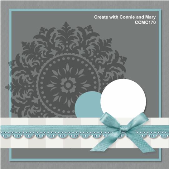
Happy Thursday, friends, and welcome to another week at Create with Connie & Mary!  Connie & Mary are treating us to a sketch challenge this week and you know how you like sketches, right?  Check it out:
The sketch is shown as a square but sometimes a square just doesn't work so you can take a little creative liberties and convert it to a standard A2 sized card as I did:
I was so happy to see the Day of Gratitude set return in the big catalog and didn't want to miss out on it during this fall season.  I combined it with a lovely autumn color combination from the Color Coach: Always Artichoke, Cajun Craze and So Saffron.  It's a pretty simple card but I'll just show you a few details:
Fussy-cut leaves combined with an Antique Brad and some linen thread....notice how the design in the middle of the brad coordinates with the design on the big medallion?  Love Stampin' Up for their coordinating designs!  The Square Lattice embossed panel adds such great texture--kinda like burlap which is especially fitting for fall projects, don'tcha think?
And just because it isn't a holiday card without a little shimmer or shine, I spritzed some homemade Champagne Shimmer mist in a sweep across the front as well as a few speckles with an Early Espresso marker and my Color Spritzer.
That's it from me today...busy, busy, busy!  Be sure to pop on over to see all the fabulous design team inspiration over at Create with Connie & Mary.  We would love for you to join us this week and, if you do, be sure to link up your lovely creation by Wednesday, October 12th at noon (EST) to be in the running for a Top 3 Pick!  Thanks for stopping by today!

Photobucket

supplies:
stamps: day of gratitude; hand-penned holidays; seasonal sentiments [retired]
ink: so saffron, cajun craze, always artichoke, early espresso
paper: so saffron, cajun craze, always artichoke, very vanilla
xtras: always artichoke seam binding ribbon; antique brad; linen thread; square lattice embossing folder; seven-sided distressing tool; early espresso stampin write marker; color spritzer

Wednesday, January 19, 2011

Color Dare #93

Happy hump day everyone!  Riley has another bright Color Dare combination for us this week: Regal Rose, Pink Pirouette and Pacific Point.  Hmmm....another stumper for me this week!  But, I persevered and in the end I'm happy with the result:
I have learned that if I am stumped by a color or colors, to cheat a little and include a lot of white and less of the color that is stumping me.  OK, this isn't a new idea but it just dawned on me...maybe I'm a slow learner!  I started with our 3.5 x 5" Whisper White note cards.
I inked up a clear "D" block with a Pink Pirouette marker and stamped it directly onto the note card.  This would have been easier with an ink pad (!) but I had to work with the supplies I had.  I like the way the marker gave it a streaked look in the background.  On top of my clear block image, I stamped Fine Flourish in Regal Rose.  I cut out a Pacific Point heart with the Scalloped Heart or Heart embosslit and layered it with a piece of retired DSP in Regal Rose that I punched with the Full Heart punch.  The "love you" sentiment is from Short & Sweet--an all-time favorite-- stamped in Pacific Point.
A quick-and-simple inside using the much-neglected I {Heart} Hearts stamp set and a sentiment from Seasonal Sentiments.  Thanks so much for stopping by today and be sure to check out the inspiration from the rest of the Color Dare Design Team.  Then hop on by the Color Dare blog to play along.  We would love to come visit you!
supplies:
stamps: fine flourish, short & sweet, seasonal sentiments, i heart hearts
ink: regal rose, pacific point
paper: 3.5x5" note cards; pacific point CS; regal rose DSP (retired)
xtras: clear acrylic D block; full heart punch; scalloped heart of hearts embosslit; basic rhinestones

    Wednesday, December 1, 2010

    Crushed Chocolate Plums {CD87}

    I know I say this every week but...here I go again...this week Riley has a gorgeous color combination for you at The Color Dare!  Chocolate Chip, Concord Crush and Perfect Plum--lovely isn't it?  These rich, luxiurious colors put me in the mind of a non-traditional Christmas card and I knew right away what I wanted to do.  Because Concord Crush is a very intense color, I wanted to toned it down a bit with Perfect Plum on the background panel.  I've used this technique before on this card and I just love the look--especially with the Vintage Wallpaper impressions folder.  Using a brayer, I rolled Concord Crush ink directly onto one side of the plastic impressions folder, going over it a few times for good ink coverage.  I placed a piece of Perfect Plum into the inky folder, ran it through the Big Shot and the results are a two-tone dry embossed effect that is so pretty!  Here's a close-up for you:
    For this card, I inked the front of the impressions folder (that's the side with the Stampin' Up logo) which placed the ink on the de-bossed areas.  You could also ink up the back of the folder (the side without the logo) to highlight the raised or embossed areas.  Either way the results are stunning and such a simple way to incorporate two colors into your design! ;-)
    With such a bold main panel, I needed to keep the other elements simple so I embossed one of the ornaments from Delightful Decorations in Concord Crush, popped it out with my coordinating ornament punch and layered it over some rich Chocolate Chip striped grosgrain ribbon.  I little adhesive basic pearl added just a touch of elegance to the only sentiment on the front.  
     I kept the inside simple too with another strip of the inked & embossed cardstock.  Seasonal Sentiments was the perfect flourish for the greeting and I overstamped it in Concord Crush on top of a simple medallion from Charming.  I thought the Charming medallion was a good match to the shapes in the Vintage Wallpaper impressions folder and inked in Perfect Plum (and stamped off once) it tied in with the cardstock nicely.  

    So there's my clean but elegant (I think!) card for this week's Color Dare...won't you join us?  To get started, check out the fabulous inspiration from the rest of the design team below and then head over to The Color Dare to link up your creation.  We can't wait to see what you do with these colors!

    The Design Team:
    supplies:
    stamps: delightful decorations, charming, seasonal sentiments
    ink: concord crush, perfect plum
    paper: chocolate chip, concord crush, perfect plum & very vanilla CS
    xtras: vintage wallpaper impressions folder; brayer; chocolate chip striped grosgrain ribbon; basic pearls

      Wednesday, November 24, 2010

      Gratitude and Thanksgiving wishes for you! {CD86}


      Hi all, can you believe it's the day before Thanksgiving?  Where has this year gone?  Well, it's Wednesday and that means another challenge at the Color Dare {86}: Pumpkin Pie, Cajun Craze, Wild Wasabi and Baja Breeze.  Wow, at first glance, I thought "what am I going to do with that?!"  Then, I saw this fabulous wreath over on my friend LeAnne's blog and I knew I wanted to try my hand at it too.  Using the lid of a small storage jar, I lightly traced a circle in pencil onto my Naturals White cardstock.  The storage jar lid was handy but you could also use a punched circle as a template.  The circle is about 1 3/4".  The circle helped me line up the leaves, branches and twigs of my wreath to create an [almost] uniform circle instead of the ellipse I got the first time I tried it without tracing a circle! :-)


      I stamped the small leaf from Autumn Days in Wild Wasabi leaving a little space between each one.  Next, I stamped the same leaf in Pumpkin Pie and followed up with Baja Breeze leaves.  I really like how the BB looks next to the PP & WW!  Lastly, the twig branch was stamped in Cajun Craze randomly around the circle.  A little Pumpkin Pie 1/4" grosgrain ribbon, secured with a glue dot, added a little dimension to the wreath.  As always, the hardest part was figuring out the pattern of leaves and colors--there were a few samples in the trash before I settled on "the one".


      The color combination was looking so pretty (thanks Riley!) that I wanted to dress up the inside too.  I tried acrylic block stamping in Baja Breeze and I love the effect.  Just put your acrylic block directly on the ink pad and then stamp on your paper.  It gives a great background element.  Here, I used SU's block "D" and stamped off once before stamping the Baja Breeze onto the Naturals White cardstock.  I have tried this was some non-SU acrylic blocks (while I was waiting for the UPS man to bring my order with the blocks!) and I have to say that the SU blocks are better for this technique because the edges are rounded and give a soft stamped edge.  Other blocks have a right angle edge which gives a sharp hard edge to your stamped image.  Anyway....the wonderful Thanksgiving sentiment from Seasonal Sentiments, was overstamped in Cajun Craze with the other colors, Pumpkin Pie & Wild Wasabi, coming in on the leaf and branch from Autumn Days.

      I wish I could send this card to all of you, dear blog readers and friends.  Your comments and well wishes keep me going and push me to be more creative with each post.  Since I can't mail one to all of you, this post is dedicated to you--thank you!  Whether you are celebrating Thanksgiving tomorrow or not, here's to you and a wonderful weekend ahead with friends and family...cheers!

      supplies:
      stamps: autumn days; seasonal sentiments, woodgrain bg, thankful for
      ink: cajun craze, wild wasabi, pumpkin pie, baja breeze
      paper: cajun craze, wild wasabi, naturals white CS
      xtras: dotted scallop ribbon border punch; pumpkin pie 1/4" grosgrain ribbon; acrylic block D

      Wednesday, November 3, 2010

      Medallion Damask: Color Dare {83}

      Hi crafty friends!  Welcome to another challenge week at The Color Dare where Riley is testing us once again with this beauty:
      Color Dare 83
      Garden Green
      Blushing Bride
      Perfect Plum
      Very Vanilla
       I really liked the layout of this previous card and I was inspired by the Damask challenge over Moxie Fab World.  So, combined with this week's CD colors, here is what I created for you:
      I adore the Medallion stamp and I really like it stamped off the Blushing Bride panel here.  I drew over a few areas of the Medallion with my glue pen and sprinkled on some Dazzling Diamonds.  This beautiful sentiment is from the level 2 hostess set, Peaceful Season, which I stamped in Garden Green on vellum cardstock and cut out with the (retired) Scalloped Oval frame die.  I used the largest of the Basic Rhinestones and snipped off a piece of stampin' dimensionals to tuck under each one.  This popped the oval up enough but allowed the dimensionals to hide under the rhinestones!  The other side of the oval is held up by another dimensional hiding under the beautiful dove.

      I stamped the dove from the same set in Versamark ink onto Very Vanilla, sprinkled with Heat & Stick powder until it turns to liquid.  Then I sprinkled it with Dazzling Diamonds and heat until set.  The Heat & Stick powder is just sticky enough to hold onto the DD and the result is one sparkly dove!  A little bit of Very Vanilla seam binding ribbon was scrunched up on the edge for a soft and gentle ribbon treatment.


      This medallion is so pretty that I stamped it again on the inside, this time in Blushing Bride and again embellished it with some Dazzling Diamonds.  The Seasonal Sentiments set provided the perfect greeting when stamped in Garden Green.  Head on over to the other designer's blogs to see what they've crafted for you.  You're sure to find lots of inspiration there:
      What will YOU make with these colors?  We can't wait to see.  Be sure to visit us at The Color Dare and link up your creation.  Thanks for visiting!

      supplies:
      stamps: medallion; peaceful wishes; seasonal sentiments
      ink: garden green, blushing bride, perfect plum, versamark
      paper: garden green, blushing bride, very vanilla, vellum CS
      xtras: scallop oval die (retired); basic rhinestones; glue pen; dazzling diamonds; very vanilla seam binding ribbon; heat & stick powder