Pages

Showing posts with label work of art. Show all posts

Sunday, May 27, 2018

Bravo, Our Shining Star - PP395

Hi friends!  My sweet pal, LeAnne has an awesome sketch for us this week at The Paper Players...take a look:
Firstly, I have to apologize for the quality of these photos....I was in a hurry to photograph and schedule this post before leaving for a weekend [birthday!] trip so I had to use indoor lighting with my phone--gah!  Anyway, LeAnne's awesome sketch was a perfect chance to use the big script on this retired set called Bravo:
I can't believe it....our daughter graduates from 8th grade on Tuesday!  Oh my, I'm getting weepy just thinking about it...but so happy for all the opportunities that await her in high school.  So this card is for her...and I didn't worry about retired products or colors or anything, just created with her in mind.  Done in colorful pastels, with a little bit of sparkle and personalization, I think she will love it. 
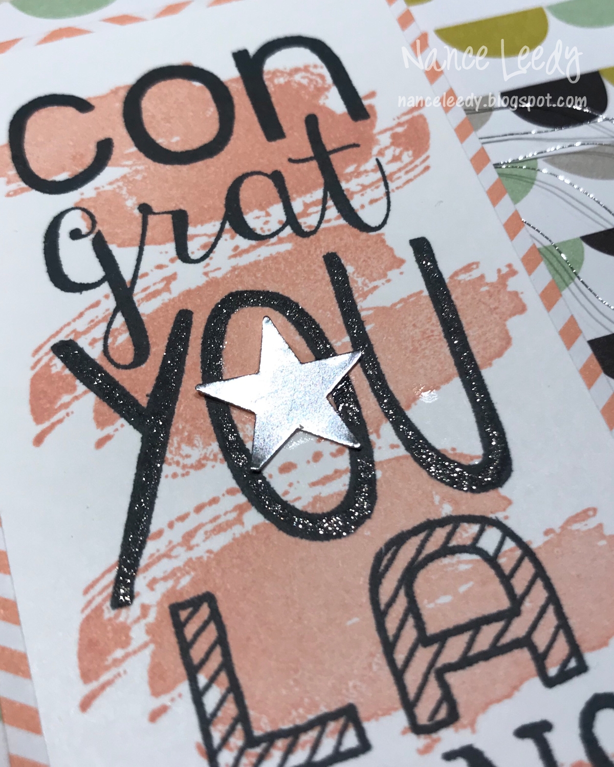
First the sparkle...some shiny silver thread, some Wink of Stella on the "you" and a silver punched star because...well, she's our shining star!   
Here's the personalized part...I used the rotary alphabet stamp to create a repeated sentiment with the acronym of her school and graduation year...MMS 2018.  I didn't want the circle to cover up the larger sentiment so I tucked it behind the main panel.  A little different than the sketch but I don't think LeAnne will mind that I took a little creative license.  ;-)
The inside features another retired favorite...Word Play...I just love the scale and mixed font of this sentiment so I couldn't let it go.  Good thing to because it's perfect for graduation cards!  I'm sure I'll dig it out in another 4 years for her high school graduation....YIKES!

Be sure to pop over to The Paper Players and check out all the inspiration from my teammates--they do lovely work!  Maybe you will be inspired to join us before the challenge ends on Friday, June 1st at Noon (PST).  Thanks for stopping by!

The Paper Players Design Team 

Sunday, February 4, 2018

Timeless Textures Valentine PP379

Hi friends!  Are you all ready for the Super Bowl?  We're not huge football fans in this house--give us volleyball or cycling any day--so we probably won't even watch it. LOL. However, I am rootin' for the Eagles just for my Paper Players pal LeAnne!  Speaking of The Paper Players, this week the lovely and talented Claire has a fun Theme Challenge for us: 
I tried a few things and just wasn't getting anywhere and then I spied a picture of the Painted with Love designer paper in the Occasions Catalog.  I don't own it--really trying to cut down on my paper buyign--but it is gorgeous!  When I saw the paper, something just clicked!  So I pulled out my stamp pads, acrylic blocks and some abstract stamp images and made this:

Which turned into this:

I made my own designer paper and it was so much fun!  I started with some Blushing Bride ink on a small acrylic block stamping it in a loose checkerboard pattern on a piece of Whisper White cardstock.  Next I added the abstract swoosh from Work of Art in Sweet Sugarplum.  Next was an element in Flirty Flamingo from the Timeless Textures stamp set.  A step back to look at it and it still needed some more layers....so I kept going.  I added another image from Timeless Textures in Powder Pink ink and some random tiny splotches, also from Timeless Textures, in Fresh Fig.  That seemed pretty good but to really make it special, I added a swirly stamp--you guessed it from Timeless Textures--that I heat embossed in gold.  
You can better see all the stamped images in this close-up and also see the little bit of gold thread added behind the die-cut sentiment.  Love that I was able to fill a whole sheet of cardstock because now I can make at least 4 more card fronts from it!  Woohoo!  I had a little strip of the my stamped cardstock left over which I used to trim the inside panel of the card.  I can't show it to you though because that would give away the name of the recipient!  Shhhhhh. 

Be sure to check out the work of my fabulous teammates at The Paper Players and come join us before the challenge ends on Friday, February 9th at Noon PST.  Thanks for stopping by!

The Paper Players Design Team 

Y'all seemed to enjoy last week's photo of our daughter playing volleyball so I thought I would share again...two pix from last weekend's tournament in Tampa:
And this is one of her teammates but I just love the shot and the intensity of Cate's stare--I think I would be intimidated looking at that from across the net!

Love these girls and their moxie!


Sunday, May 14, 2017

Happy Mother's Day PP344

What a special day today!  A day to honor not only mothers but sisters, daughters, aunts, nieces, friends.....all the wonderful women in our lives.  For me, there are plenty but none more influential, strong or loving than my mother.  My constant, my rock, my support....I love you to the moon and back times infinity Mom!  Thank you for everything you do for our family.

This week at The Paper Players another wonderful woman, Claire, has a bright and beautiful color challenge for us:
I'll admit, I was a little vexed when I first saw these colors but then I realized that I could blend the red and orange together....maybe cheating a little but it's a good way to approach similar colors in a palette.  So here's what I pulled together:
I really love the Special Reason stamp set and am sad to see it retire.  So far, I've mostly used it with the coordinating dies for the beautiful cut outs it creates.  Here I wanted to feature the full stamp and the pretty flowers.  
The two sizes of similar flowers makes for easy bouquets—I like the graduated look of the sizes.  Here I inked the flowers first in Tangerine Tango and with a sponge dauber tapped in the center and the edges with Real Red ink.  After cutting out with the coordinating die, I painted the flowers with Wink of Stella…happy sigh.
The watercolor look to the background was made easy with the swoosh stamp from Work of Art—a set I am happy to report is not retiring!  Since the swooshes were stamped off I wanted another layer that was full strength Tempting Turquoise so I added some watery dots from the Dragonfly Dreams set
So, there are a mixture of sentiments from three different stamp sets.  The front features an oldie but goodie from Delightful Dozen while the inside combines Petite Pairs and Teeny Tiny Wishes.  I stamped another blended flower and using a mask added some more swooshes and Pear Pizzazz leaves.

Thanks so much for stopping by today….be sure to check all the lovelies from my teammies at The Paper Players.  Maybe you will join us before our challenge closes on Friday, May 19th at Noon (PST).  Have a great day!

The Paper Players Design Team 


Sunday, August 16, 2015

Beachside Bungalows and a Sleigh Ride {PP258}

Hi all!  The lovely LeAnne is our Paper Players hostess this week with a fun Clean-and-Simple Challenge...The Beach!
I had just received my box of pre-order goodies from the Stampin' Up holiday catalog (goes live for customers September 1st) and I was itching to use something, anything from that box for my card today!  But what to do with holiday goodies for a beach challenge?  Let's see if you can find the holiday goodie on my card:
I wanted to create the look of a tropical seaside village with colorful houses and a rising sun.....so I used the new Sleigh Ride Edgelit dies to make my sand dunes, ocean and houses!  I cut two hills with the house edgelit die from Crumb Cake cardstock.  The die has these little houses on it and since I wanted to make them in different colors, I simply snipped them off the Crumb Cake layer leaving me with a good sand dune.  Stamping some Gorgeous Grunge speckles in the same color gives the illusion of sand.  I cut another edgelit from Pool Party cardstock and used the line stamp from Gorgeous Grunge in the same ink color for the illusion of moving water.

For the houses I used a scrap piece of cardstock to cut just a part of the edgelit.  Since I only needed one house in each color, I didn't need the whole piece.  I chose Calypso Coral, Blushing Bride and So Saffron for my seaside village.  The Sun from the stamp set Kinda Eclectic was stamped in Daffodil Delight and the clouds were stamped in Soft Sky with the Work of Art stamp set. 
One more sneak peek you really can't even see but trust me, you're going to want it!  That's the fine tip glue pen I used to adhere the Hello framelit to my card.  It has a needle like tip that hollow and lets the glue flow freely and easily onto the tiniest of surfaces.  Love it!

I hope you like today's card and an alternative way to use your holiday goodies!.  Do stop over to the rest of The Paper Players design team to see what goodies they are sharing.  I hope you will play along with us before our challenge closes Friday, August 21st at Noon (PST).

The Paper Players Design Team
Anne Marie Hile (on leave) 
Sandy Mathis

Photobucket

Sunday, May 10, 2015

Tribute to By the Seashore {PP244}

Hi there friends.....wishing all the mamas out there--pet mamas too--a very Happy Mother's Day!  This week at The Paper Players, the lovely LeAnne is our hostess with a beautiful color challenge:
Blue, green and natural....happy sigh!  So pretty together and the colors reminded me of the beach, which reminded me that I soon needed a retirement card for a dear friend who....loves the beach!  So, today's card was born:
It was very difficult to get a good photo of the colors.  I guess the light background with fairly light colors did not add up to a bright card...no matter what the light was outside!  I used a base layer of Naturals White because the flecks lend itself to the casual, rustic, beach feel.  A combination of images was used to achieve the seaside look--coral in Pistachio Pudding and a trio of sea life in the challenge colors....how 'bout a close-up?
I stamped each one with Versamark and heat embossed with white embossing powder.  I had a hard time getting the colors to stand out just stamping on white paper with the colored ink.  I thought the white embossing on colored cardstock highlighted the colors better.  For the Lost Lagoon nautilus (?) shell, I cut around the swirl and used a double stack of dimensionals to make the center stand out.
You can also see in this photo that I sponged the edges of the base layer, as well as the shells and starfish with [retired] Champagne Mist shimmer paint.  I still have several bottles of the stuff....I just love the soft color and lustre that it adds.  

I'm going to keep this short and sweet today so you can get on with your day!  Be sure to stop by the rest of the Design Team to see what wonderful ideas they are sharing this week.  We hope you will play along with us before the challenge closes on Friday, May 15th at Noon (PST).  Thanks for stopping by today!

The Paper Players Design Team

Photobucket
Table built using Product Table Builder by The Crafty Owl - Independent Stampin' Up! Demonstrator.

Sunday, April 26, 2015

A Lakeview of Adventure {PP242}

Hi there friends...happy Sunday!  It's another week at The Paper Players and our fabulous friend Ann is this week's hostess for sketch challenge!
And do you know what else?  It's Ann's birthday today!!  Woohoo!  Happy Birthday, Ann!  May today be as fabulous as you are!  Be sure to pop over to her blog and send her big birthday hugs!  So I hope Ann will forgive me for taking a bit of a....er....um...."abstract" interpretation of her sketch.  I had a couple things in mind and once I started creating, well....creative energy was flowing and I ended up with this:
Oh yeah, and I flipped the sketch on it's side too [insert blush here].  But you can still see the sketch, right?  I used the water and the grass as two of the banners and the linen thread as the third banner element.  The oval is there and the sentiment placement is the same so I hope Ann is OK with it!
I used an assortment of stamp sets on this one and there all listed at the bottom of the post.  I also had to pay homage to my beloved Naturals White cardstock which is on the SU retiring list as well as the Petite Pairs stamp set.  Won't be getting rid of that one--the sentiments are too good and I love the scale of them!  This card is being mailed to the fabulous teacher who recently arranged for my daughter's fifth grade class to go on an amazing camping trip.  I chaperoned the trip last week and it was an amazing experience!  

A gorgeous location full of nature hikes...

campfires.....with s'mores of course!

friendship....
 and adventure....
Yes, that's me climbing the 40 foot Alpine Tower...and I made it to the TOP...along with many of the kiddos!  OK, if I haven't lost you yet, you might be even more interested in the goodie bags DD and I made for all the campers...
Like that closure?  Two holes punched in the top of the bag with a stick from our yard threaded through....clever, yes?  I thought so!  Thanks for bearing with all my photos in today's post.  We had such a great time.  I am so proud of our girl and the effort she made to learn new things and test her abilities.  What an adventure!  So, you can see why I needed to make a special card for the teacher who made this whole trip possible.  The rest of the design team have amazing samples for you so be sure to pop over to The Paper Players and have a look!  We would love for you to join us before the challenge ends on Friday, May 1st at Noon (PST).  Thanks for stopping by!

The Paper Players Design Team
Photobucket

Table built using Product Table Builder by The Crafty Owl - Independent Stampin' Up! Demonstrator.