Pages

Wednesday, December 8, 2010

Season's Greetings {CD88}

It's Color Dare Wednesday and this week Riley has chosen a wonderful holiday combination for us!  Riding Hood Red, Old Olive + a neutral of your choice...perfect!  I've noticed in my own holiday card-making, the closer we get to Christmas the simpler my cards have become and this week's clean and classic one is no exception!

 Lots of Very Vanilla here because I wanted the focus on that beautiful sentiment and holly sprig--both courtesy of Peaceful Season.  The Petals-a-Plenty impression folder gives a wonderful texture to the background and breaks up all the "white", or in this case vanilla, space.  I inked the holly sprig with my Old Olive & Riding Hood Red stampin' write markers and overstamped the sentiment in Jet Black Stazon.  

I did want to glam it up a little so I tried something new (to me) with gold embossing powder.  I dragged the edges of my cardstock in Versamark ink, dipped them into gold embossing powder and heat set.  The result is a very cool, gilded edge that adds the perfect simple frame.  Next time I think I would drag it across the Versamark pad a little more so the embossing shows up better. 

Here's a quick peek at the inside...I inked the holly sprig with my markers again but this time stamped off once before stamping on my paper.  The sentiment from Christmas Greeting is a favorite and was overstamped in Basic Black ink.


 A quick pass through the Big Shot with the Petals-a-Plenty folder just on the bottom of the cardstock adds a great textured border.

Sorry this will be a quick post today...lots to still do for the birthday party this weekend.  Have a great day my friends and be sure to stop on over at The Color Dare to see all the DT inspiration and to link up your holiday creation...I can't wait to visit you!

supplies:
stamps: peaceful season; a christmas greeting
ink: jet black stazon, versamark, basic black
paper: very vanilla CS
xtras: petals-a-plenty impressions folder; riding hood red striped grosgrain ribbon [retired]; stampin' write markers; gold embossing powder

Monday, December 6, 2010

Christmas Kids for Inkspirations {51}

Happy Monday everyone!  Only two weeks of work and school in our house and then we are all off until January...can't wait!  I'm so excited to share a sweet little card I made for the Inkspirations Challenge {51}.  This week's sketch really caught my eye so I found a bit of time to play along!  Here's the sketch:


And here is the sweet little card I made (can you tell I am happy with it?!)

Oh my gosh, I don't know why I waited so long to order Greeting Card Kids it is absolutely adorable!  Well, I know why...I was afraid of coloring the images but my Stampin' Write markers made quick work of it and I think it turned out alright.  Actually, when my daughter saw what I was working on she asked me to stamp one for her and we colored them together...so much fun!  I like the way Baja Breeze and Blushing Bride work together but I didn't want to go all pastels so I added some Love Letter DSP in Basic Black.  I like how the black DSP picks up on the black outline of the stamp and the sentiment.
I colored the little girl's outfit with Blushing Bride, Baja Breeze and Crumb Cake and applied Dazzling Diamonds to the trim on her coat & hat.  The tree was inked with Pear Pizzazz, Blushing Bride and a touch of Daffodil Delight for the star.  I also used my Color Spritzer to add some Crumb Cake sprinkles to the background.
I know you noticed the Tinsel Trim, right?  I wasn't kidding when I said it was my go-to holiday accent.  I think I've used it on almost every holiday card I have made!  Here, I ran it across the back of my circle, close to the edge and held it in place with good 'ole Scotch Tape, worked like a charm!  In the background, you can see snowflakes from Jolly Old Saint Nick stamped in Baja Breeze on the matching cardstock.
Next, I added the Blushing Bride strip embossed with my Polka Dot Impressions Folder as well as some Certainly Celery ribbon treated to the "scrunchy" effect.  The ribbon looked a little bare so I added a Pear Pizzazz glimmer brad wrapped with more silver Tinsel Trim.  Love how it echoes the bigger circle! 
Lastly, I wanted to color some more(!), so I stamped the little girl on the inside and colored her outfit to match the front but just a tad bit lighter.  I didn't want to compete with the outside.  The sentiment is from the Peaceful Season [level 2 hostess] which I stamped in Stazon Jet Black for a crisp image.  Don't you love how it looks like her hand it holding up the sentiment?  So that's my little card for today...thank you so much for stopping by.  Please let me know what you think!

supplies:
stamps: greeting card kids; peaceful seasons, teeny tiny wishes
ink: stazon jet black; baja breeze
paper: crumb cake,  baja breeze, blushing bride, very vanilla CS; love letter DSP
xtras: polka dot impressions folder; stampin write markers; dazzling diamonds; silver tinsel trim; certainly celery twill ribbon [retired]; "in color" glimmer brad; color spritzer

Sunday, December 5, 2010

Christmas for the Paper Players {27}

Hi Paper Players!  I hope you're having a great weekend.  It's been fabulous weather here with temps today around 70--woohoo!  Perfect for working and playing outside which is just what we did.  This week The Paper Players are challenging you with a Christmas (or holiday) theme.  "Anything goes" with a Christmas theme: cards, scrapbook pages, 3D projects, gift bags, boxes the possibilities are endless.  Want to see what I made for you?  Well, actually I made it for our daughter :-) but couldn't wait to share it with you too!  Ready?

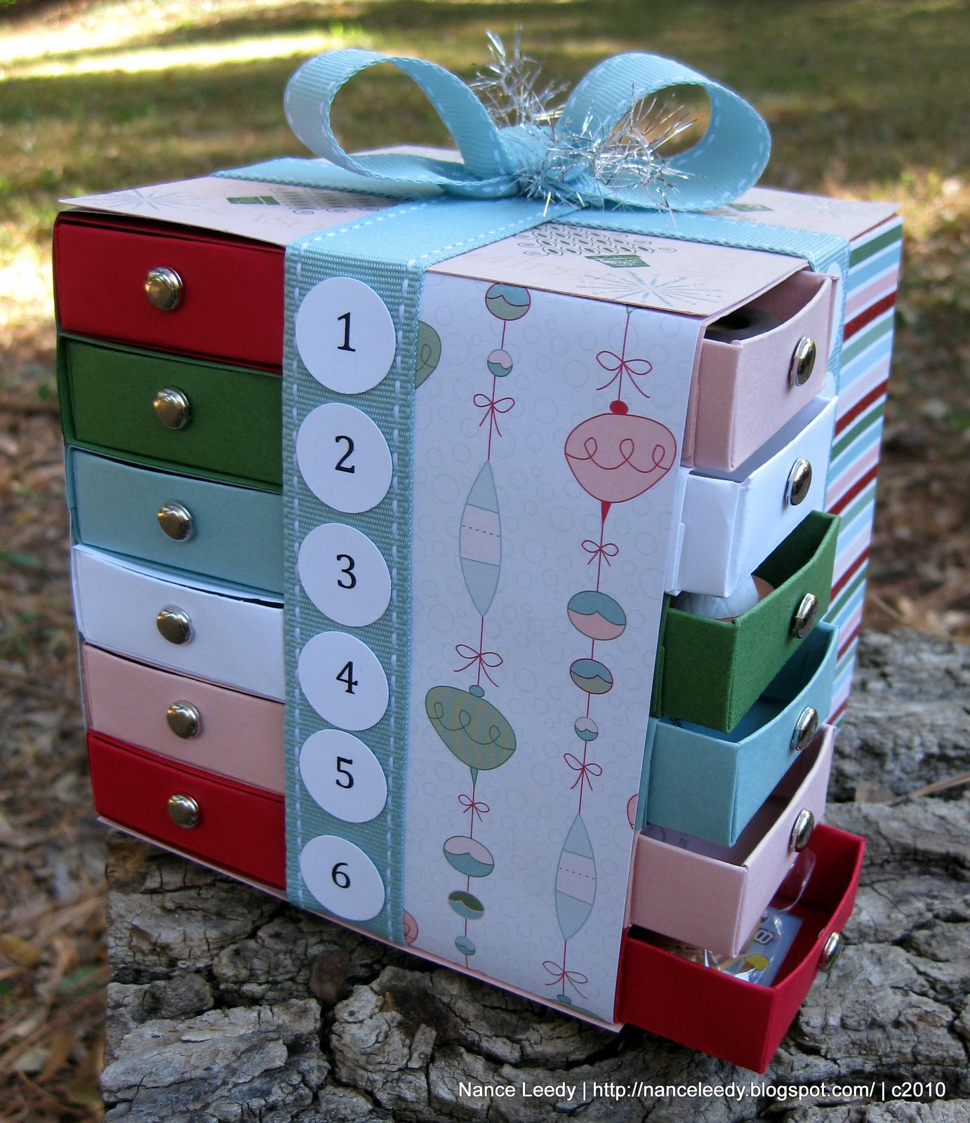
It's an Advent Armoire!  Ok, did you squeal yet?  Because I did when I saw this one at Wickedly Wonderful Creations.  What a great idea (I can say that because I didn't think of it!).  I'm not sure I can explain exactly how I made it because I started with the inspiration photo and figured it out from there.  The basic construction is 4 towers of 6 drawers each made with the Matchbox Die, stacked and held together with ALOT of sticky strip!!  I used Candy Cane designer paper and all it's coordinating colors: Blushing Bride, Baja Breeze, Garden Green, Real Red and Whisper White.  Each "tower" has a different coordinating paper.  Here are the two on the other side:
I wrapped each side with some [retired] Baja Breeze grosgrain ribbon on which I adhered the calendar dates.  The dates were super easy to make.  I just typed them up on my computer, printed them on Whisper White cardstock and popped 'em out with a 3/4" circle punch.
Of course, I couldn't leave the "inside" blank so each drawer opens to reveal a little surprise stamp from Deer Friends [retired] inside.
 The top is decorated too with a variety of stamps--Curly Cute, Contempo Christmas and Snowburst--and Dazzling Diamonds!  The bow is just made from a big loop of ribbon that I cinched in the middle and wrapped tightly with some silver Tinsel Trim and a big [retired] Baja Breeze corduroy brad.
Here you can see what the drawers look like as they open, cute?!  Believe me our daughter is having a difficult time resisting the urge to open all of them right now!  And who can blame her right? 

The Paper Players can't wait to see what you will come up with this week.  We love peeking into your blogs and leaving comments on all your wonderful creations.  Come play along with us--we'd love to have you!  Just link up your project at The Paper Players by midnight (PST) Friday December 10th to be in the running for A Cut Above and our Headliner.  Be sure to head over and check out all the inspiration from the Design Team.  Thanks for stopping by...cheers!

supplies:
stamps: curly cute; contempo christmas; snowburst; deer friends
ink: garden green, baja breeze, blushing bride
paper: candy cane DSP; blushing bride, real red, garden green, baja breeze, whisper white
xtras: baja breeze grosgrain ribbon [retired], silver brads (non-SU); matchbox die; silver tinsel trim; baja breeze corduroy brads [retired]; 3/4" circle punch; dazzling diamonds

Thursday, December 2, 2010

Arden's Garden Party

Hiya friends!  Just a quick post tonight to share a birthday party invitation with you.  We are hosting a Garden Party (remember we live in Florida!) for our daughter, Arden, this month and this is the sweet little invitation I made for her. 
I love these flower pot cards and with the Cherry Blossom embosslit there is very little stamping here!  I'm not sure who came up with the original flower pot but I first saw this great tutorial on Stephanie Luman's blog.  With the instructions at this site, they go together pretty easily.  Of course, when you're making 24 of them they may be easy but they take a lot longer than I expected!  Thank goodness my mom helped with all the cutting, embossing, scoring and folding so all I had to do was assemble.  The flower pot was cut from Crumb Cake cardstock and the colors for the Cherry Blossoms--Melon Mambo, Tempting Turquoise & Daffodil Delight--were chosen by my daughter.  The 5-pointed flower in Old Olive was used to create the leaves.
 I typed up the party details on my computer, printed onto Whisper White cardstock. and matted on a piece of Crumb Cake.  I wrapped the top of the flower pot with some ribbon from my stash and the sentiment was also printed from my computer (so it would match the inside font) onto WW and punched with the Large Oval punch.  
 With a little room at the top of the inside panel, I was able to arrange the Cheery Blossoms such that they bloom right over the flower pot when the invite is "closed".  They look so sweet and most of all, Miss Arden just loved them...and actually so have several of the guests' moms!  Still lots of details to iron out for the big day but it should be lots of fun...I'll keep you posted.  :-)  Have a great Friday, friends!

Wednesday, December 1, 2010

Crushed Chocolate Plums {CD87}

I know I say this every week but...here I go again...this week Riley has a gorgeous color combination for you at The Color Dare!  Chocolate Chip, Concord Crush and Perfect Plum--lovely isn't it?  These rich, luxiurious colors put me in the mind of a non-traditional Christmas card and I knew right away what I wanted to do.  Because Concord Crush is a very intense color, I wanted to toned it down a bit with Perfect Plum on the background panel.  I've used this technique before on this card and I just love the look--especially with the Vintage Wallpaper impressions folder.  Using a brayer, I rolled Concord Crush ink directly onto one side of the plastic impressions folder, going over it a few times for good ink coverage.  I placed a piece of Perfect Plum into the inky folder, ran it through the Big Shot and the results are a two-tone dry embossed effect that is so pretty!  Here's a close-up for you:
For this card, I inked the front of the impressions folder (that's the side with the Stampin' Up logo) which placed the ink on the de-bossed areas.  You could also ink up the back of the folder (the side without the logo) to highlight the raised or embossed areas.  Either way the results are stunning and such a simple way to incorporate two colors into your design! ;-)
With such a bold main panel, I needed to keep the other elements simple so I embossed one of the ornaments from Delightful Decorations in Concord Crush, popped it out with my coordinating ornament punch and layered it over some rich Chocolate Chip striped grosgrain ribbon.  I little adhesive basic pearl added just a touch of elegance to the only sentiment on the front.  
 I kept the inside simple too with another strip of the inked & embossed cardstock.  Seasonal Sentiments was the perfect flourish for the greeting and I overstamped it in Concord Crush on top of a simple medallion from Charming.  I thought the Charming medallion was a good match to the shapes in the Vintage Wallpaper impressions folder and inked in Perfect Plum (and stamped off once) it tied in with the cardstock nicely.  

So there's my clean but elegant (I think!) card for this week's Color Dare...won't you join us?  To get started, check out the fabulous inspiration from the rest of the design team below and then head over to The Color Dare to link up your creation.  We can't wait to see what you do with these colors!

The Design Team:
supplies:
stamps: delightful decorations, charming, seasonal sentiments
ink: concord crush, perfect plum
paper: chocolate chip, concord crush, perfect plum & very vanilla CS
xtras: vintage wallpaper impressions folder; brayer; chocolate chip striped grosgrain ribbon; basic pearls