Pages

Tuesday, March 5, 2013

Up, Up & Away with CAS {CTS17}

Hi everyone, happy Tuesday! I can't believe I'm sneaking in another post this week but I had to get this one in under the wire. I was introduced to a new-to-me challenge site, CAS(E) this Sketch and I was smitten with this week's sketch!
See what I mean?  What a creative sketch!  Since I needed a birthday card for a [male] family friend, I had to give this cool CAS sketch a try.  Here's what I made:
My color scheme was taken straight from the Comfort Cafe designer series paper and includes Midnight Muse, Cajun Craze and Summer Starfruit
I stamped the hot air balloons from Up, Up & Away in Cajun Craze and Summer Starfruit onto Very Vanilla cardstock and fussy-cut.  A little Linen Thread bow added just enough detail but isn't too feminine. 
I love how the die from the Hearts a Flutter framelit allows me to stamp in the negative space.  I just lined the framelit up on the card front, secured it in place with some small post-it notes and after a quick pass through the Big Shot I've got a cute little window for the sentiment. edited to add: I'm a bit behind in checking my Google Reader and just discovered the Emphasize the Negative Challenge in the Moxie Fab World so I had to play along...and you should too!
To balance the placement of the sentiment on the inside, I stamped a couple more balloons and some Pool Party clouds both peeking through the window and to frame the additional balloons.

I hope you've enjoyed my surprise post today!  Be sure to check out the fabulous sketches over at CASE(E) this Sketch.  You're sure to find some inspiration!  Thanks for stopping by today.

 Photobucket
Supplies 
Stamps: Up, Up & Away 
Ink: Cajun Craze, Summer Starfruit, Soft Suede, Pool Party 
Paper: Midnight Muse, Very Vanilla CS; Comfort Cafe DSP
Extras: Linen Thread; Hearts a Flutter Framelits; paper snips; Crystal Effects (to secure the bow)

Sunday, March 3, 2013

Stitched Papillon Potpourri {PP135}

Hiya friends and welcome to another week with The Paper Players!  LeAnne is our hostess this week and she has a fun challenge for us:
I couldn't wait to get to work with my sewing machine and had all sorts of ideas swimming in my head.  I created one project (I'll show you later this week) but then I saw one of the newest digital MDS downloads and knew right away what I would do with it:
I love printing DSP with My Digital Studio on my home printer.  It's a great way to extend my designer paper collection for very little money.  This paper is from the Spring to Life Digital Kit and features these adorable butterflies on a Lucky Limeade background.
I printed the DSP onto Whisper White cardstock and got to work on the butterflies.  I stamped the bitty butterfly from Papillon Potpourri in Versamark on Basic Gray cardstock, heat embossed with clear EP and punched them out with the coordinating Bitty Butterfly punch.  I backed each one with another bitty butterfly punched from vellum cardstock and stitched them to my DSP using a little bit of removable adhesive to hold them in place during sewing.  
My first instinct was to use a gray or limeade ribbon but I experimented a little and found that Calypso Coral really popped against the Basic Gray.  Coral was too much for the sentiment though so I heat embossed a sentiment from Blooming with Kindness with Pewter embossing powder.  You can also see that I sponged the Framed Tulip embossed edges with a little white craft ink to highlight that gorgeous embossing.
I promise you those butterflies on the inside really are Calypso Coral!  They look a bit more terracotta  here but it's really not. :-)  Paired with a sentiment from Wishes Your Way, this seemed the perfect pick-me-up to a friend who recently underwent surgery. 

So, what do you think?  Have I inspired you to add some stitching to your project?  Real or faux, whatever way you can imagine...we would love to see it in the gallery at The Paper Players.  Be sure to check out the rest of my friends on the design team and their fabulous stitched creations!  Then come on back to join us before the challenge closes on Friday, March 8th at Noon (PST).  Thanks for looking today!

The Paper Players Design Team

 Photobucket
Supplies 
Stamps: Papillion Potpourri; Wishes Your Way; Blooming with Kindness
Ink: Calypso Coral, Lucky Limeade, Basic Gray, Versmark
Paper: Basic Gray, Calypso Coral, Whisper White, Vellum  CS; Spring to Life Digital Kit DSP
Xtras: Calypso Coral ruffled ribbon; Pewter embossing powder; sewing machine; Framed Tulip embossing folder; Bitty Butterfly Punch; Basic Rhinestones

Sunday, February 24, 2013

A Sketch By the Tide {PP134}

Hi friends! Did you think I fell off the earth? I had so much going on last week that I took a little break from The Paper Players. Before I knew it, it was Sunday again and time for another Paper Players challenge! They do come around quickly, don't they? This week, Jaydee has a fabulous sketch for us:
I told you it was fabulous, right?  I will be using this one over and over!  I used the sketch to design a card for my stamp clubs using one of my favorite sets from the Spring Catalog, By the Tide:
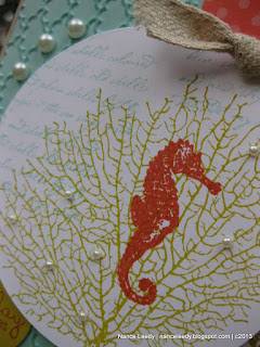
Oh how I love the coral and seahorse images!  I've used some of my favorite colors here too: Summer Starfruit, Calypso Coral and Pool Party.   Such great beach colors together!  What am I going to do when Pool Party retires in June??  I started with a Crumb Cake base and added a layer of Pool Party embossed with the Fancy Fan folder.  I sponged some Pool Party ink all over the embossing to really make it pop.  Love how the fancy fan texture looks like waves.
The circle of Whisper White was cut with the 3" circle die onto which I collage stamped the coral, seahorse and script images and scattered some pearls in the coral.  I used two strips of designer paper for the vertical element of the sketch, notching the ends and giving them a slight curl for extra movement.  Can you hear them blowing in the warm ocean breeze?  Well, probably many of you are under piles of snow right now so you'll just have to imagine the lovely breeze!  :-)
I am really loving this sentiment from the Sale-a-Bration set Vintage Verses--it's so pretty! And, of course, I can't get enough of that sweet little seahorse either!  He was the perfect finishing touch to the inside of my card.

 I just know the rest of my friends on the Design Team will have some amazing projects for you this week.  Be sure to pop over and give them some love!  Then pop over to the Paper Players to join us before the challenge closes on Friday, March 1st at Noon (PST).   I can't wait to see what you can make with Jaydee's sketch!

The Paper Players Design Team
 Photobucket
Supplies 
Stamps: By the Tide; Petite Pairs; Vintage Verses 
Ink: Calypso Coral, Summer Starfruit, Pool Party
Paper: Crumb Cake, Pool Party, Whisper White, Summer Starfruit CS; Sycamore Street DSP, Designer Series Patterns Stack (2011-2013 In Colors)
Xtras: Naturals Trim ribbon; Basic Pearls; 3" circle die; 1.25" square punch; 1.25" circle punch; Fancy Fan embossing folder

Sunday, February 10, 2013

Vintage Verses for the Paper Players {PP132}

Hiya friends and stampers! It's another great week over at The Paper Players. The always-amazing-Ann has a fresh color challenge for us:
I absolutely love Summer Starfruit--it's such a bright and happy color.  The girls in my stamp clubs have some rather....ahem....."colorful" descriptors for this color but I love it!  Especially paired with Midnight Muse and that little pop of Primrose is the perfect accent color:
Patio Party DSP has all the challenge colors in it so I started with the paper as my inspiration building my card around the Summer Starfruit pattern.  A couple of Paper Doilies off-set from the sentiment panel were the perfect landing spot for a trio of butterflies.
Love the texture provided by the Needlepoint embossing folder!  I thought it was a great match to the stitching lines of the Primrose Petals satin ribbon too.
Since I used a sentiment from Vintage Verses (FREE during Sale-a-Bration) on the front, I kept it going with another one from the same set on the inside.  More butterflies on the inside, complete the look!  I have no idea who or what I will use this card for but I had fun pulling together these colors.  And I hope you do too when you make a card to join us in the challenge this week!  :-)  Be sure to stop by the rest of the Design Team and check out their fabulous work!  Don't forget, our challenge ends Friday, February 15th at Noon (PST).

The Paper Players Design Team


Photobucket
Supplies 
Stamps: Vintage Verses; Papillion Potpourri
Ink: Midnight Muse, Summer Starfruit, Primrose Petals
Paper:  Midnight Muse, Summer Starfruit, Whisper White CS; Patio Party DSP
Xtras: Bitty Butterfly punch; Elegant Butterfly punch; Primrose Petals stitched satin ribbon; Needlepoint embossing folder; Basic Pearls

Sunday, February 3, 2013

Poppies Full of Sympathy {PP131}

Happy Sunday, everyone! This week I am your hostess over at The Paper Players for our monthly Theme Challenge:
I find that sympathy cards are among the hardest to design--even more so than masculine cards.  For me, it's about finding just the right balance between enough embellishments to make it special but a clean design to convey peace and serenity.
So how did I do?  Do you feel calm looking at this card?  :-) One way I think it conveys a calming effect is through color.  The Color Coach came through on this one for me: Not Quite Navy, Pool Party and So Saffron are pleasing to the eye as well as cool and serene.  I stamped the large background stamp, Pleasant Poppies, onto Pool Party designer paper with Not Quite Navy ink.
I stamped it a second time and fussy cut a few flowers for added dimension.  This adds some interest but isn't too heavy or busy to detract from the overall feeling of the card.  I matted the focal image on So Saffron and added a sentiment from Loving Thoughts--also on So Saffron cardstock.  Just a touch of Not Quite Navy taffeta ribbon keeps it simple but elegant.

I hope you like my Poppies Full of Sympathy card and feel inspired to play along with our challenge at The Paper Players.  Be sure to stop by and check out the work of the other Design Team members...you won't be disappointed!  If you can play along with our challenge this week, just remember that it closes Friday, February 8th at Noon (PST).  Thanks for stopping by!
 
The Paper Players Design Team

Photobucket
Supplies
Stamps: Pleasant Poppies; Loving Thoughts 
Ink: Not Quite Navy
Paper: Not Quite Navy, So Saffron cardstock; In Color Designer Paper Patterns Stack
Extras: Not Quite Navy taffeta ribbon; paper snips