Pages

Thursday, July 29, 2010

Who is that stylish lady?

My mom taught me to sew when I was 7. It was not a common hobby for my generation but I loved it! My earliest sewing memory is making handkerchief blouses that were successful enough to sell to my fellow fifth grade friends! It was an early introduction to the pride of handcrafting which continues to this day. Today, my daughter enjoys helping with the cutting and sewing is always very proud when she wears a "made by mama" outfit! While on vacation in Michigan last week, my mom introduced me to her favorite craft store...Archiver's. When I saw this Sew Stylish set there, it was a must-have! OMG! I was in heaven at that store. It's probably a good thing there isn't one in Florida, LOL!

The color combination is a little out of my comfort zone but I actually like it and think it works well with the images. The Crumb Cake base was stamped with Versamark using a companion stamp made up of pattern pieces. Might be able to see it better here:

I stamped the oh-sew-stylish lady in Chocolate Chip on a Very Vanilla Top Note and sponged the edges with a little cat's eye ink pad (sorry can't remember the color and I'm too tired to go get it right now!) Her outfit was colored with a Real Red marker with a few "white" spaces peeking through to highlight the "fabric" and show
movement. In my head her suit is a plaid wool boucle (a la Chanel) and I think the Square Lattice impressions folder on the Night of Navy cardstock evokes the texture of my imaginary fabric.

Lastly, you can't sew without a tape measure so I stamped the measuring tape image from this set on a strip of daffodil delight and created my own measuring stick! And I love the little bit of chocolate PTI baker's twine threaded through the fun yellow button. (Thanks Mom!)

Thanks for stopping by and indulging my little trip down memory lane. Have a great day!

supplies:
stamps: sew stylish & make your own (hero arts)
ink: chocolate chip, versamark
paper: crumb cake, very vanilla, night of navy, daffodil delight cardstock
xtras: top note die, square lattice impressions folder, baker's twine (PTI), real red stampin' write marker,

Monday, July 26, 2010

Fabulous Flip-Flops

Hi everyone! Sorry it's been so long since my last post. We visited family last week and there was no time for blogging! While visiting my mom, we taught a flip-flop embellishing class with her stampin' and scrappin' gals--boy, did we have a good time! Just look at the great flip-flops we made!
Everyone brought their own pair of plain flip-flops and using the Daisies #2 die and the Big Shot we cut 3 flowers out of various materials including sparkly felt, craft foam and glitter foam. The Circles #2 die cut a coordinating circle which was made into a "button" with two punches of the Crop-o-Dile. We tied it all together with some ribbon. Aren't they darling?

Can't leave without showing you the table favors mom and I made using the Two Tags die and Island Oasis DSP inspired by these beauties from Monika Davis. My clever mom created the flip flops on her Cricut--how stinkin' cute are they?!
Here's a shout out to everyone who came to the party--I hope you all had as much fun as mom and I did. Thanks for a great evening!

Thursday, July 15, 2010

Two for One: CQC{41} & 2S4Y{56}

Hi all! First, I need to give a big welcome to a lot of new friends. The number of friends following and reading this little blog has really picked up this week! Thank you so much for giving me a virtual morale boost. Knowing you're out there is so encouraging to me.

OK, on to the reason you're here...the card! I had so much fun putting this one together. I'm not sure which came first in my mind: the colors or the sketch but both are courtesy of two great challenges. This sketch over at 2 Sketches for You
was really easy to work with and is a definite keeper! I flipped it so I could allow more room for the other details on the card. So many possibilites with this one!

Then, who could resist Arielle's luxe combination of colors and textures over at the Color Que this week?! Pretty, yes? I didn't have any Pink Passion so I substituted with Melon Mambo, a current core color. Love the sophisticated color combination. The black card base got a zip through my Big Shot with the Movers & Shapers die. So cool--it cuts, scores and cuts out a little window shape in the card. Here I used the modern label shape to mimic the rectangular piece of the sketch. Once the window is cut and the inside cardstock glued down I just stamped my sentiment right through the window!

A little closer look at the sweet armchair from PTI's On My Couch stamped in Versamark directly onto some Basic Grey designer paper then heat embossed with black embossing powder. The embosssing really makes the details of the chair stand out. The grey stripe looks a bit like a man's suit, yes? That sweet little Melon Mambo pillow is from the same set stamped on whisper white and cut out. I punched a 1 3/4" circle of Whisper White, stamped the coordinating Melon Mambo "rug" and set up the chair on dimensionals. The Melon Mambo scallop circle was run through the Square Lattice impressions folder and then punched out with the new 2 3/8" scallop circle punch--you must have this, it's such a great size.

See the cute background? It didn't photograph that well but the armchair is randomly stamped in Basic Black ink on the card background. Cute? Gives a nice subtle backdrop to the colors and textures in the rest of the card.

Peeking through the modern label window shows a sweet little friend on the inside.

Thanks again for all your comments and support on my crafting journey I "chair-ish" each of you! :-)

supplies:
stamps: PTI on my couch, on my couch additions
ink: melon mambo, basic black, basic grey, versamark
paper: basic black, whisper white, melon mambo cardstock
xtras: whisper white organza ribbon; 1 3/4" circle, 2 3/8" scallop circle, scallop edge & corner rounder punches; black stampin' embossing powder; movers & shapers die;
adhesive rhinestones from my stash (still waiting for my SU ones!)

Tuesday, July 13, 2010

A Rose for JAI {25}

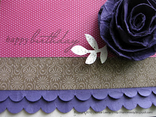
Hi all! Just a quick post tonight for a couple challenges. A lush color combination over at Just Add Ink includes Very Vanilla, Soft Suede, Elegant Eggplant and Rose Red--so pretty. I got the layout from Makeesha over at Inkspirations


I used Tania Gould's fabulous rolled rose tutorial to make the purple rose. It's super easy and I'm really happy with the way it looks.
The designer paper is all from the Thoroughly Modern stack (retired). I haven't received any new stampin' Up! paper yet so I'm moving through my retired stack. I am so fond of Soft Suede and I love the flower/damask design used here.


The two rows of scalled elegant eggplant were punched and then distressed by rolling and scrunching the paper in my hands, I curled the edges to make it look like fabric ruffles. It's the same technique I used on this card. I think it coordinates well with the distressed rose. Just a quick finish to the inside with the background stamp from Charming and a flower from Of The Earth (retired hostess) in Elegant Eggplant and Rose Red. I never would have dreamed up this color combination but I think it is fabulously rich and elegant!I'll come back later with a supply list. Have a great night!

Monday, July 12, 2010

Pals Paper Arts {50}

Whew, two posts in one day! That's what happens when I procrastinate about deadlines for challenges! I love, love the color combination at Pals Paper Arts this week so I had to play along. Isn't this a great combination? Basic Grey, So Saffron, and Chocolate Chip--yum!

This is a great layout for showing off those fabulous designer papers from your stash! We all have them and sometimes it's so hard to cut into them, right?! That's the great thing about this layout, you only need to small squares in a variety of coordinating patterns. So easy with a square punch!

There are a couple of fun little details on this card that I had me squealing in delight in my craft room today, really it's true! The first is the So Saffron striped grosgrain ribbon (retired). A piece of sticky strip held my ribbon in place while I stitched it on with my sewing machine--such a fun detail! Also, I knew that I wanted the Chocolate Chip sentiment in that final square but a plain piece of white was just too...well, plain! So I inked up the Woodgrain background in So Saffron and stamped right over the sentiment. Just the right touch of a natural element. You might be wondering how I selected the designer paper...because you know it certainly wasn't random! :-) No, it took awhile to figure out. I tried to balance the selection of patterns with graphic elements--such as the polka dots, circles and stripes--with natural details such as leaves, flowers and woodgrain. Paying attention to the details made sure that my patterns work together rather than compete. I'm sure there is a design principle for all that but I don't know what it's called!

I did not have an occasion in mind with this card so there is no sentiment on the inside. I liked the look of the So Saffron Woodgrain so much that I carried it over to the inside on a piece of Whisper White. And finally, a pretty little stem of leaves from the retired Best Blossoms set adds the finishing natural touch in Basic Grey!

Thanks so much for stopping by, again! I look forward to hearing from you...cheers!


supplies:
stamps: great friend; woodgrain background; best blossoms
ink: chocolate chip, so saffron, basic grey
paper: basic grey & whisper white cardstock; walk in the park & sweet pea stack DSP (both retired)
xtras: so saffron striped grosgrain ribbon; chocolate chip epoxy brads; corner rounder & 1.25" square punch (marvy uchida)

Bird on a Wire: CTD{100}

The Color Throwdown challenge turns 100 this week! Well, I mean, they're celebrating 100 challenges and when I saw these colors I had to {throw} my hat in the ring. :-)
Anyone who knows my stamping, knows that I love birdie stamps. If you've been reading this blog you've seen them on tons of cards. So, this card is an homage to all the birdies that have come before!

I stamped the cloud background stamp (Hero Arts, sorry SU!) in Baja Breeze and drew "wires" across the clouds with my coordinating Baja Breeze Stampin' Write marker. Then I inked up this sweet bitty bird from Branch Out (retired) in all of the challenge colors: Regal Rose, Certainly Celery, Real Red & more Baja Breeze.

The cloud die (PTI--love!) was cut from Whisper White cardstock and inked up on the edges with a sponge dauber and Baja Breeze ink. My stamp-a-ma-jig came in real handy here to stamp the sentiment from a retired hostess set, Picture This, in Real Red ink. Isn't it just perfect?!

I mixed things up a bit on the inside and used a piece of Baja Breeze cardstock instead of the usual white or vanilla. Really, it is Baja Breeze although it looks a bit washed out in the pic--cloudy skies when I snapped this picture. I needed to have more fluffy white clouds on the inside so naturally they had to be on a baja breeze background. The stamp-a-ma-jig was essential, again, for fitting the Real Red sentiment from On Your Birthday in the cloud...

Thanks for stopping by today and indulging me and my little birdie friends...let me know what you think! Have a great day!

supplies:
stamps: branch out; on your birthday; picture this (retired); clouds (hero arts)
ink: baja breeze, real red, regal rose, certainly celery
paper: whisper white, real red baja breeze cardstock; regal rose dsp
xtras: baja breeze stampin write marker; certainly celery poly/twill ribbon (retired); cloud die (PTI), sponge dauber; scallop edge punch; stamp-a-ma-jig

iPicks Choice!

OMG, {squeal}! I'm so excited, Nancy Riley chose this card of mine to highlight in her weekly post iPicks. I am honored to be highlighted among so many talented stampers. Thanks for the shout-out Nancy!
blog it

Saturday, July 10, 2010

Vintage Queen: SCIC{10}

Hi, all! Tonight I have a new-to-me challenge to share with you. Stamping Celebration is a challenge site with an amazing Design Team, great inspiration and fun for all! When I saw the gorgeous inspiration photo of challenge #10, I knew exactly what I was going to do. Vintage! I think yellow, black and white, or in this case very vanilla, is such a timeless and elegant color combination. I've used some of my new favorites here including the Newsprint DSP, 2 3/8" scallop circle punch, Vintage Wallpaper impressions folder and Daffodil Delight cardstock.

To make the flower I punched one 2 3/8" scalloped circle and two 1 3/8" scalloped circles from the Newsprint DSP. I scrunched each circle up, crumpling it in my hand and then layered each one with the larger scalloped circle in back. A 3/4" circle of basic black highlights the pearl brad (non-SU) nicely. Did you notice the new adhesive pearls in the new catalog? So excited, can't wait to get mine! Anyway, I just love the way this little flower looks!

The Daffodil Delight strip needed something more than just the quote from Favorite Thoughts. I dug around my stamp cabinet and found this pretty bitty damask image from the Charming set. Inked up in Daffodil Delight and stamped in an alternating pattern, it makes a great background. Of course, this sentiment wouldn't be complete without the crowning touch from Tiny Tags to dress it up!

The inside needed a strong dose of style to match the outside and this flourished frame stamp from Gallery (retired) in Daffodil Delight fit the bill perfectly! An equally flourished {contraband} stamp (Hero Arts) set off with a pair of crowns is just the finishing touch for this royal card of elegance and style! Now, I wonder who I should give it to?

supplies:
stamps: favorite thoughts; tiny tags; charming; gallery (retired); fabulous birthday (hero arts)
ink: daffodil delight; stazon jet black
paper: basic black, daffodil delight, very vanilla cardstock; newsprint designer series paper
xtras: vintage wallpaper textured impressions folder; 2 3/8" scallop circle, 1 3/8" scallop circle & 3/4" circle punches; top note die; old olive 1/4" grosgrain ribbon; stamp-a-ma-jig; pearl brad from my stash

Protect your Butterfly Embosslit


When you use the Beautiful Wings Embosslits Die, be sure to run the die through the Big Shot, or Cuttlebug, so that the hinge is opposite the Big Shot, or Cuttlebug, handle. This will help protect the hinge. Big Shot users, make sure that you are using tab 1 on the multipurpose platform with this die. This will ensure the long life of those sweet little butterflies!

Wednesday, July 7, 2010

Happy Skies & Butterflies

Oh, how I love clouds and butterflies! I had to pick up this adorable cloud background stamp at my local craft store. As soon as I brought it home, I knew that I wanted to combine it in Tempting Turquoise with these sweet butterflies from the Punched Posies hostess set and the Island Oasis dsp--doesn't the paper look like rainbows?

I stamped the butterflies in Versamark ink on Rose Red and Pumpkin Pie cardstock and then heat embossed with clear embossing powder. Gives great dimension and texture! But the best part was being able to punch them out with SU's coordinating butterfly punch--love a coordinating punch! A little bit of linen thread wrapped about the body and secured with a bead created the antennae.


Once the front was finished, I just had to keep going with a matching butterfly, dsp and clouds on the inside!


I truly appreciate all your comments and visits to my little crafting corner of blogland. There are so many talented crafters and stampers out there and I'm grateful that you stopped by...so this card is for you! "I hope your day is as happy as happy gets!" Cheers!

supplies:
stamps: apple blossoms (sentiment); punched posies; flight of the butterfly (inside sentiment); good neighbors (retired-inside clouds); cloud background stamp (hero arts)
ink: versamark, early espresso, rose red, old olive & tempting turquoise
paper: so saffron, tempting turquoise & whisper white cardstock; island oasis dsp
xtras: linen thread; beads from my stash; cloud die (PTI); polka dot impressions folder;

Tuesday, July 6, 2010

River Dreams: JAI {24}

Just a quick post tonight...had to get this one in under deadline! Here's a clean-and-simple entry for the sketch challenge over at Just Add Ink: 24. Isn't it great? So many possibilities! This beautiful stamp from Dream Garden is embossed in black on some fabulous River Rock designer paper I picked up in the SU Clearance Rack. I was so happy when SU brought back River Rock--it was the very first SU stamp pad I ever purchased and has remained a favorite! It looks great paired here with the deep tones of Cherry Cobbler--a yummy color--used on the sentiment from Wonderful Words (retired).


For the inside, the Dream Garden crane was inked up in River Rock and the little sentiment from Occasional Quotes (new hostess level 2 set) stamped right over in Cherry Cobbler. Such a great color combination don't you think? Sorry so short but I'm exhausted--thanks for looking!

supplies:
stamps: dream garden; occasional quotes; wonderful words (retired)
ink: river rock, versamark, cherry cobbler
paper: river rock, basic black & cherry cobbler cardstock; brocade backgrounds dsp (retired)
xtras: corner rounder punch

Monday, July 5, 2010

Happy Birthday Thoughts: Curtain Call {Act 37}

Hi everyone! Thanks for stopping by and for all the great comments you have left for me. I love hearing from you! Today's card is for the color challenge over at Stacey's Stamping Stage and it's a special one because this week is Stacey's birthday...Happy Birthday Stacey!

Simple design to this card...I can't stop using this hostess level 2 stamp set, Apple Blossoms, just love it! My colors are Melon Mambo, Chocolate Chip, Tempting Turquoise and Daffodil Delight. The challenge called for Barely Banana but with none in my stash I had to substitute.
The Tempting Turquoise cardstock was run through my Big Shot with the Square Lattice Impressions Folder--a summer mini fave that I'm happy to see continued in the new 2010-2011 catalog!

This wouldn't be a birthday card for Stacey without a little ribbon and a button! :-) Here, I've wrapped Linen Thread around the turquoise panel twice and then tied on a Chocolate Chip corduroy button (retired). The Tiny Tags stamp and Medium Jewelry Tag punch are the perfect little detail for the button! Aren't they sweet?

Had to finish off the inside with the big bloom from the Apple Blossoms set and a little sentiment from On Your Birthday. Just pulling together all the colors from the front for a cohesive look. There you have it, some virtual birthday cheer! Hope you have a great day!

supplies:
stamps: apple blossoms; on your birthday; tiny tags; punched posies
ink: melon mambo, chocolate chip, tempting turquoise, daffodil delight, old olive
paper: chocolate chip, temptin turquoise & whisper white cardstock
xtras: linen thread; square lattice impressions folder; corduroy button; medium jewelry punch; daffodil delight marker (flower center); paper piercer & piercing mat

Friday, July 2, 2010

CAS-tastic Journey {CWC010}

Well, I'm not sure how clean and simple this card is despite following this fab sketch over at CAS-tastic Challenges, {CWC010} pretty closely. Maybe it's the busy paper that makes it feel not-so-clean-and-simple? CAS or not, I'm actually pretty happy with it! I'm calling this a belated birthday card for my poor husband who had surgery the day before his birthday and his wife couldn't even get it together enough to make him a card! Seems like sometimes I make cards for everyone else except the ones I am closest too--does that happen to you, too? Please say, yes! Anyway, he commutes to work on his bike 3 days a week and in honor of his tremendous cycling dedication, I have been itching to use this super cool bike from the Pedaling Past set with the Travel Journal DSP. This paper has some great patterns like the subway map and that little bit of a stripe that reminds me of a man's silk tie... Funny thing, I had the DSP pieces all lined up, I stamped the bike (in Night of Navy) but I kept fussing with it. It just didn't seem finished to me...it was missing just a little something. Hmmm, that's it! How about a cute little birdie on the back? Perfect! This little guy is from an all-time favorite, Wild About You (retired), and stamped in coordinating Pumpkin Pie. A little matting in Garden Green, a companion spiral punch on the end and I called it done! Well, until I got to the inside and had to finish that off too, especially since I still had a sliver of DSP left. That should do it! What do you think? Thanks for stopping by!

supplies:
stamps: pedaling past; wild about you
ink: whisper white; night of navy; pumpkin pie; crumb cake
paper: crumb cake, garden green, night of navy cardstock; travel journal dsp
xtras: spiral punch; stamp-a-ma-jig