I couldn't wait to use some sneak peek items and settled on using some of the fall themed products because I couldn't bring myself to make a Christmas card just yet. :-)
My demonstrator friends will recognize that today's card is inspired by one shown in Stampin' Success, our monthly demonstrator magazine. I changed the layout and added designer paper to brighten it up a bit. I love stamping in the negative space--the space left behind when you punch or cut out a shape--so with the Circles Framelits I cut a circle into the mat of DSP and stamped the cardstock behind.
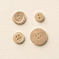
You need to see a close up of these stamps to appreciate the detail. Look closely at the watercolor swatch in the background. It actually has a texture to the stamp that makes it look a bit like cheesecloth--so cool! This is a sneak peek of the stamp set For All Things. They showed it to us at convention and I couldn't wait to get my hands on it! And, did you see that big brushed gold button?! Yep, it's another sneak peek from he Holiday Catalog. They're flat and the brushed finish gives a nice subtle finish to the gold. They are just like the Silver Basic Buttons we have in the big catalog. Love!
Just a little finish to the inside--nothing fancy--but I love how you can use just a scoche of washi tape when you need a touch of color. Here it's--you guessed it--another sneak peek Color Me Autumn Designer Washi Tape. Come on say it again with me--LOVE! This and all the other sneak peek items I've used are listed in the table below. You're going to LOVE all of them and nearly everything else in the Holiday Catalog. I do think it's the best one yet--SWOON!
I hope you'll play along with Jaydee's fabulous sketch at The Paper Players before our challenge closes on Friday, August 29th at Noon (PST). Be sure to check out the rest of the design team for even more spectacular sneak peeks on display!
The Paper Players Design Team

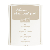
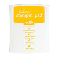
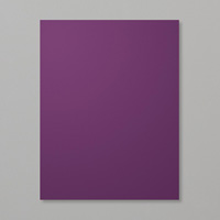
Table built using Product Table Builder by The Crafty Owl - Independent Stampin' Up! Demonstrator.







Great card, Nance! I love how the stamping in the negative space looks!
ReplyDeleteVery cool! The negative circle space design is a fun spin on the sketch. Your stamping and colors are fantastic. I LOVE it!
ReplyDeleteGorgeous!! Love the negative space you used as well as the colours and image.
ReplyDeleteBeautiful card, Nance! I love the design, it's awesome!
ReplyDeleteReally like your color palette, Nance. I too like stamping in the negative space. I really didn't care for this stamp set until I saw your card. Now I have ideas!
ReplyDeleteJust beautiful!!!
ReplyDeleteGorgeous card Nance - your card is perfect for fall, even if the weather with you isn't! Love the way you stamped in the negative space and picked up the fall colours from the DSP. The gold button is the perfect finishing touch too.
ReplyDeleteNothing close to fall-like weather here in NY either, Nance! 90 degrees today! Gorgeous take on the sketch. Love the colors and your circle frame. And washi tape! I have so much that I never use. Thanks for the inspiration!
ReplyDeleteSo pretty, Nance! I love the pairing with washi tape. Reminds me that I have some rolls that I need to use ...
ReplyDeleteNance, I keep thinking I don't need this set... and then I see this card and think I do! I love the way you used the DSP and how the focal elements draw from the colors of the DSP. fabulous card. Thanks for rocking my sketch challenge this week
ReplyDeleteHugs
Jaydee