Pages

Sunday, April 29, 2012

Purses for Tea {PP93}

Happy Sunday, friends!  It's bonus week at The Paper Players and that means Anything Goes.  But this week, Lesley has a twist for us...Anything Goes Tic-Tac-Toe:
That means create any project using items shown on the "game board" either across, down or diagonally.  If your selection includes the center square then add whatever you choose!  I went diagonally for Flowers, Designer Paper and added our newest die, Petite Purse!
Aren't they the cutest?!  As soon as I saw this die in the Summer Smooches preview this month, I knew I had to have it!  So many uses as party favors/name holders for mother's day brunch, bridal/baby showers or even a girls shopping trip!  These sweet little ones will get bundled with 25(!) of their friends and adorn the tables at the Mother's Day Tea party in my daughter's classroom this week.  Yes, I need to make 25 more...by Monday...ack!  Good thing they go together easy-peasy.
I cut the base of the purse from several patterns in the Springtime Vintage DSP [retired] and ran the die through again with a scrap piece just to cut the top flap from either a coordinating paper or from the leftover bits of DSP I used for the base.  To the handle I added a piece of cardstock punched with the Scallop Ribbon Border punch and adhered it to the sides with a glue dot.  The flowers on the front were made with the Boho Blossoms punch.
Since I've played around with this die a little bit now, I have a few tips for you:
  1. To get the flap curved so it fits nicely over the top of the purse, run a bone folder on the under side from the back to the front.
  2. There's a little tab on the end of the front flap that slides into slit in the front of the purse.  This holds the purse closed.  Poke your fingernail or the tip of a bone folder into the slit to open it up a little.  The tab will fit better and will actually stay closed.
  3. If you cover the front flap with DSP or some other material, make sure to put adhesive on all sides.  It covers the flap much better and stays in place.
That's it for me.  I'm not feeling my best...we lost the last of our fur-babies this weekend and it has been rough.  I know she's in a better place, playing with her brother in kitty heaven, but damn it's quiet around the house...too quiet.  I miss her old-lady-kitty chatter.  :-)  Take care, friends.  Oh, I almost forgot...be sure to check out the rest of the Design Team for some amazing work.  This is our last week with Guest Designer Shirley so be sure to give her some comment love!  Thanks for all your work Shirley...(hugs)

The Paper Players Design Team
Shirley Pumpkin (April GD)

 Photobucket 

Thursday, April 26, 2012

Not so Masculine afterall...

Happy Thursday friends and welcome to another week with Connie & Mary! It's color time so let's see what our challenge is this week:
 Hmmm....at first these colors seemed a bit masculine to me but I try to think outside the box and not always go with my first reaction.  So...I used them to make a feminine card.  In fact, a Mother's Day card!
I had forgotten how pretty Sahara Sand is...especially paired with Peach Parfait and Night of Navy!  The background is stamped with the retiring stamp French Filigree in Sahara Sand and the Night of Navy polka dot paper is from the Regals Designer Patterns Stack.  
The focal image is from the hostess set, Simply Soft and stamped in Sahara Sand and Peach Parfait.  I sponged the edges in more Sahara Sand and used the script stamp from the Charming set for a slightly vintage look.  Do you recognize the scalloped mat layer?  Using the Scallop Square Duo die, I cut two Peach Parfait squares and layered them to create a scalloped rectangle that I needed for my stamped image!
On the sentiment panel I stamped another pretty little image from the Charming set in the background with Sahara Sand ink, stamped off once.  Teeny Tiny Wishes came to the rescue with a perfectly sized sentiment.  And every mother needs a string of pearls don'tcha think?

I hope you like today's card and are inspired to play along with us at Create with Connie & Mary.  If you do, be sure to link up your creation before the challenge closes on Wednesday, May 2nd at Noon (EST).  Now, go check out the rest of the CCMC Design Team for even more eye candy!  Thanks for stopping by!

Photobucket
Supplies 
Stamps: Simply Soft; Charming; Teeny Tiny Wishes 
Ink: Peach Parfait, Night of Navy, Sahara Sand
Paper:  Peach Parfait, Night of Navy, Sahara Sand, Very Vanilla; Regals Designer Patterns Stack
Xtras: Linen Thread; Basic Pearls; Scallop Oval Punch; Large Oval Punch; Scallop Square Duo die; Scallop Ribbon Border punch  

Sunday, April 22, 2012

A Sketch for the Paper Players

Happy Paper Players Sunday, friends!  This week at The Paper Players, I am delighted to be the hostess with a sketch that I designed:
The sketch is based on this card I designed a few weeks ago and I liked it so much that I CASED myself, LOL!
This card is going to a very special blogging friend of mine who is celebrating a birthday this week.  She's probably going to see it here but she doesn't yet know it's for her.  Shhh, don't tell!  {wink!}  I hope she will be surprised when she finds it in her mailbox!  I took my color cues from the Timeless Portrait designer paper: Basic Black, Very Vanilla, River Rock, Cherry Cobbler & Island Indigo.  Designer paper is a great source for color combinations and takes the guess work out of the process!

Along each side of the center panel, I embossed the scalloped border with the Adorning Accents embossing folder.  Embossing Vanilla cardstock really lends an elegant feel to the whole project and coordinates nicely with the floral spray on the DSP.
The Mixed Bunch blossom was heat embossed with Cherry Cobbler embossing powder and the scalloped borders were sponged with Island Indigo ink to make them pop!  Because my friend adores pearls, I filled the center of the flower with as many as I could fit!
I hope you'll consider playing along with my sketch over at The Paper Players--just link up before Friday, April 27th at Noon (PST).  Be sure to check out the rest of the Design Team for even more amazing inspiration.   Thanks for stopping by today!
The Paper Players Design Team
Shirley Pumpkin (April GD)

  Photobucket
Supplies 
Stamps: Mixed Bunch; Sweet Cake; Bring on the Cake 
Ink: Cherry Cobbler, Island Indigo, Jet Black Stazon, Versamark
Paper: Very Vanilla, Basic Black, River Rock, Island Indigo CS; Timeless Portrait DSP
Xtras: Cherry Cobbler embossing powder; Basic Pearls; Blossom punch; Scallop border punch; Adorning Accents embossing folder; Island Indigo ruffled ribbon

Thursday, April 19, 2012

You're a Gem {CCMC198}

Happy Thursday friends! You know what Thursdays mean around here...yep, it's another week over at Create with Connie & Mary! This week the gals have a terrific sketch for you. Take a looksee:
Isn't it a great one?  I just had to play with some new sneak peek goodies.  There's a whole suite of products that Stampin' Up is previewing for us this month.  The line is called Summer Smooches and it will appear in the new catalog in June.  Don't you just love new stuff!!  This month demonstrators and customers are able to purchase a few of the products I've used on today's card.

 New stamps, new designer paper and new ribbon--woohoo!  My color palette is taken directly from the Summer Smooches DSP featuring Island Indigo, Lucky Limeade, Daffodil Delight, Real Red and Tangerine Tango.  So bright and happy!  I colored the Bright Blossoms vase and flowers with Stampin' Write markers and stamped onto a Whisper White oval cut with the Ovals die.  I layered it onto Tangerine Tango cut with the Framelit Labels collection.  A trio of Basic Rhinestones were added to the label in order to balance the bow and compliment the sentiment from You're a Gem.  By the way, this great little sentiment set is just one of the many sets scheduled to retire at the end of May. :-( Gonna miss that one!
Here's a little peek at the flower.  I stamped the red tulip once directly onto the Whisper White.  I stamped it a second time on some scrap, fussy-cut just the tulip and popped it up on a "riser" AKA Stampin' Dimensional.  Adds a little but of whimsy don'tcha think?
 Lastly, I stamped it again on the inside...let's pretend that it was actually stamped straight, 'kay?!  Geesh.  See that big strip of DSP at the top....I'm using that to distract you from the crooked stamping, lol!

I would love to know what you think of today's card (apart from the crooked stamp!) and hope that I've inspired you to play along with this sketch.  I know you'll want to check out the rest of the Design Team over at Connie & Mary for even more inspiration.  Maybe enough inspiration for you to play along with us...just make sure to link up your crafty goodness by Wednesday, April 25th at Noon (EST).  Thanks for stopping by today...have a good one!

 Photobucket
Supply List 
Stamps: Bright Blossoms; You're a Gem
Paper: Island Indigo, Whisper White CS; Summer Smooches DSP 
Ink: Early Espresso, Real Red classic ink
Extras: Framelits Labels Collection; Ovals die; 3/16 Corner Rounder punch; Basic Rhinestones; Stampin' Write Markers; Daffodil Delight Seam Binding Ribbon

Sunday, April 15, 2012

Zen and the Art of Watercolor

Happy Paper Players Sunday, friends!  I'm so excited to share my card with you today!  But first, let me tell you about this week's challenge with Jaydee as our hostess:


Truth be told, I used to be afraid of watercoloring but I've been practicing and practicing...and...you get the picture...now I think I can say that I actually like watercoloring!  So, I busted out some watercolor paper, my ink pads and an Aqua Painter to make this birthday card for a dear friend:


I needed a masculine card so the clean-and-simple approach was perfect.  The demure little bonsai in the Plant Hope set is ideal for my friend who likes Asian themes.  I think the key to watercoloring, for me, is to layer the color by starting with the lightest shade.  With several light applications, you end up with a shade that has more dimension than an image colored with a single color.  Use the darker color to add shading allowing some of the light color to peek through. 

   
For the pot, I started with several light coats of Calypso Coral only adding Poppy Parade on the edges.  For the tree, I started with  Pear Pizzazz and added a punch of color with Lucky Limeade while the tree trunk and branches was a blend of Crumb Cake and Soft Suede. This method does take some patience as the water needs to dry between each coat otherwise it will run.  Of course, I wouldn't know anything about that....no, not me, not at all!  LOL.  To finish it off I added two score lines with my Simply Scored board and tucked a piece of Lucky Limeade ruffled ribbon underneath.  You can't really tell in the photo but that's a piece of Brushed Gold cardstock under the ribbon--it adds just the right touch of glam.  Coz, even guys like a little sparkle!

I hope you liked today's card--I would love to know what you think!  Be sure to check out the rest of the Design Team for their fabulous take on this challenge.  I hope you'll join us in The Paper Players gallery--the challenge will close on Friday, April 20th at Noon (PST).

The Paper Players Design Team
Shirley Pumpkin (April GD)


 Photobucket
Supplies 
Stamps: Plant Hope; Teeny Tiny Wishes
Ink: Calypso Coral, Poppy Parade, Pear Pizzazz, Lucky Limeade, Crumb Cake & Soft Suede classic ink; Timber Brown Stazon
Paper: Basic Black, Brushed Gold CS; Watercolor paper
Xtras: Lucky Limeade ruffled ribbon; Simply Scored board; Aqua Painter

Thursday, April 12, 2012

Love & Irises {CCMC197}

Happy Thursday, friends, and welcome to another week at Create with Connie & Mary! It's a color challenge this week and the colors are gorgeous together...take a look:


I combined the colors with this fantastic sketch from the gals over at Card Patterns--love their sketches! 


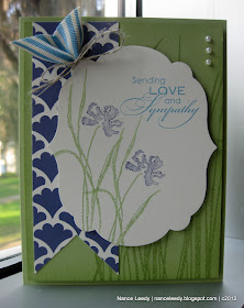
Blues and greens are probably two of my favorite colors but I rarely use purple and Concord Crush even less, lol!  It's a very intense color so for my card, I lightened it up a bit:


The set Love & Sympathy is so pretty with two heartfelt sentiments and this gorgeous, grassy flower.  To me it looks a bit like an iris so Concord Crush was a perfect color choice.  I inked the flower with a Concord Crush marker and after stamping off once, inked the grass with a Certainly Celery marker and stamped the whole image onto some Very Vanilla cardstock cut with the Labels Framelit die.  I repeated another flower, for a field effect, and added the lovely sentiment in Maria Mist. To the background I stamped the grass from Inspired by Nature in Certainly Celery to compliment the grass of the flower.


So, are you wondering where the Concord Crush DSP came from?  Curious?  Well, you can probably guess...that's right...My Digital Studio!  I realized that I didn't have any Concord Crush DSP and I actually didn't have one in MDS that I liked either...shocking, I know!   So...I made my own.  I used a digital stamp called Fancy Fan (it matches a letterpress plate by the same name) and colored the "stamp" in Concord Crush.  Because I wanted it a little lighter, I used the "opacity" command in MDS to reduce the intensity of the color.  So not only did I make my own DSP, I also made my own color, lol!  Concord Crush "lite"!

I mentioned that this set has two pretty sentiments--you saw the first one already and the second one is perfect for the inside.  Stamped here in full strength Concord Crush and this time with a Marina Mist flower.  I hope you've enjoyed today's card and feel inspired to play along with these gorgeous colors.  Be sure to check out the rest of the amazing design team over at Create with Connie & Mary.  If you decide to play along, you have until Wednesday, April 18th at Noon (EST).  I hope you'll join us!
Photobucket
Supplies 
Stamps: Love & Sympathy; Inspired by Nature
Paper: Certainly Celery, Very Vanilla CS; MDS hybrid designer paper
Ink: Certainly Celery, Concord Crush, Marina Mist classic ink
Xtras: Marina Mist 1 1/4" Striped Grosgrain Ribbon; Linen Thread; Labels Framelits; Basic Pearls; Stampin' Write Markers (Certainly Celery, Concord Crush, Marina Mist)

Sunday, April 8, 2012

Sweet Floral {PP90}

Happy Sunday, friends.  If you celebrate Easter--happy egg hunting!  If you're hunting up a lovely color challenge, look no further than LeAnne's gorgeous choices for this week's color challenge at The Paper Players:


Blues and greens are always a favorite and so easy to mix together.  I recently acquired a large background stamp called Sweet Floral and decided to use that as the focal point for today's card:


Pretty dramatic, eh?!  Stamping the darker color, Not Quite Navy, onto the lighter Pool Party is an easy way to incorporate two of the challenge colors.  For a little pop, I stamped the floral image again and fussy-cut a few of the flowers:


Now, to incorporate Certainly Celery, I layered striped grosgrain ribbon, a label stamped with a Four Frames image and an itty bit of Pool Party ruffled ribbon:


I made my sentiment from the mix-and-match set, Fabulous Phrases in Not Quite Navy with a little background stamping in Pool Party.  I had so much fun playing with these colors and I know that you will too!  Be sure to check out the rest of the Design Team for their amazing inspiration.  I hope you will join in the fun over at The Paper Players.  Remember, this challenge will close on Friday, April 13th at Noon (PST).  Hope to see you there!

The Paper Players Design Team
Shirley Pumpkin (April GD)


Photobucket
Supplies 
Stamps: Sweet Floral, Fabulous Phrases, Fresh Vintage (retired) 
Ink: Not Quite Navy, Pool Party, Certainly Celery 
Paper: Not Quite Navy, Pool Party, Certainly Celery, Very Vanilla CS 
Extras: Decorative Label punch, Large Oval punch; Certainly Celery 1 1/4" Striped Grosgrain Ribbon; Pool Party ruffled ribbon.

Thursday, April 5, 2012

Mojo Escargot {CCMC196}

Hey there everyone! Welcome to another week at Create with Connie & Mary!  It's a sketch week at CCMC and the gals have drawn up a good one for you:


I have been feeling void of any mojo the last few days so my card is a very literal interpretation of the sketch even right down to the wavy ric-rack!


I took all my color choices from the Just Add Cake designer paper coloring the cute little snail with a Blender Pen and Baja Breeze, Wild Wasabi, So Saffron and Peach Parfait ink pads.  Are you wondering how I got the narrow ric-rack?  After I cut the Baja Breeze cardstock with the Tasteful Trims die, I just slid the newly cut piece up a little on the die and ran it through again.  It cut off just enough to give me a narrow piece that I layered on top of the Peach Parfait ric-rack.  Just for fun, I added a trail of Dazzling Diamonds to make a sparkling snail trail.  Tee, hee.  The 2 1/2" circle was trimmed with a long piece of Wild Wasabi cardstock that was punched with the Scallop Ribbon Border punch, run through a paper crimper and adhered to the back with sticky strip.   Finally, I just threaded the Baker's Twine through the tiny holes in the border and tied a bow.  Had to finish off the inside too:

The designer paper is doing double duty both decorative and functional.  It's hiding the sentiment that is right under the stamped snail!

I'm going to keep this short and sweet, my friends.  I hope you'll check out the rest of the Connie & Mary Challenge team and consider playing along with us.  The challenge ends on Wednesday, April 11th at Noon (EST).  Hope you have a great day!

 Photobucket
Supplies 
Stamps: Easy Events; On Your Birthday
Ink: Baja Breeze, Wild Wasabi, So Saffron, Peach Parfait classic inks; Jet Black Stazon
Paper: Baja Breeze, Wild Wasabi, Peach Parfait, Whisper White CS; Just Add Cake DSP
Xtras: Dazzling Diamonds; Lucky Limeade Baker's Twine; Tasteful Trims XL die; Scallop Ribbon Border punch; Paper Crimper; Blender Pen; 2 1/2" Circle punch; Basic Rhinestones

Sunday, April 1, 2012

Lunchbox Punny Love {PP89}

Woohoo, it's Sunday! I love Sundays because I get to play with my gal pals at The Paper Players! Our friend Anne Marie has a challenge as big as the state of Texas for us this week:


Yes, you read that right..."Tickle your Funnybone!"  If you're a follower of my blog, you know that I don't do humorous cards very often...so this one was definitely a challenge for me.  I decided to go the "punny" route and make a set of "Lunchbox Love" cards to brighten my daughter's day at school:


Aren't they cute?!  I printed a sheet of images in MDS from the Under the Big Top set and colored each one with ink pads and blender pens to coordinate with the new Summer Smooches DSP which is available beginning today!  The coordinating sentiments are so "punny", I just know that they will come in handy when my daughter needs a school-day smile!  I thought you might want to see each one up close...

Isn't this muscle man the cutest?!  His Tempting Turquoise unitard just makes me giggle and that big 'stache makes him look a little bit like the guy from the Village People don't you think?  LOL!


Who can resist a Tangerine Tango lion?  Not me!  And finally...


The smarty pants of them all...isn't he too cool for school with his Converse sneakers?  You may have noticed the size is a little bit different...these are all 4 1/4" square...a nice size for a lunchbox note but a little more "canvas" to work with than bitty notecards.  I won't bore you with the details...supply list is below.  Be sure to check out the inspiration from my fabulous teammates:

The Paper Players Design Team
Shirley Pumpkin (April GD)

I would also like to extend a big Paper Players welcome to our April Guest Designer Shirley Pumpkin!  Welcome aboard, Shirley, we're delighted to work along side of you this month.  And, we would be delighted to see your card or project in the gallery this week...so get bizzy in your craft space!  You've got until Friday, April 6th at Noon (PST).  Thanks for stopping by!
 
Photobucket 
Supplies 
Card #1: Strongman
Stamps: Under the Big Top (MDS); Mixed Bunch
Ink: Tempting Turquoise, Daffodil Delight, Real Red classic inks
Paper: Lucky Limeade,Tempting Turquoise, Daffodil Delight, Whisper White CS; Summer Smooches DSP; Real Red glimmer paper.
Xtras: 2 1/2" circle punch; Scallop Ribbon Border punch;  Adoring Accents embossing folder & Edgelits; Decorative label punch; Itty Bitty punch pack (circle); Blender Pen; Real Red polka dot grosgrain ribbon (retired); Blush Blossom Stampin' Write marker

Card #2: No Lion
Stamps: Under the Big Top (MDS); Mixed Bunch
Ink: Tangerine Tango,Tempting Turquoise, Daffodil Delight, classic inks
Paper: Tempting Turquoise, Daffodil Delight, Lucky Limeade, Whisper White CS; Summer Smooches DSP
Xtras: 2 1/2" circle punch; Scallop Ribbon Border punch;  Adoring Accents embossing folder & Edgelits; Decorative label punch; Blender Pen; Tangerine Tango striped grosgrain ribbon (retired)

Card #3:  Smarty Pants
Stamps: Under the Big Top (MDS); Mixed Bunch
Ink: Real Red, Tempting Turquoise, Daffodil Delight, classic inks
Paper: Tempting Turquoise, Daffodil Delight, Real Red, Whisper White CS; Summer Smooches DSP
Xtras: 2 1/2" circle punch; Scallop Ribbon Border punch;  Adoring Accents embossing folder & Edgelits; Decorative label punch; Blender Pen; Tempting Turquoise 1/4" grosgrain ribbon; Lucky Limeade ruffled ribbon; Blush Blossom Stampin' Write marker